Judging a Book Cover by Its Color
Okay, do me a favor, Book Riot readers. The next time you’re near your bookshelf, take a quick browse and tell me this: Is there any book cover color you predominantly see?
If so, you might be under the influence of great art designers. The colors we choose often reflect the books we like to read. Designers want to make sure the book feels right to authors and readers alike.
“Color is so key in helping to set the tone for a book in an instant,” says Kelly Lawler, the Creative Director for adult and YA imprints at Sourcebooks. “Yellow screams happy, red can give you the sense that something is off, black is dark and moody…and if that feeling doesn’t match with the content of the book, you’re essentially causing confusion for a consumer before they’ve even picked it up.”
Olivia Croom Hammerman, an independent designer who has worked with the Big 5 publishers, small presses, and self-published, agrees. A basic example is red.
“Is red going to bring up horror, romance? Is it going to bring up Communism? You really have to make sure you’re pairing it [correctly] with the manuscript,” she said.
But the way colors work can change with each book.
Holly Ovenden, a freelance designer who previously worked with Penguin and Bloomsbury Publishing, says that, “After reading a book, I get a sense of whether the cover needs to reflect the writing by being bright and eye catching, clashing, or harmonizing. It is often a case of trial and error where I play with color palettes as the design progresses.”
Sometimes it’s even the title that can inspire the color.
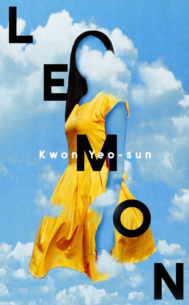
Ovenden’s recent design of Kwon Yeo-sun’s novel Lemon focuses on the unsolved murder of a teenage girl set in contemporary Seoul.
“I wanted to cleverly use the color yellow in the design without being too obvious,” she says. “I decided to use it as secondary color after coming across the perfect photo of a young girl wearing a yellow dress—strikingly similar to one described in the book.”
Readers may have also noticed that certain book colors are used in certain genres more often. According to miblart.com, an online book design company, with nonfiction, one often sees books with oranges, blues, and yellows. In romance, it’s still pinks and reds, and, for the more cerebral fiction, blue tends to dominate.
But that’s only a start. These ideas can actually be used to subvert tropes when a designer works with theme. An example might be Tana French’s novel Into the Woods, a murder mystery that uses white, a symbol of purity, on the cover.
In addition, each year there are trends in color choices, influenced by larger cultural events. Of course that brings up the question: Will the pandemic change designs?
For Lawler, the pandemic has highlighted the relevance of online shopping — and the need for strong color choices.
“Making sure a cover stands out at thumbnail on an Amazon page is a totally different ballgame than having it stand out in a brick and mortar store on a shelf,” she says. “Right now we’re seeing increasingly bright, poppy, saturated colors everywhere, which makes sense when you want to make sure your cover jumps out at a potential customer.”
Hammerman isn’t sure how the pandemic will affect book colors in the future. Perhaps we’ll see more green in covers since people are spending so much more time outdoors, she says.
But she has already noticed a different trend: an upswing in yellow and gray. Pantone, the company known for those handy color design strips, announced Ultimate Grey and Illuminating (yellow) as the 2021 choices.
“It’s a very nineties color combo,” Hammerman says. “If you look back at ads from that time, you’ll see a lot of gray and color matching.”
There’s also been a strong move toward pastels, especially pinks, blues, and purples, she says.
Hammerman thinks Toni Morrison’s memoir, The Source of Self-Regard: Selected Essays, Speeches, and Meditations played a role in pink’s new power position. The book originally featured a strong pink that pushed the color more mainstream.
“I started seeing much more pink after that book,” Hammerman says.
Browsing my own shelves, I didn’t find a lot of similarity in color until I looked at old favorites. There was a lot of black and light blues. Does that mean I’m drawn to the cerebral and moody? I wouldn’t disagree.
What about a least common color?
For Ovenden, she doesn’t really think there is one. But when she was in design school, she was told to avoid green because it doesn’t sell.
“To be honest, I have no idea if this is true, but I love working with green, and it certainly hasn’t stopped me creating green covers since,” she said.
For Lawler, the advice was against another color.
“I will never forget getting feedback from a key buyer that ‘white covers don’t work in fiction’ and that was something we really took to heart for years.”
Regardless of what happens with current trends, 2021 is sure to produce some great new designs.
So, what colors did you find in your bookshelves? Any surprises?
Want to see more book designs? Check out these great designers with 23 Book Cover Designers to Follow on Instagram.
