In Which I Put My Marriage to the DATACLYSM Test
I’m a data nerd. I’m not ashamed of it; I love spreadsheets and graphs and other things that help me understand the world and the way people think. That’s why I freaked out (in a good way) when I first heard about the book Dataclysm: Who We Are (When We Think No One’s Looking) by Christian Rudder. Rudder, a fellow data nerd, is one of the founders of OKCupid, and he’s spent years and years analyzing the data from the site in order to understand more about all of us, our preferences, and what we think.
One of the chapters that jumped out at me was how you can tell the health of your marriage through your Facebook friends. I read in fascination Rudder’s description of how it’s not the number of mutual friends that you and your partner have that determine the strength of your relationship, but how those friends are distributed. Specifically (and I’m vastly generalizing here), if your spouse is the only connection (besides you) among your various groups of friends on Facebook, that means your relationship is healthier than in a situation where, say, your ex-boyfriend has that distinction. Of course, the second I read this, I wanted to test it out on myself, and I was thrilled to see that Rudder provided a tool on the Dataclysm website to accomplish this. I rushed over to the URL, only to find that the tool wasn’t live yet (seeing how I was reading an advance copy of the book weeks before its scheduled release, this wasn’t surprising).
Naturally, being the data nerd that I am, I bookmarked the Relationship Test. And every morning, I’ve visited the page, hoping to be able to put my own relationships to test. And this morning, it finally loaded for me.
Instead of a “Page Not Found” advisory, I was greeted with the following:
It was with hope and a little bit of nervousness that I connected my Facebook account and waited for my data to load. I knew that, if my husband (“R”) wasn’t at the top of my assimilation score table, it didn’t mean our marriage was bad . . . but I preferred not to go there.
Finally, the page came up and this is what I got: (I’m the white dot at the center. The fact that the graph is cut off at the bottom is not due to my bad screengrab skills, but instead it is actually cut off on the page.)
It was with great relief that I discovered my husband was at the top of my assimilation score chart, with a score of 42,025,398. My sister was a (not so close) second, with 4,134,923. Both of these scores made total sense, as my husband is my husband, and my sister is connected with my family cluster on Facebook, as well as childhood friends, and she and I are very close so I’m friends with a lot of her friends on Facebook and vice versa.
After that, things get wonky. It shows me as having 0 friends in common with my mother-in-law, when in fact I have 15. The three subsequent people on my chart (after my husband and my sister) are three people who are in no way central to my life and our only mutual friends on Facebook are one another and my husband. So clearly it has some issues. And I got the following score for my VERY CLOSE Facebook friend Neil deGrasse Tyson, who is very central to my life. He just doesn’t know it.
So, clearly this tool isn’t without its own issues. But that doesn’t mean that some of the data can’t still be relevant. And with that I began to dig.
Here is my husband on my graph. The red lines mean he has a lot of connections with my very different, disparate groups of friends.
Up in the top leftish corner of my graph is what I’ll call my book friends (see below). (Remember, I’m the white dot and my husband is the blue dot to the bottom left of me.)
I’ve used our Book Riot fearless leader Rebecca Schinsky as my example here because I really don’t think she’ll care about me outing her on the Internet. And notice who else she’s friends with—my husband. This is one of the reasons that R’s assimilation score for me is so high. You notice how interconnected that group is within itself, yet how it’s connected to my other groups by so few threads. This means that it’s a self-contained group, so anyone that’s friends with people in it and people in other areas of my life is automatically going to have a high assimilation score for me.
My two densest and most interconnected groups are my childhood friends.Anyone who’s a cultural minority (especially one who went to a small school, like I did) knows that you had your elementary/middle/high school friends and then you had your cultural minority (in my case, Indian) friends. Sometimes these groups overlapped; often they didn’t. Because you and your Indian friends went to different schools across elementary, middle, and high schools, you find that there are some random connections between them and your school friends that don’t really go through you.
There are a precious few friends who were both in my Indian circle and in my school circle. The one that happens to be the most interesting (who I also share the most friends with, 115 to my husband’s 95) straddles the two groups, with a lot of friends in both. (For reference, I’ve colored my husband’s dot sky blue, my sister’s dot pink, and my mom’s dot sky blue. And why is my mom friending my FRIENDS on Facebook??? God, MOM. You’re so embarrassing.)
So there you have it. My Facebook friends deconstructed into data, and analyzed to tell me what that says about my personal life. There are some other interesting tidbits, but what I found most interesting, perhaps, was what wasn’t there: my current social network.
Oh, I found my individual friends on there, but they didn’t really constitute a network unto themselves. Part of this is because the people we regularly see fit into multiple categories: we have dinner with R’s close friends from college every month, and one of my closest friends who lives down the street I’ve been friends with since fourth grade. More people than you’d think who I’m close friends with aren’t even on Facebook, and many who are don’t use their accounts regularly. This means that my current social circle is mishmashed among my friends, my sister’s friends, R’s college friends, and my extended family.
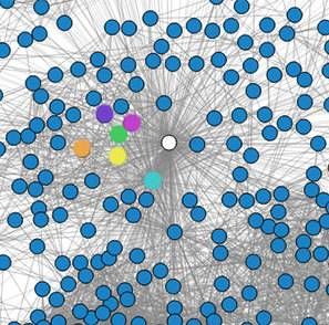
On the graph above, my husband is the sky blue dot, one of my sister’s best friends the green dot, one of my closest current social circle friends the pink dot (who isn’t friends with the green dot, but my sister is friends with both), my cousin the purple dot, a friend from college (who I never see or talk to) the yellow dot, and another current close social circle friend the orange dot.
Which is to say, graphically, that my Facebook friend clusters are not representative of my adult social circle.
Does this mean that we’re using Facebook less as we get older? That Facebook becomes less and less relevant until you have kids, and then once you do, it becomes important again (this is my suspicion)? Or maybe that I just don’t really like or keep up with Facebook much (this is also true)?
Whatever it is, the data really is fascinating, and I highly encourage you to read the book and then put your own relationships to the test. [EDIT: The link has been updated to the correct page]
No matter what your results might be, you can be certain of one thing: I’ll be running this on my husband’s computer and I’d BETTER be at the top of his assimilation score list.
____________________
Expand your literary horizons with New Books!, a weekly newsletter spotlighting 3-5 exciting new releases, hand-picked by our very own Liberty Hardy. Sign up now!


