We (Finally) Got a New Goodreads App and It’s Gorgeous
In some ways, Goodreads is the model of what a wholesome social media network should be. People talk about one thing: books. We gush about our favorites, criticize our disappointments, and keep up on what our friends are reading. We track our reading progress for the year (73 so far, baby!), we organize our shelves meticulously by genre, and stress over which rating we should give the latest Stephen King. Four stars? Three?
But the one thing Goodreads has always lacked is a good design. The website has improved somewhat since its inception. I didn’t even use it for years because it looked like a website from 2004. Now, the desktop site isn’t too bad (though it could do with some improved graphics here and there). But the Goodreads app is clunky, hard to navigate, and prone to crashing. I rarely use it, preferring the cleaner interface of the website.
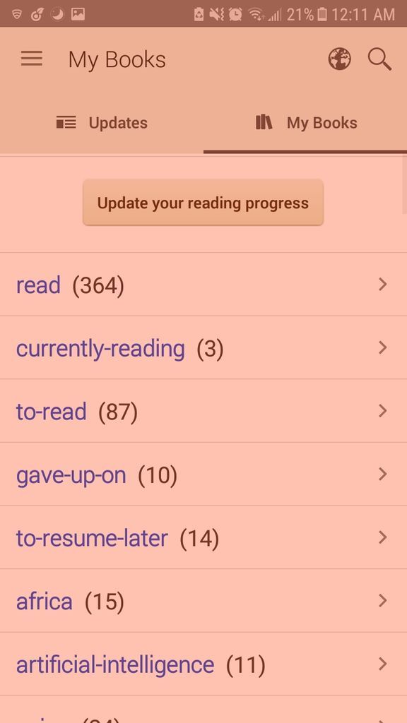
The old goodreads app shown here. Gross. (This screenshot is tinted red because of an app to remove blue light at nighttime).
Until now.
On June 25th, 2018, Goodreads made a blog post announcing that they would be updating their Android app. Readers everywhere rejoiced! (If they had an Android, that is). Finally, the mobile experience would be aesthetically pleasing. And they delivered.
Here are some screenshots from the new Goodreads app.
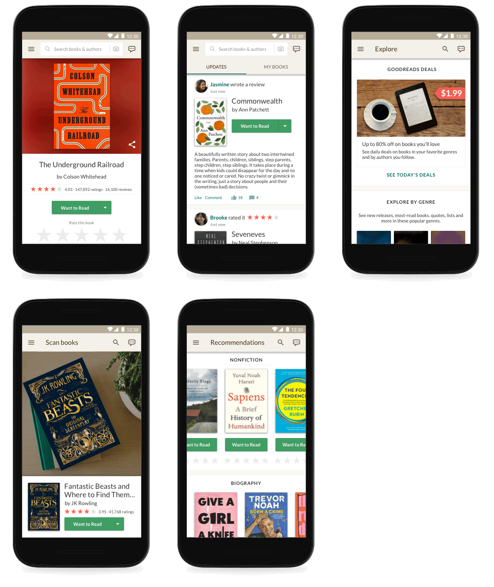
new UI/UX, updated graphics, easier format, oh my!
The original app was clunky and slow to load. The new app, I can attest, loads information and book covers quickly and with ease. It’s fun to update your progress and add new books with this design.
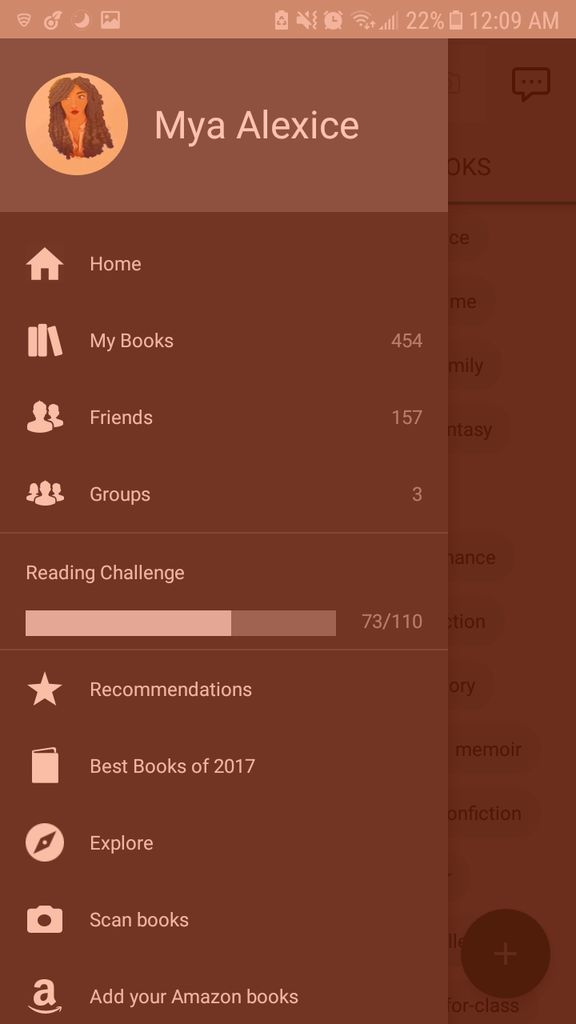
(screenshot tinted red because of blue-light-remover app on my phone.)
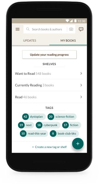
In addition, there is now an “explore” page, where you can “browse books trending on Goodreads, new releases hot off the presses, and community-created reading lists across every genre”. My favorite new addition? The Goodreads deals that save me time and time again from spending lots of cash on new reading material—they’re on the app now, too.
In addition, your shelves (besides the exclusive shelves like “to-read”) are now “tags” and work as a sorting mechanism for all your books. Most Goodreads users I know use shelves in this manner anyway, so this is an added bonus.
Overall, I’m overjoyed with this new update. It feels clean, modern, and makes me want to update books on the go again. Now, almighty Amazon…maybe it’s time to give the site a makeover, too?
what are your thoughts on the new goodreads app?
Let us know, and find Book Riot on Goodreads!


