


Exploring the First Cover of THE HOBBIT
So I’ve been participating in the #RiotGrams Bookstagram challenge, and ran into a bit of a snag the other day for the favorite cover prompt. My actual favorite cover of The Hobbit is the first edition of The Hobbit, but since I don’t own it, I had to photograph something else. (As it turns out, I posted a different edition of The Hobbit that I do own, so it wasn’t a big leap.) I was inspired by the #RiotGrams prompt to look further into this cover art, and was excited to discover its interesting evolution.
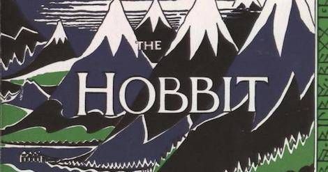
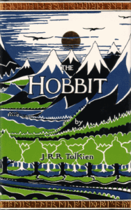
The Hobbit was originally published in 1937 by George Allen & Unwin. This original dust jacket, featuring a stylized mountain landscape with simple coloring, is Tolkien’s original artwork.
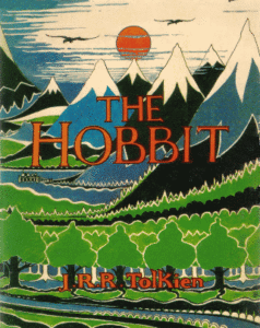
The original art continued to be used, unchanged, through multiple editions, until 1975, when the sun and text were colored in with red.
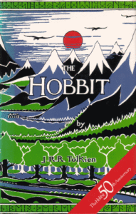
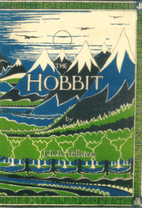
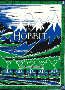
In 1987, for the book’s fiftieth anniversary, the text on the cover was returned to its original coloration, while the sun remained red. According to the Tolkien Library, the sun (as well as the flying dragon on the back side of the jacket) was originally intended by Tolkien to be painted red, though budget restraints did not allow for it in the first printing.
In 1991, one of the first printings done by HarperCollins (the current UK publisher of The Hobbit) featured the sun and rune borders in a gilt finish.
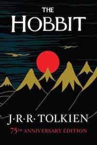
More recently, in 2012, Houghton Mifflin Harcourt (the book’s US publisher) released a 75th Anniversary Edition that pays homage to the original cover art, but with golden mountains and a red sun on a black base.
And, finally, in celebration of the book’s 80th anniversary this year, HarperCollins has released a Facsimile First Edition in the UK and Australia, which not only replicates the original 1937 artwork, but the original text (the version we are most familiar with was a re-edit that Tolkien did in order to better connect the story to The Lord of the Rings) as well.
While my focus has been this particular cover and its multiple iterations over the years, there are, of course, so many more covers used for The Hobbit. If there’s a specific edition with a cover you love and want to recognize, let us know in the comments!
*Cover scans for 1937-1991 editions from TolkienBooks.net