Movie Tie-In Covers Are Great (And So Can You!)
Over on Twitter, BookRiot Head Honcho, Raconteur, and Gadfly Jeff O’Neal said, and I quote, “Nothing brings out the lit snobs like movie tie-in editions.” I stopped to acknowledge the truth of that statement, but then I glanced at my shelves and realized I’ve got oodles of tie-in editions. You know the ones. A book is coming out as a movie, so they’ve done up the cover with pictures of actors and re-released it.
Maybe this’ll bring out the lit-snobs too, but I’d like to admit here and now that I really like movie tie-in editions. I seek them out, sometimes (What I hate, though, are where the normal book has a big splashy sticker-looking thing printed on it with the words NOW A HIT MOTION PICTURE!!! because seriously, that looks utterly stupid.).
Anyway, I thought I’d share some of my favorites with you.
The Road, by Cormac McCarthy
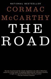
The regular cover of The Road, a staggeringly bleak post-apocalyptic novel by Cormac McCarthy, was about as spare and simple as you could get. It’s just a black cover with some text on it. Like so:
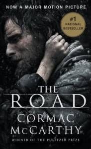
Nothing at all wrong with it, but nothing all that exciting either. Now here’s the movie tie-in edition that I actively went and sought out.
I adore this one. It conveys bleakness with incredible power and simplicity, the look on Viggo Mortenson’s face is perfect, and that little arm around his neck…there’s everything you need to know about the book, on display right in that image, and it makes it very happy. (Well. Crushingly sad. But you know what I mean.)
A Game of Thrones by George R.R. Martin
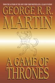
This is a really recent read for me. I haven’t seen the show yet, but I feel left out so I’m slowly getting into the book itself. I recently bought the tie-in edition they released, having never ever been tempted by the regular edition. Why not? Because it looks like this:
I mean, come on. A gradient, what could be clip-art, some text. It’s just not much. Maybe I’m being unkind, but I really disliked it…and the future books in the series look very similar, but with different color gradients. I feel like if I assemble them all together, I can summon Captain Planet. (Editor’s Note: BookRiot takes no responsibility for the opinions of its authors and if you are going to shotgun someone’s mailbox, make it his and not ours, okay?)
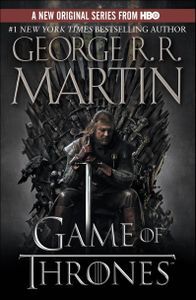
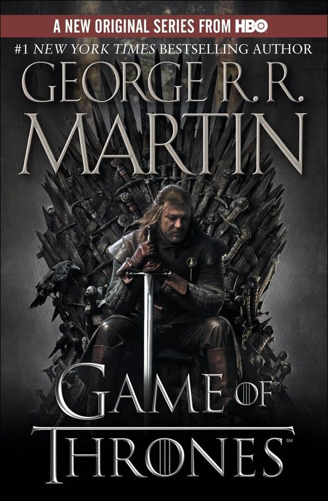
Here’s the tie-in edition to the HBO series, which is what I now own.
I think this is fantastic, and I thought so even before I’d read the book. Without knowing anything about it, I love the posture of Sean Bean on the cover there, the way he’s leaning on his sword, the haunted look on his face. I love that throne, made of swords. It’s just so properly cool.
Let The Right One In, by John Ajvide Lindqvist
I’ve talked about this book and movie plenty of times before. The Swedish film is possibly my favorite vampire story, full-stop. And that says something, because I’m not that fond of vampire stories on the whole, so my love of this one is pretty surprising, even to me.
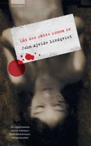
When originally published in Sweden, this was the cover (or so I think: I invite you to search for books in Swedish sometime, buddy)
Now, it’s not a bad cover at all, although it doesn’t look to me a whole lot like the book it covers. Anyway, it was eventually made into a superb Swedish film and a (in my opinion) extremely mediocre American film, which changed the name to Let Me In.
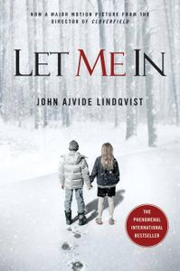
There was a wealth of movie-themed covers that then came out in association with both movies, and a lot of them are really terrific (google it! Seriously!) but here’s the one that I sought out and bought:
I love it. I think it conveys so much about this subtle, slow-crawl horror novel, namely that there is not only a horrific element to the book, but this real friendship between the two main characters, one a very old and lonely vampire and one a very young, very angry lonely boy. I love the little details of the cover too, like the single set of footprints. I love the simple color scheme. It’s very sharp.
I go one further with this one, too. I really didn’t care for the American film Let Me In, which I thought spent all of its time just trying to imitate the Swedish film shot-by-shot (but without ever going anywhere with them), but I do think it improved on the title. I much prefer Let Me In over Let the Right One In. It’s more forceful, it’s got more emotion and power behind it. This time, I not only picked my preferred cover, but I picked my preferred title as well.
I’m not picky. You’re picky.
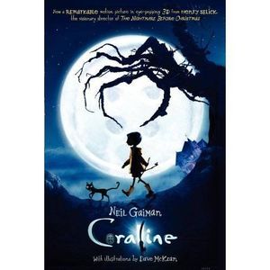
Anyway, that’s a few of mine. As an ending, parting shot, here’s a movie tie-in cover that I don’t own, but that I really wish I did. It’s for Coraline, done by Henry Selick and LAIKA House, which are like gods on earth. Here’s the tie-in cover:
Book cover love should transcend snobbery. If you dig it, who cares if it’s a movie tie-in or whatever? Just buy cool looking books and don’t worry about anything else.
That’s it. Peace out, cub scout.


