By the Cover: Meet Kirk Benshoff, Graphic Designer & Art Director for Orbit Books, Yen Press, Redhook, & More
There’s a lot that goes into the production of the books you love, you know, in addition to all the writing. Publicity, sales, editorial, production… there are so many parts that come together to make a book happen and get it into your favorite local bookstore. And there’s one in particular we notice quite often, but never really dig deep into.
The cover.
Just who is it that makes our books look so lovely? Can you tell when a book is designed by a particular designer or illustrator? You’d be surprised. Welcome to By the Cover, where we spotlight some of the artists that make your books look so gorgeous.
Kirk Benshoff is a Brooklyn based graphic designer/art director who originally intended to live in New York for only a year. Almost 20 years later, he’s completely addicted to the culture he can’t get anywhere else.
In addition to working full time at Orbit Books and Yen Press, Yen On, and Redhook, Kirk collaborates with a wide range of writers and artists.
How did you get your start, working in publishing and designing books?
When I graduated from Rochester Institute of Technology, I didn’t really know where I wanted to focus my career. I ended up taking jobs that purely interested me and felt would be fun doing.
One of my first jobs was redesigning a trade magazine on optometry from cover to cover, which allowed me to work with amazing talent like Keith Kasnot. I followed my interest and opportunities working for a range of places like Knitting Factory Nightclub/KnitMedia, Fun For All Toys, NFL, and Nickelodeon, on everything from Print to Web to Branding. My criteria was to leave any job, the new one had to be more enjoyable and a bigger challenge than what I was doing.
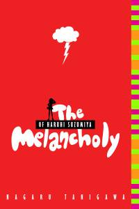
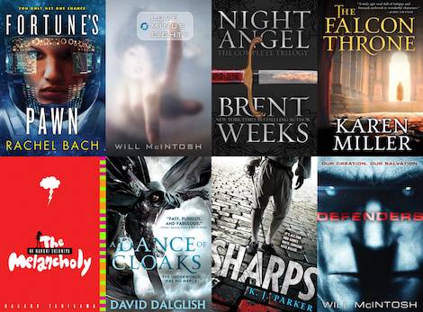
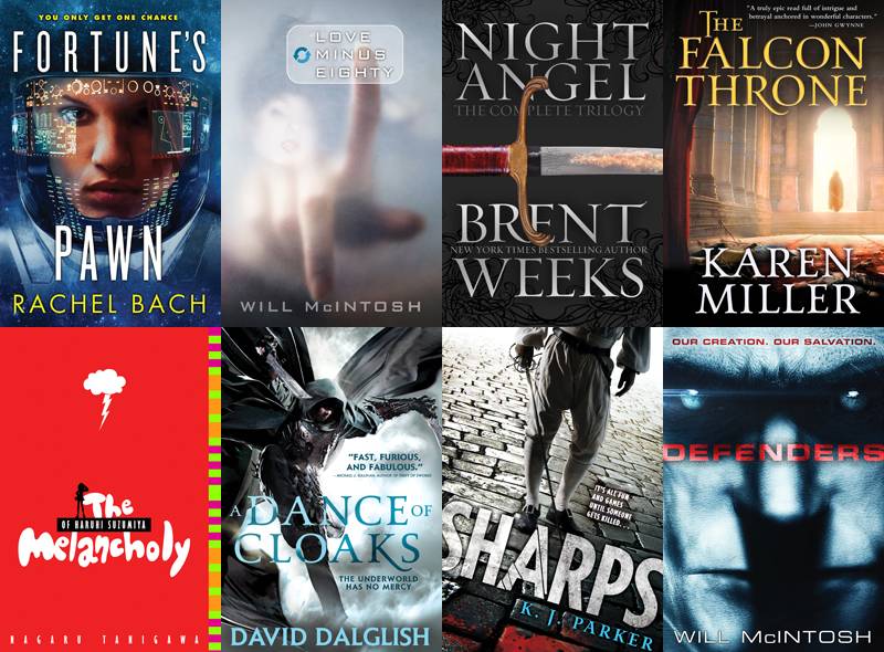
It so happened that I had been working in the children’s marketplace for a few years and an opportunity opened up at Little, Brown Books for Young Readers. I moved over to book publishing and have had the honor of designing some fantastic titles: Pseudonemus Bosch’s The Name of this Book is Secret, Sherman Alexie’s The Absolutely True Diary of a Part Time Indian, Nagaru Tanigawa’s The Melancholy of Haruhi Suzumia, and more.
At that time, Yen Press was developed and I was able to work on their books. Yen Press and Orbit Books eventually joined forces and I’ve been designing manga, comics, Sci Fi, and Fantasy ever since.
Do you have a favorite project in particular? What about it made it so special?
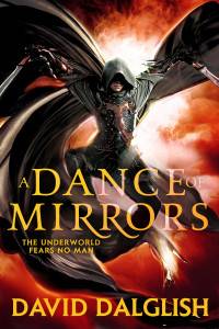
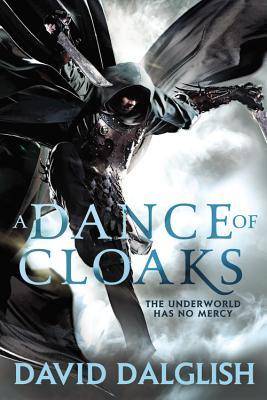 That’s a tough one. So many things make a project fun in their own way… but one in particular I reall
y loved was David Dalglish’s Shadow Dance series. When I first heard about this series, the first thing that popped into my head was getting images like in Crouching Tiger Hidden Dragon. Ultimately, this allowed me to hire a martial artist in a stunt studio with a photographer.
This became my all intensive obsession for a while because I needed to sort out all of the details: costumes, weapons, stylist, photographer, photo illustrator, studio, etc. I was super excited because we ended up documenting the whole thing in a blog series (which you should check out if you haven’t) about what goes into making a cover.
This project had so many pieces in the air that when it all came together everyone involved had so much fun at the shoot seeing the images/photographs materialize. We all felt like we were kids again watching Bryce Bermingham do crazy stunts off a trampoline with weapons in his hands. Can’t beat it.
Does it matter if you don’t fall in love with the book?
No, because I’ll always fall in love with the cover. If I love a book, that’s an added bonus. The cover is ultimately the first wave of attack in marketing, so if the cover doesn’t look rad, no-one is going to pick the thing up to read the cover copy. I need to be emotionally invested in my own work, because if I’m not, I’m not doing my job.
How many mock-ups and comps do you generally whip up, before leading up to your final?
That can range. There is a lot of details that go into concepting a cover: What are comp titles in the marketplace, how do we want to position the book in the marketplace, what vision does the author have, what can we effectively illustrate on the cover, do we want illustration vs photography, etc.
I can do a cover option and the entire room can say “That’s it!” and we’re done. Conversely, I can do rounds and rounds and only after seeing something mocked up do we all feel a direction isn’t working, and it’s back to the drawing board.
What’s the process like going from designing a hardcover to working on a paperback or mass market of that same book?
Hardcovers have a different look and feel than trade paperbacks which differ from mass markets. What format is being published initially and what other editions are going to be in the future are decided on by the editors and publisher.
For example, in the summer folks may be likely to purchase a trade paperback than a hardcover since they’ll be taking the book on vacation with them. Or, if the comp titles are all hardcover, we would release in that format to compete. There’s a whole psychology behind it that makes the decision, and I need to design for that format.
When changing formats, first and foremost you need to design for that format. Hardcovers will tend to be a bit more gifty while trades give you a chance to really play up the marketing successes of the book (larger bylines, more quotes, etc). In most cases I take what was created in one format and tweak it for the new format. In some cases, a format change gives us an opportunity to revise the design altogether should we feel it’s necessary.
Any advice for aspiring book designers?
Have fun and design! The best work comes from when a designer is having fun. Once you get some projects, share your work with other people and engage in conversation. Use Reddit, Behance, etc. to get your work out there. Remember, not everyone is going to love everything you do, and it’s good to learn how to deal with negative comments. Collaborate with people as much as you can. Any project you do where you have to work with others is a real world project, and those experiences lead to new projects.
If you can do all of this, you can get yourself on a path designing covers for projects you want to be doing!
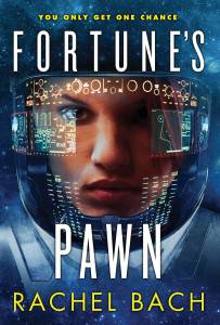
And finally, can you show us some of your favorite projects? We’ll share them below.


