


Strange the Dreamer Cover Roundup
This content contains affiliate links. When you buy through these links, we may earn an affiliate commission.
With the release of Muse of Nightmares, the sequel to Strange the Dreamer, just days away, I thought it was the perfect time to look back at some of the many gorgeous editions of Strange from around the world. The first book in Laini Taylor’s YA fantasy duology has some of the most gorgeous cover designs I’ve seen, but you may not be familiar with the editions found in other countries. It’s time for a Strange the Dreamer cover roundup!
 Keep in mind that many editions used the same cover art seen in the U.S. or UK hardcovers, so I’m not going to list repeats of those here.
 There’s a lot of great symbolism on this cover—the dichotomy between earth and sky, mortals and gods. Not to mention the gold leaf, which is absolutely gorgeous. It’s a little unusual, which I like—not your traditional YA fantasy book cover.
 I love the intricate simplicity of the UK hardback. The main focus is on the moth, but all that filigree work on its wings and body make for a much more interesting image. This is definitely the kind of cover I’d want to show off on my bookshelf.
Another relatively simple design. This one strikes me as targeting a more adult audience than the first two covers from the U.S. and UK hardback editions.
I love the intricate simplicity of the UK hardback. The main focus is on the moth, but all that filigree work on its wings and body make for a much more interesting image. This is definitely the kind of cover I’d want to show off on my bookshelf.
Another relatively simple design. This one strikes me as targeting a more adult audience than the first two covers from the U.S. and UK hardback editions.
 Drawing on the artwork and imagery from the UK hardback, but the reflection of the moths makes for a nice effect and a very different look.
 Continuing the moth imagery as well as that gorgeous, deep blue color, but this one has a slightly more whimsical feel. The font seems reminiscent of the circus—in a good way—and I almost feel like this could be the poster for a new Cirque du Soleil show that I would definitely want to see.
 The Turkish edition looks quite different from any of the others. Though there’s some gold in the U.S. edition, this is the most colorful cover so far. The bright honey-yellow color with the green and blue accents is very eye catching. And this cover introduces an element we haven’t seen in any of the others—skulls. Simultaneously more colorful and more ominous than any of the other covers—which I kind of love.
I don’t know what exactly it is about this one, but it feels like a very classic YA cover. And I’ve got a bit of a complaint with that moth which looks much more like a butterfly than anything else.
Another pretty big departure in terms of design, but I think it’s working really well. I like the partial view of the moth and the way the text is incorporated into its wing. I also like the die cut feel of the black printed on top of the teal background. Lovely, but uncluttered.
So, what do you think? Which edition is best? I’m partial to the UK hardback, myself, but they’re really all pretty stunning. It’s hard to go wrong. Which is your favorite? Let us know in the comments!
And if you want to continue gushing over Strange the Dreamer while you’re waiting for the release of Muse of Nightmares, check out this great interview with Laini Taylor or peruse these other cover roundups featuring the many magical editions of Harry Potter, 40 great Frankenstein book covers, and these Hunger Games covers from around the world.
The Turkish edition looks quite different from any of the others. Though there’s some gold in the U.S. edition, this is the most colorful cover so far. The bright honey-yellow color with the green and blue accents is very eye catching. And this cover introduces an element we haven’t seen in any of the others—skulls. Simultaneously more colorful and more ominous than any of the other covers—which I kind of love.
I don’t know what exactly it is about this one, but it feels like a very classic YA cover. And I’ve got a bit of a complaint with that moth which looks much more like a butterfly than anything else.
Another pretty big departure in terms of design, but I think it’s working really well. I like the partial view of the moth and the way the text is incorporated into its wing. I also like the die cut feel of the black printed on top of the teal background. Lovely, but uncluttered.
So, what do you think? Which edition is best? I’m partial to the UK hardback, myself, but they’re really all pretty stunning. It’s hard to go wrong. Which is your favorite? Let us know in the comments!
And if you want to continue gushing over Strange the Dreamer while you’re waiting for the release of Muse of Nightmares, check out this great interview with Laini Taylor or peruse these other cover roundups featuring the many magical editions of Harry Potter, 40 great Frankenstein book covers, and these Hunger Games covers from around the world.
 Keep in mind that many editions used the same cover art seen in the U.S. or UK hardcovers, so I’m not going to list repeats of those here.
U.S. Hardcover Edition
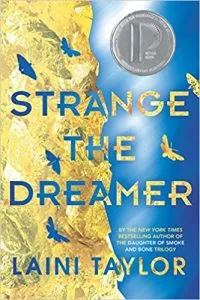 There’s a lot of great symbolism on this cover—the dichotomy between earth and sky, mortals and gods. Not to mention the gold leaf, which is absolutely gorgeous. It’s a little unusual, which I like—not your traditional YA fantasy book cover.
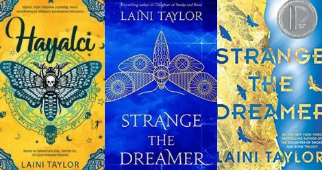
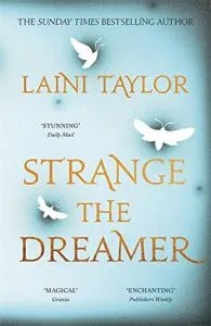
UK Hardcover Edition
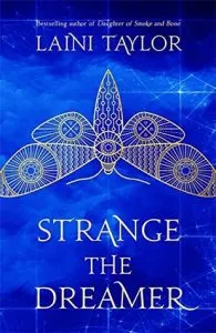 I love the intricate simplicity of the UK hardback. The main focus is on the moth, but all that filigree work on its wings and body make for a much more interesting image. This is definitely the kind of cover I’d want to show off on my bookshelf.
UK Paperback Edition
 Another relatively simple design. This one strikes me as targeting a more adult audience than the first two covers from the U.S. and UK hardback editions.
Italian Edition
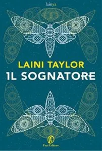 Drawing on the artwork and imagery from the UK hardback, but the reflection of the moths makes for a nice effect and a very different look.
Polish Edition
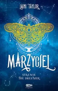 Continuing the moth imagery as well as that gorgeous, deep blue color, but this one has a slightly more whimsical feel. The font seems reminiscent of the circus—in a good way—and I almost feel like this could be the poster for a new Cirque du Soleil show that I would definitely want to see.
Turkish Edition
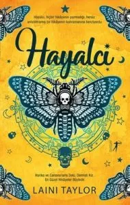 The Turkish edition looks quite different from any of the others. Though there’s some gold in the U.S. edition, this is the most colorful cover so far. The bright honey-yellow color with the green and blue accents is very eye catching. And this cover introduces an element we haven’t seen in any of the others—skulls. Simultaneously more colorful and more ominous than any of the other covers—which I kind of love.
Hungarian Edition
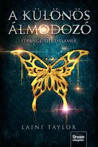 I don’t know what exactly it is about this one, but it feels like a very classic YA cover. And I’ve got a bit of a complaint with that moth which looks much more like a butterfly than anything else.
Norwegian Edition
 Another pretty big departure in terms of design, but I think it’s working really well. I like the partial view of the moth and the way the text is incorporated into its wing. I also like the die cut feel of the black printed on top of the teal background. Lovely, but uncluttered.
So, what do you think? Which edition is best? I’m partial to the UK hardback, myself, but they’re really all pretty stunning. It’s hard to go wrong. Which is your favorite? Let us know in the comments!
And if you want to continue gushing over Strange the Dreamer while you’re waiting for the release of Muse of Nightmares, check out this great interview with Laini Taylor or peruse these other cover roundups featuring the many magical editions of Harry Potter, 40 great Frankenstein book covers, and these Hunger Games covers from around the world.
Another pretty big departure in terms of design, but I think it’s working really well. I like the partial view of the moth and the way the text is incorporated into its wing. I also like the die cut feel of the black printed on top of the teal background. Lovely, but uncluttered.
So, what do you think? Which edition is best? I’m partial to the UK hardback, myself, but they’re really all pretty stunning. It’s hard to go wrong. Which is your favorite? Let us know in the comments!
And if you want to continue gushing over Strange the Dreamer while you’re waiting for the release of Muse of Nightmares, check out this great interview with Laini Taylor or peruse these other cover roundups featuring the many magical editions of Harry Potter, 40 great Frankenstein book covers, and these Hunger Games covers from around the world.


