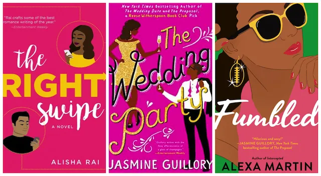
Trending: Illustrated Romance Covers, Romcoms
This content contains affiliate links. When you buy through these links, we may earn an affiliate commission.
This is a conversation I had recently, heavily paraphrased:
Person: Uh, I picked up this chick lit book and it’s real porny all of a sudden WHAT AM I READING.
Me: Weird, what book?
Her: The Kiss Quotient?
Me: **laughs for ten minutes, picks myself up off the floor** Okay, so…that is not chick lit. That is a romance novel, with a fairly high level of steam.
Her: Oh. WHEW. Wow, the cover really confused me. I like “steamy” as a description!
 After a heyday in the mid-aughts, chick lit has, as a genre, mostly stopped being a thing people talk about, along with new adult as a category outside of romance; I believe the two disappeared together because they largely existed together. That’s not to say that they’re entirely gone, but we mostly don’t use those words to describe them.
There is a new(ish) trend in romance novels: trade paperbacks with illustrated covers. I love them. They are beautiful and my favorite size/format for reading. BUT. They look like the chick lit novels of 10–15 years ago, and readers like the one I had that conversation with are confused. She didn’t have a problem with steamy romance—but she didn’t know that’s what she was getting into until suddenly there was explicit sex. This is…maybe not great?
Romance as a genre is derided from what seems like all sides, all the time. It’s dirty. It’s cliché. It’s whatever. It’s no coincidence that it’s also the most heavily female genre. It’s also historically been the one genre expected to show exactly what to expect on its covers. Clinches. Abs (or no abs). You name it, but always pretty darn steamy.
This move toward illustrated covers is, arguably, a move away from an entire genre that is depicted in a specific way and a move toward covers that more widely reflect the diversity and quality of the books. (Although I have a problem with anyone who didn’t think romance novels were diverse and high quality before. Unless you take issue with the whiteness of the genre in traditional publishing, in which case us too.) So, are confused readers part of natural growing pains as the transition happens, or is it a major problem? Or both?!
I don’t have the answer, but I do have a lot of illustrated covers for you, and some more questions.
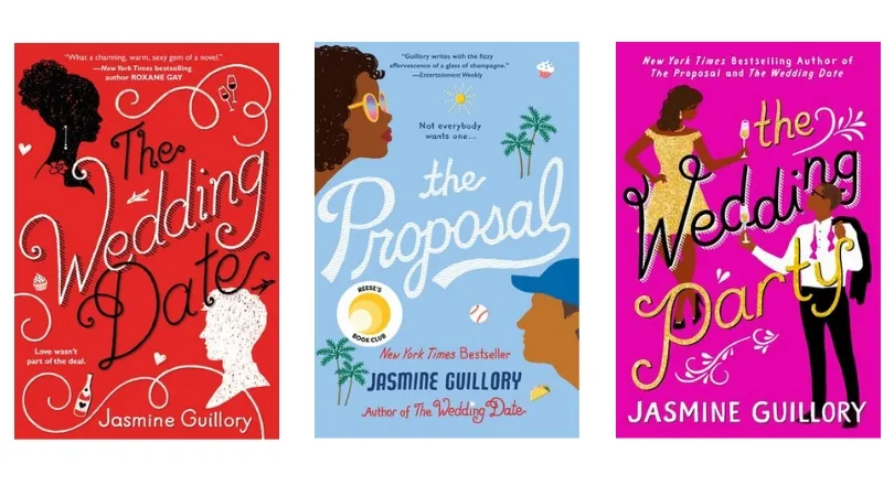
 Jasmine Guillory’s books, all from Berkley (who also published The Kiss Quotient), have gorgeous illustrated covers that suggest the contents of the books without a clue about the heat level. (Again, I am not saying that covers should or should not convey that information—just whether they do, in my extremely professional opinion as a person who has read them.) For the record, The Wedding Date is explicit and very steamy, The Proposal is all fade-to-black, and The Wedding Party is steamy but not as steamy as The Wedding Date. (There is a forthcoming fourth book in the series, Royal Holiday, which I have read but cannot remember how explicit the sex is.)
Here’s a big question that’s been on my mind: were illustrated covers first brought in to sell books by women of color and then expanded to white authors when they were successful, or am I seeing a trend that isn’t there? As far as I can tell, the answer is…both?
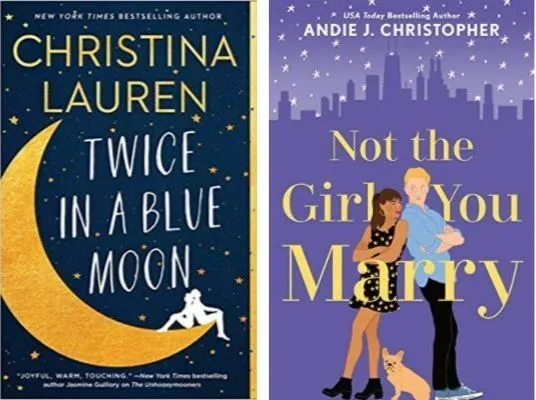
 Christina Lauren is the pen name for two white women who write together, and all of their books, both YA and romance, have illustrated covers, though many are more like traditional romance covers. Lauren’s forthcoming Twice in a Blue Moon has an illustrated cover, as does Andie J. Christopher’s forthcoming Not the Girl You Marry (excerpt here), the former coming from Simon and Schuster and the latter from Berkley. Christopher is a woman of color whose previous book covers featured models and beautiful landscapes. Not The Girl You Marry is a gender-flipped retelling of 10 Things I Hate About You, which of course is a retelling of The Taming of The Shrew.
Many other examples I have found so far of romance novels with illustrated covers are by women of color. I am not saying that necessarily means anything—most of them are from a single publisher, too, and nearly all of Berkley’s new releases, romance and not, have illustrated covers. But again, it’s interesting.
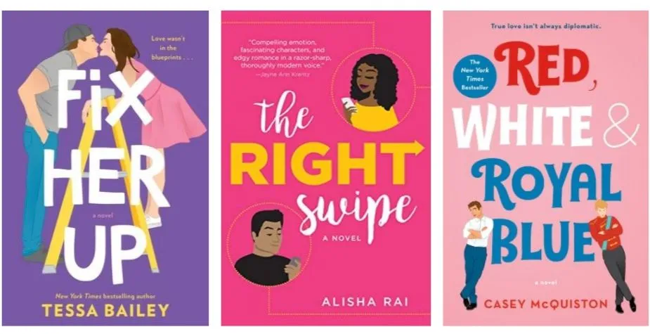
 An exception to this rule—if it is a rule!—is Tessa Bailey’s Fix Her Up, from Avon. (I am fairly sure Bailey is white, but have not confirmed it.) Fix Her Up has some of the most explicit sex I have ever read on the page, but you’d never know it to look at the cover.
Avon is also publishing Alisha Rai’s new series, beginning with The Right Swipe, which features illustrated covers that are a huge departure from her last series, which had extremely steamy covers featuring models of color. (I have not yet read The Right Swipe, so am uncertain whether it is explicit, but her previous series was.)
Red, White & Royal Blue by Casey McQuiston, from St. Martin’s Griffin, an imprint at MacMillan, is another example that’s worth examining…and unlike many books mentioned herein, it is not being mistaken for chick lit but for young adult…awkward since it contains explicit sex. (I believe McQuiston is white.)
Could this trend be related to the rising resurgence of the romantic comedy? Romance readers know romcoms never went away, but now they’re back in the mainstream and gaining popularity at the movies, especially on Netflix—last year’s adaptation of To All The Boys I’ve Loved Before and this year’s Isn’t It Romantic (about which I have no comment) are being followed in quick succession by Netflix original Always Be My Maybe and upcoming theatrical release Last Christmas.
Most chick lit had a romantic element similar to a romcom, but usually with the romance as a subplot rather than the primary story. Could romance publishers be trying to find that audience with their illustrated covers?
As I said—I have no answers, only more questions (and a very sexy TBR).
 After a heyday in the mid-aughts, chick lit has, as a genre, mostly stopped being a thing people talk about, along with new adult as a category outside of romance; I believe the two disappeared together because they largely existed together. That’s not to say that they’re entirely gone, but we mostly don’t use those words to describe them.
There is a new(ish) trend in romance novels: trade paperbacks with illustrated covers. I love them. They are beautiful and my favorite size/format for reading. BUT. They look like the chick lit novels of 10–15 years ago, and readers like the one I had that conversation with are confused. She didn’t have a problem with steamy romance—but she didn’t know that’s what she was getting into until suddenly there was explicit sex. This is…maybe not great?
Romance as a genre is derided from what seems like all sides, all the time. It’s dirty. It’s cliché. It’s whatever. It’s no coincidence that it’s also the most heavily female genre. It’s also historically been the one genre expected to show exactly what to expect on its covers. Clinches. Abs (or no abs). You name it, but always pretty darn steamy.
This move toward illustrated covers is, arguably, a move away from an entire genre that is depicted in a specific way and a move toward covers that more widely reflect the diversity and quality of the books. (Although I have a problem with anyone who didn’t think romance novels were diverse and high quality before. Unless you take issue with the whiteness of the genre in traditional publishing, in which case us too.) So, are confused readers part of natural growing pains as the transition happens, or is it a major problem? Or both?!
I don’t have the answer, but I do have a lot of illustrated covers for you, and some more questions.
 Jasmine Guillory’s books, all from Berkley (who also published The Kiss Quotient), have gorgeous illustrated covers that suggest the contents of the books without a clue about the heat level. (Again, I am not saying that covers should or should not convey that information—just whether they do, in my extremely professional opinion as a person who has read them.) For the record, The Wedding Date is explicit and very steamy, The Proposal is all fade-to-black, and The Wedding Party is steamy but not as steamy as The Wedding Date. (There is a forthcoming fourth book in the series, Royal Holiday, which I have read but cannot remember how explicit the sex is.)
Here’s a big question that’s been on my mind: were illustrated covers first brought in to sell books by women of color and then expanded to white authors when they were successful, or am I seeing a trend that isn’t there? As far as I can tell, the answer is…both?
 Christina Lauren is the pen name for two white women who write together, and all of their books, both YA and romance, have illustrated covers, though many are more like traditional romance covers. Lauren’s forthcoming Twice in a Blue Moon has an illustrated cover, as does Andie J. Christopher’s forthcoming Not the Girl You Marry (excerpt here), the former coming from Simon and Schuster and the latter from Berkley. Christopher is a woman of color whose previous book covers featured models and beautiful landscapes. Not The Girl You Marry is a gender-flipped retelling of 10 Things I Hate About You, which of course is a retelling of The Taming of The Shrew.
Many other examples I have found so far of romance novels with illustrated covers are by women of color. I am not saying that necessarily means anything—most of them are from a single publisher, too, and nearly all of Berkley’s new releases, romance and not, have illustrated covers. But again, it’s interesting.
 An exception to this rule—if it is a rule!—is Tessa Bailey’s Fix Her Up, from Avon. (I am fairly sure Bailey is white, but have not confirmed it.) Fix Her Up has some of the most explicit sex I have ever read on the page, but you’d never know it to look at the cover.
Avon is also publishing Alisha Rai’s new series, beginning with The Right Swipe, which features illustrated covers that are a huge departure from her last series, which had extremely steamy covers featuring models of color. (I have not yet read The Right Swipe, so am uncertain whether it is explicit, but her previous series was.)
Red, White & Royal Blue by Casey McQuiston, from St. Martin’s Griffin, an imprint at MacMillan, is another example that’s worth examining…and unlike many books mentioned herein, it is not being mistaken for chick lit but for young adult…awkward since it contains explicit sex. (I believe McQuiston is white.)
Could this trend be related to the rising resurgence of the romantic comedy? Romance readers know romcoms never went away, but now they’re back in the mainstream and gaining popularity at the movies, especially on Netflix—last year’s adaptation of To All The Boys I’ve Loved Before and this year’s Isn’t It Romantic (about which I have no comment) are being followed in quick succession by Netflix original Always Be My Maybe and upcoming theatrical release Last Christmas.
Most chick lit had a romantic element similar to a romcom, but usually with the romance as a subplot rather than the primary story. Could romance publishers be trying to find that audience with their illustrated covers?
As I said—I have no answers, only more questions (and a very sexy TBR).


