
The Creepy Covers of IT
So you’ve probably heard that the first trailer for the 2017 remake of It was just released, and lots of us here at Book Riot are going absolutely bonkers because holy crap have you seen that trailer?!?!
So now I’m in full It mode and it got me thinking about all the different editions of It that I’ve read/owned/thought about owning since high school. Turns out there’s a lot of them, and with interest in the movie likely increasing exponentially over the next six months, we’re probably going to see all kinds of new covers making their way onto bookshelves. Let’s take a look at some of the cover changes It has undergone over the years. (I make no apologies for amassing such a large collection of clown illustrations. You have been warned.)
The Common Editions


 (L-R: Hardcover, mass market pbk, Kindle edition)
I think I’ve owned all three of these copies at one point, and we’ve probably all seen them at the bookstore over the years. BTW, that hardcover book weighs as much as a sack of bricks, and yet that was the edition I lugged around with me the most in high school, along with the ten thousand other textbooks I was carrying. I’m not a huge fan of the lizard/chicken claws coming out of the grate, but whatever. Don’t judge a book by its cover, and all that jazz. And let me say that the paperback edition doesn’t necessarily hold up well to multiple readings. I’m pretty sure my copy was held together by packing tape at one point.
The Minimalist Covers


 (L-R: Trade paperback, German translation, mass market paperback, Dutch translation, Kindle)
I’m actually a big fan of these minimalist covers. It is such a rich, complex story, and such a terrifying monster to boot, that you don’t need fancy, detailed covers to catch someone’s attention. I actually paid money to purchase the trade paperback edition shown here, even though I already owned three separate editions at the time, because that is just the most shiver-inducing cover I could possibly imagine. And that’s the copy I plan to reread before the movie comes out, most likely up in the staff room at work so I can creep out my coworkers.
The Detailed Covers


 (L-R: 25th anniversary hardcover edition; Polish translation; Russian translation)
And on the opposite end of the spectrum, we have covers with a lot going on. The first cover listed here is especially detailed because it also includes both black and white and full color illustrations inside, courtesy of Cemetery Dance Publishers who released a limited anniversary edition of this book in 2011. The Polish cover looks like a demented version of Where’s Waldo, and the Russian cover manages to convey both detail and minimalism in a super creepy cover. And they managed to do this without a single clown on there!
The “Are You Sure We’re Reading the Same Book?” Covers


 (L-R: Kindle edition, German translation, paperback, Russian translation, Spanish translation, hardcover)
Okay, cover artists, I’m not sure we read the same books here. The first cover looks like it’s some sort of epic, dark Southern Gothic family drama, the second looks like it should be the cover of Salem’s Lot, the third looks okay at first but the illustration style is kind of hairy and just looks like the Monster Book of Monsters is hiding in the sewer, the fourth looks like Pennywise invaded the Sweet Valley High series, the fifth is a person who may have been pulled from the cover of a Caroline B. Cooney novel, and the sixth looks like it was created while the artist was on LSD.
The Creepy Covers


 (L-R: mass market paperback, Portugese translation, Swedish translation, Spanish translation, Danish translation, Turkish translation, Polish translation, Spanish translation)
Holy hell, people. I have no words.
Have fun sleeping tonight!
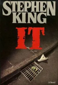

 (L-R: Hardcover, mass market pbk, Kindle edition)
I think I’ve owned all three of these copies at one point, and we’ve probably all seen them at the bookstore over the years. BTW, that hardcover book weighs as much as a sack of bricks, and yet that was the edition I lugged around with me the most in high school, along with the ten thousand other textbooks I was carrying. I’m not a huge fan of the lizard/chicken claws coming out of the grate, but whatever. Don’t judge a book by its cover, and all that jazz. And let me say that the paperback edition doesn’t necessarily hold up well to multiple readings. I’m pretty sure my copy was held together by packing tape at one point.
The Minimalist Covers


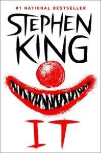 (L-R: Trade paperback, German translation, mass market paperback, Dutch translation, Kindle)
I’m actually a big fan of these minimalist covers. It is such a rich, complex story, and such a terrifying monster to boot, that you don’t need fancy, detailed covers to catch someone’s attention. I actually paid money to purchase the trade paperback edition shown here, even though I already owned three separate editions at the time, because that is just the most shiver-inducing cover I could possibly imagine. And that’s the copy I plan to reread before the movie comes out, most likely up in the staff room at work so I can creep out my coworkers.
The Detailed Covers
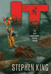

 (L-R: 25th anniversary hardcover edition; Polish translation; Russian translation)
And on the opposite end of the spectrum, we have covers with a lot going on. The first cover listed here is especially detailed because it also includes both black and white and full color illustrations inside, courtesy of Cemetery Dance Publishers who released a limited anniversary edition of this book in 2011. The Polish cover looks like a demented version of Where’s Waldo, and the Russian cover manages to convey both detail and minimalism in a super creepy cover. And they managed to do this without a single clown on there!
The “Are You Sure We’re Reading the Same Book?” Covers





 (L-R: Kindle edition, German translation, paperback, Russian translation, Spanish translation, hardcover)
Okay, cover artists, I’m not sure we read the same books here. The first cover looks like it’s some sort of epic, dark Southern Gothic family drama, the second looks like it should be the cover of Salem’s Lot, the third looks okay at first but the illustration style is kind of hairy and just looks like the Monster Book of Monsters is hiding in the sewer, the fourth looks like Pennywise invaded the Sweet Valley High series, the fifth is a person who may have been pulled from the cover of a Caroline B. Cooney novel, and the sixth looks like it was created while the artist was on LSD.
The Creepy Covers


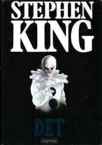




 (L-R: mass market paperback, Portugese translation, Swedish translation, Spanish translation, Danish translation, Turkish translation, Polish translation, Spanish translation)
Holy hell, people. I have no words.
Have fun sleeping tonight!


