What’s Up With the Lettering in Comics?
It’s never the first question I’m asked about comics. That’s usually “Wait, how many versions of Superman are there?” or “But why did they cancel this comic that I only just discovered?” or “Can you explain Hawkman’s whole deal?”*
But eventually my new-to-comics friends, family members, and business associates will ask: “So why is the text in comics Like That?”
The short answer is usually that it’s tradition inherited from when comics were printed on the cheap and intended to be read by young children. The long answer, though…
First of all, the text in comics is referred to as lettering. That’s the words in the speech balloons and thought bubbles, the balloons and bubbles themselves, the narration boxes, the sound effects, and sometimes more. Lettering is also the term for the process of putting words in a comic. The person who does this is referred to as the letterer. So it would be correct to say: “The lettering in this comic is really good. The letterer did a good job lettering it.” (Correct, but not necessarily gripping conversational material.)

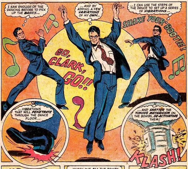
This 1979 Superman comic demonstrates classic comics all-caps lettering, complete with random emphasis…and also his ability to defuse a bomb by dancing??? The letterer is most likely responsible not just for the text in Clark’s thought bubbles, but “GO, CLARK, GO!!!” “KLASH!” and my personal favorite, “SHAKE YOUR BOOTIE!”
Sometimes the person who drew the comic also letters it. This is more common in indies and especially comic strips; big joints like Marvel and DC almost always have different people do the drawing, inking, coloring, and lettering, just because of the sheer volume of comics they put out.
Lettering can be done by hand or digitally. Some artists marry the two by making a font of their handwriting. There’s some baggage about the various methods within the industry, but you don’t need to worry about that—although you should read this very cool piece by Gene Luen Yang about the pros and cons of each method.
Okay, okay, but that’s not answering your question, which is probably more along the lines of: Why is it in all caps? And why do older comics have random words bolded and italicized, especially the names of characters? It feels like the comic is shouting at me!
Well, a few reasons. Comic books inherited the all caps thing from their predecessor, the newspaper comic strip. Newspaper comics were much bigger than they are today, but also much more dense. They were printed cheaply—you don’t get much more disposable than newsprint intended to be thrown out by the end of the day, after all—and though obviously they were intended for a literate audience, the levels of literacy, English language fluency, and age of the reader varied. (Imagine a little kid picking up the funnies when Dad is done with the paper, for example.) The art might get chopped up or shrunk down. The text needed to retain its legibility even if the art got resized, smudged, crumpled, and handed to a 7-year-old, and all caps were much more up to the challenge than sentence case.
Most importantly, though, there was the Ames Guide. Invented in 1917, this was a small tool that enabled artists to quickly create even, consistent guidelines that kept their text level and all the same size. (Not the easiest thing to do, as anyone who’s ever written on a chalkboard or whiteboard can attest to!) Lowercase letters require five guidelines: the top of the letter (say, the highest part of a b or h), the middle (the top of an a), the bottom, any bits that dangle below the line (such as on a j or a y), and the spacing between the lines of text. Capital letters, being a uniform height, only require three guidelines: top, bottom, and spacing.
When you’re working on a deadline, drawing three guidelines instead of five makes a big difference, especially when you consider all the other factors laid out above re: legibility. Thus, all caps became the standard for comic strips…and when comic strips begat their rowdy child, the comic book, in the 1930s, the all caps tradition was inherited. Here is an article on the Ames Guide that goes into a bit more depth, and here is a nifty video on how to use one (people still totally do!).
But why the random bolding and italicizing of words? Well, looking at a lot of all caps text becomes tiring on the eyes. Emphasizing words in a big flashy way not only helps remind readers that they’re reading a book about Superman or Captain America, it breaks up the text inside a speech bubble in an aesthetically pleasing way that gives the eye a break.
Of course, now that lettering can be done digitally, some of these trends are falling by the wayside. But comics are so slow to change that you’ve probably seen all caps lettering and even seemingly random emphasis at least a few times, even if you’re a relatively new reader.

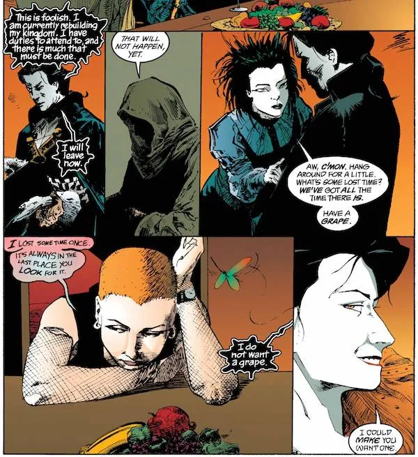
Sandman (which started in 1989) was one of the trendsetters in eschewing the classic lettering style for a more eclectic mix, including sentence case fonts. Note that all five of these characters speak in a different typeface.
All that is mostly trivia, though. The most important thing I’d like you to take away from this is that lettering is art, just as much as penciling, inking, or coloring—especially since letterers usually create not just the ordinary text of a comic, but all those BAM!s and POW!s and KERSPLONK!s bursting over the page. And often, the better the artist, the less you notice their work, because their job is to marry the text to the image in a way that makes you forget they were ever two separate things.
So the next time you’re reading a comic, especially one with a lot of text or many characters speaking at once or fancy Asgardians talking in an elaborate script font, take a moment to notice the letterer’s work. They’re just as indispensable a part of the team as anyone else.
Finally, here’s some fun lettering terms to impress your friends with at cocktail parties:
Kerning refers to adjusting the spacing between specific pairs of letters so that they don’t end up looking wonky, and is the reason you can enjoy a Hawkeye comic without reading CLINT as something very different. (This XKCD strip shows another way kerning can go wrong.)
Leading is the space between rows and can mean the difference between a speech bubble that is cramped, bizarrely roomy, or Goldilocks-style, just right.
A grawlix is when a character yells “&#$@#$!” instead of a curse. This term was coined by Mort Walker, the creator of Beetle Bailey, because of course it was.
Got any other burning questions about lettering, or any other ingredient in the comics sausage? Let us know on social!
*Answers:
1) One, then two, then one again, then three, now back to one; alternately, 52; alternately, a billion.
2) Because both Marvel and DC think that it’s still 1993 and have no idea what their potential markets and ideal sales models actually look like.
3) No.


