Fantasy Book Covers Intimidate Me—Here’s Why
I consider myself a casual fan of speculative fiction. Twilight came out when I was 13 and, by then, I had already been reading Harry Potter for a while, so my interests grew into other fantasy novels with the occasional piece of science fiction. Then the dystopian boom came along, which generally incorporated pieces of science fiction or fantasy, so I read a bit of that, too. The more I read, the more interested I was in the origins of speculative—particularly fantasy—fiction. And then I started seeing older fantasy book covers.
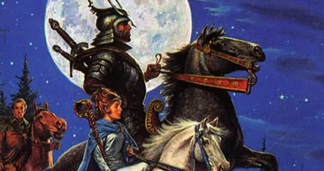
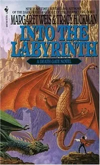
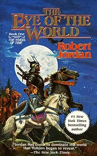
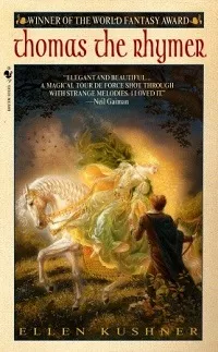
Hoo boy. There’s a lot going on with them, isn’t there?

These covers always seem to scream “high fantasy” to me. (While high fantasy technically refers to books that take place entirely in a fantasy world, I also use it to describe fantasy fiction that is just a lot—dense prose, overly-detailed descriptions, highly-political plots, you get the idea.) I can’t say exactly why that is. Maybe, early on, I had exposure to high fantasy with these covers and it created an association. Maybe there’s something to be said about something like internalized misogyny in me, and that the complex covers indicate complex interiors which is intended for men because of the myth that science fiction and fantasy are for men (and when women write it, it’s for young adults). Maybe there’s just something about the intricate covers that turn me off, like detailed illustrations in graphic novels have.

At used book sales, I typically totally disregard the fantasy mass market paperbacks. Pretty inevitably, most of the books in those collections have these kinds of covers. With precious little time to shop (you have to leave time to read!), I don’t waste my time digging through these covers to find blurbs or jacket copy that might otherwise entice me. I just generally assume these books are not for me. And that’s a shame.
Is this a me problem or a publishers problem? Both? I’m certain I need to get over myself to some degree, but I also figure publishers are doing something like gate keeping. Those highly detailed and stylized covers do feel, for whatever, very masculine to me. And maybe someone smarter than I can articulate why that is. Whatever the case, if publishers continue to publish in this style, I have a feeling they’re alienating a good chunk of a potential market.

Has a book cover ever turned you off from even picking a book up to find out what it’s about? Is there a whole category of book covers that are automatic deal breakers for you? Tell us in the comments.


