A Definitive Ranking of Goosebumps Covers
I’ve mentioned previously how my first experience with R.L. Stine wasn’t actually Fear Street but Goosebumps, his series targeted towards younger readers. My sister preferred Christopher Pike to Stine and, since she influenced a lot of my reading growing up, I had to discover his books on my own.
Thanks to the Fear Street movie trilogy, a lot of people scrambled to find those books last summer to marathon read. But this wasn’t the first screen adaptation of Stine’s works. There have been two Goosebumps movies as well as a popular TV series.
That said, due to the series as well as the book themselves, Goosebumps played a big part in the lives of many book dragons out in the world, regardless of age or generation. I would argue a good reason for this is due to the book covers. If you were to ask a reader of the series, most could tell you at least one that they remembered right off the bat with little to no hesitation. I know I can, something which I will further expand on below.
Were they all winners? Well…no. But, really, that is true of any kind of book. Despite the adage, books are still very much judged by their covers. It’s why readers get so upset when they make absolutely no sense. On the other hand, they always appreciate when a seemingly innocent detail turns out to have a huge impact on the book. Covers matter, no matter the genre — and you can’t change my mind about that.
Here are some of the Goosebumps covers that stood out to me as a kid and now. Bear in mind that this list only includes covers in the original series of 62 books. So, it is not a fully comprehensive list, and I’m sure there are other covers out there which may speak more to you personally, one way or another.
As an aside, I was inspired to write this after watching BookTuber Gavin’s reading vlog of all the original 62 books. If you have the time to spare to watch it — and it is almost three and a half hours — you can see it on his channel. Or you can just check his rankings of all the covers after you read this article and see if there were any overlaps.
Also, I will be categorizing these based on the original covers, which were illustrated by Tim Jacobus. The series has gone through a few republications, so the covers changed over time. But the originals are the only ones that are being considered here.
Iconic Goosebump Covers
These are the ones that I feel most readers would mention right off the bat if you were to ask them what is the cover they most associate with the series. This doesn’t necessarily mean it is their favorite book in it, mind you; it is just the one that they would likely name if pressed.
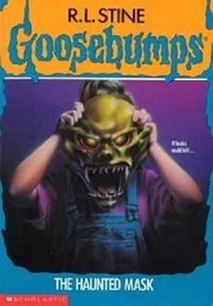
The Haunted Mask
This was my first Goosebumps book; so, it will forever be the cover I most associate with the series. Plus, that’s still a scary as heck mask.
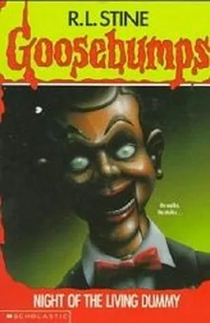
Night of the Living Dummy
I hate dummies with the passion of a thousand dying suns. I’ve always hated dummies. They are the equally evil first cousins of porcelain dolls. However, it cannot be argued that Slappy isn’t the most recognized character from the book series.
Scary Goosebumps Covers
These are the ones that are legitimately frightening to me, regardless of how the story actually turned out.
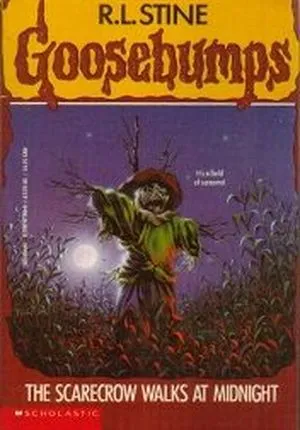
The Scarecrow Walks at Midnight
I partially blame it on Harold from Scary Stories to Tell in the Dark, but scarecrows give me the heebie jeebies. Not as much as dummies or porcelain dolls, but it’s a very close race.
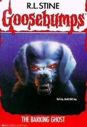
The Barking Ghost
This cover very much gives off off Cujo vibes. I know there is a lot of comparisons between Stine and King, and this comparison isn’t intended to stoke that fire, but it’s still here.
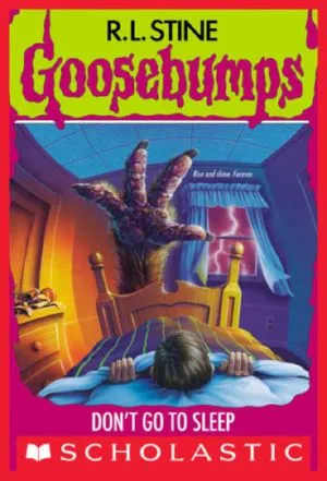
Don’t Go to Sleep
I sure as heck won’t. Seriously, if you saw this at the foot of your bed could you fall asleep? I’d parkour off my headboard out that window.
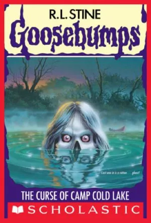
The Curse of Camp Cold Lake
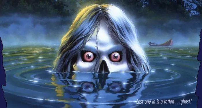
In recent years, I’ve developed into a person who can’t swim in a body of water that she can’t see through. That said, seeing this in the water would not entice me to even dip my pinkie toe in that lake.
Unsettling Goosebumps Covers
These are the covers that are not scary, but not stupid. They are just the ones that just make you feel uncomfortable if you look at them too long, so it’s a middle of the road feeling.
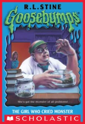
The Girl Who Cried Monster
There’s something about the size of the hands on that man just tingles all my nervous senses. It just doesn’t look right at all. Which may be the point, so if it was, good them for knocking that out of the park.
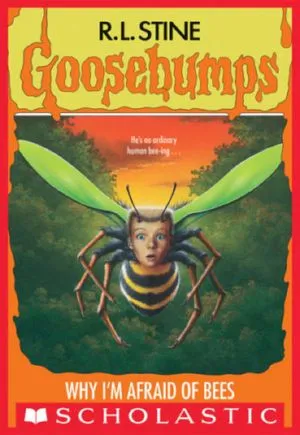
Why I’m Afraid of Bees
Any type of body horror is a hard pass for me. I’m going to be real honest; if I knew that Mexican Gothic contained as much body horror as it did, I likely would not have read it. This is largely in part due to the fourth and fifth Nightmare on Elm Street movies for both the cockroach and motorcycle respectively.
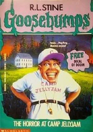
The Horror at Camp Jellyjam
The man on this cover seems like an unholy hybrid of the guy from the Monster book and Slappy. Just look at those teeth; those are not human teeth. That is a life-sized dummy.
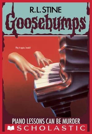
Piano Lessons Can be Murder
It’s the floating disembodied hands for me. Again, it’s an aspect of body horror that just gives me the wiggins.
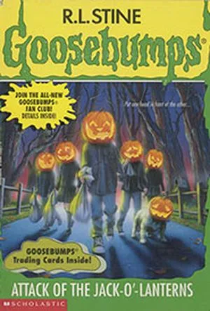
Attack of the Jack o’Lanterns
This is one of those that the more you look at it, the worst it gets. They look like they’re about to start snapping and enter in some kind of musical dance battle. And for once, the dog does not add anything of substance to the cover.
They Tried…
These are the covers that, at the very least, get an ‘E’ for ‘Effort’. They either tried to be scary or funny and missed the mark completely. But I still appreciated the effort.
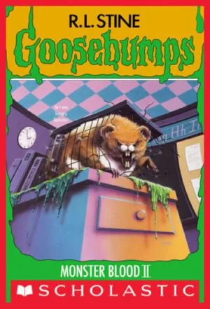
Monster Blood II
Look I know it’s supposed to be scary because Monster Blood is something that runs throughout the whole series, but…all I can think of when I see this is Eddie Murphy’s The Nutty Professor II.
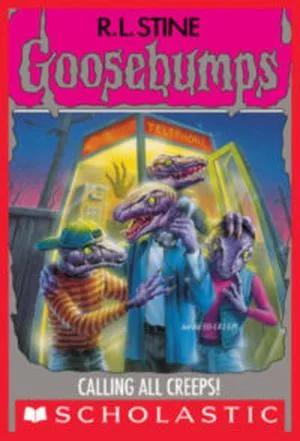
Calling All Creeps!
This is just a complete miss for me. I think they tried to go for them to look like an intimidating gang, but they are teenager sized lizards. And I’ve seen a lizard get taken out by a toddler stepping on it, which honestly was a terrible way to go. So, it does not scare me at all.
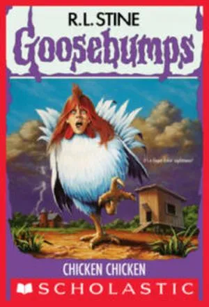
Chicken Chicken
This cover is the complete opposite of the bee book in that it just makes me laugh. It tries to give off the same vibes, but it’s not even in the same neighborhood.
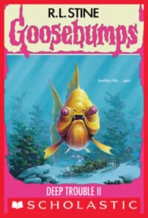
Deep Trouble II
I’m sure that this is supposed to be a piranha, but it looks like a stoned goldfish. And now you can’t unsee it either.
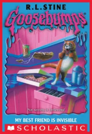
My Best Friend is Invisible
Thank goodness I wasn’t drinking anything when I saw this cover because it would have come out of my nose. And considering I drink a large amount of coffee and wine when researching and writing, that would have been painful. Buddy, if your cat does that, then you have bigger problems than an invisible friend.
And there you have it! The Goosebumps covers that, for better or for worse, stood out the most to me. Did we see eye to eye on a few or do you have different opinions? As always, let me know about it on social media. Until next time!


