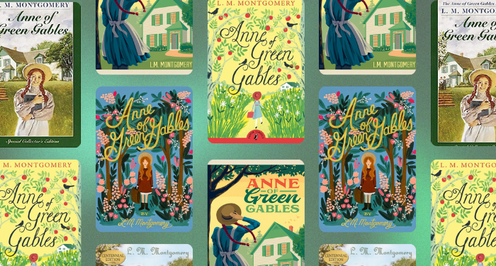
Anne of Green Gables Covers: The Good, the Bad, and the Inexplicable
Once a popular book moves into the public domain, an interesting thing happens to it. Editions multiply at rapid speeds, and the covers diverge further and further. Publishers are happy to keep putting out new versions of this title, because they don’t have to pay royalties. That leaves them room to invest in a design that will stand out from others on the shelf. On the other end of the spectrum, grifters will put out ebook editions with random cover choices, hoping that someone will accidentally give them $2 for the version they spent five minutes “designing.”
Today, I want to look at the many cover choices for Anne of Green Gables by L.M. Montgomery, from the splendid to the bafflingly bad. I combed through Google and Goodreads to find covers that represented a wide range of approaches to illustrating Anne. I then picked out the 16 that represented the best, the middling, the disappointing, and the very worst of covers.
The comments section is moderated according to our community guidelines. Please check them out so we can maintain a safe and supportive community of readers!


Leave a comment
Join All Access to add comments.