
Wrapping Up The Best Book Covers of 2024 With November and December Knockouts
In April, I rounded up some of the best book covers of 2024 so far. Those were for books that published between January and the end of April. I then revisited the best covers for books published between May and the end of July, highlighting several fantastic and memorable works of literary art. Then, of course, came the roundup of fantastic book covers for titles that published between August and the end of October.
Not to be forgotten are the books that hit shelves in the final two months of 2024. It can be way too easy to overlook them, especially in an era where “best of the year” lists are racing to publish as early as the end of September (and in a year where a presidential election pretty much trounced the hopes of books publishing in the weeks afterward). Let’s take a look at some of the knockout covers for books published in November and December 2024.
Book cover design is interesting because it’s got to play to some trends, got to play to some conventions of genre and age category, and because it’s got to play to consumer tastes. We need book covers to sell a book—it’s the number one marketing opportunity for any title. But we need those covers to also give insight into the story and to be nice to look at and to be easy to render on mobile.
Important to all of this is the team behind the cover’s creation. For too long and still to this day, cover designers and artists are rarely credited for their work. The time it takes to find this information is embarrassing in 2024, and still, many of the covers you’ll see below don’t have this information available. Publishers still don’t put it on the landing pages for these books, so it takes good Googling and a lot of luck to dig up names to credit. Unfortunately, this also makes it easier for AI-generated art to get through to book covers, which we have already seen this year.
I send a big thank you to everyone who has reached out upon discovering these posts to send along corrections or additions to the design team. It’s so appreciated.
In this fourth best covers roundup for the year, I’ve done my best to credit artists and designers, and those without are not left off as a slight. For the sake of space, time, and, well, because this is a post about book covers and not necessarily the book contents, I’ve not posted descriptions of the books but short thoughts on what makes the cover stand out. You can grab the book description by clicking the link.
These covers are only for adult fiction (and this roundup has a couple of works of adult nonfiction, too). There are certainly whole posts with more rad covers for YA books and middle grade books and children’s books, and so on.
The Best Book Covers for November and December 2024

Berlin Atomized by Julia Kornberg, trans. by Jack Rockwell, cover design by Erik Carter
Is this cover Brat? It is. It certainly is.
But beyond a 2024 meme, this cover is really neat because it manages to marry minimalism with maximalism while offering nothing more than the title and author. Neon green? Check. Neon pink? Check. A little electricity? You know it.

The Book Against Death by Elias Canetti, translated by Peter Filkins, cover design by Jamie Keenan
Many years ago, during my time as a YA librarian, there were several book covers that showcased this perspective of looking up from a grave, including Dead Connection by Charlie Price. That disappeared, but somehow, in seeing the design pop up again for this book in late 2024, I couldn’t help but really be taken by it. It’s simple but packs a visual—and emotional—punch.
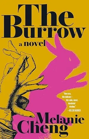
The Burrow by Melanie Cheng, cover design by Beth Steidle
In the previous roundup of best covers, I called out several incredible covers by Steidle. I’m adding this one to the list. I love the clever shadow play and the use of two distinct colors.
I point out the distinct colors bit because somehow, in the years 2024 and 2025, there are not one, not two, but three books toying with this hand/shadow puppet look on their covers. In fact, one is this exact public domain shadow puppet but with less color and cropped slightly different.
Take a look—yes, I added a third cover here from a few years back, too.
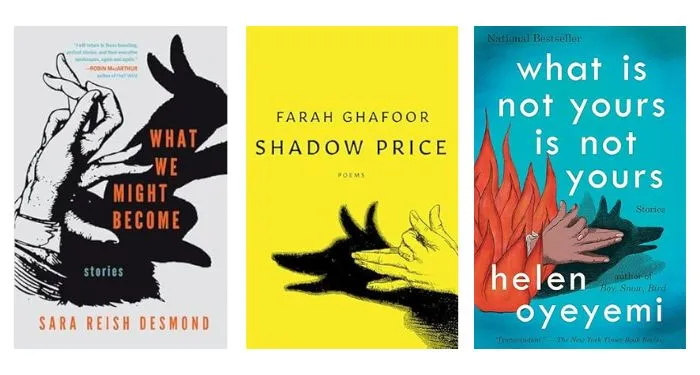
From left to right: What We Might Become from Sara Reish Desmond, which released in October; Shadow Price by Farah Ghafoor, which releases in April 2025; and, of course, Helen Oyeyemi’s What Is Not Yours Is Not Yours, from 2016.

The Color of Family by Michael O’Malley
O’Malley’s latest work of nonfiction was published by the University of Chicago Press, and this cover is just fantastic. It’s both very basic—we have outlines of people who look to be from a different historical period, with red title text that pops against the aged-looking background.
But when you look closer at this cover and take a moment with the book’s description, it becomes more noteworthy. Within the people on the cover are the genealogical records of O’Malley’s family.
The cover is at once perfectly suited for its ideal readership, while also being a cover that has a personal element to it.

Deviant Matter by Kyla Wazana Tompkins
The cover reflects the title, which reflects the content, and frankly, I am getting a little of the ick looking at it. That means it is effective…and that effectiveness is also cleverly contrasted with the bright pink coloring. Not to mention that the font brings a real sense of humor to the cover, too. You cannot talk about these gross parts of the world without tempering it with some humor and this cover delivers.
The spacing and placing of both the author’s name and the title and its subtitle work really well. I love the way the title and subtitle are about to slide right off the cover.
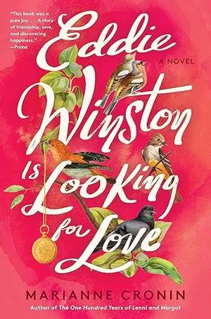
Eddie Winston Is Looking for Love by Marianne Cronin, cover by Olivia McGiff
There might not be anything groundbreaking or revolutionary about this specific cover. But that is, perhaps, what makes it worthy of a “best of” designation for 2024. It manages to take a lot of elements we see in cover design and allow them to look and feel fresh. The birds here are reflecting the title while sitting upon it, and we see little details like the locket, which come from the story. The script for the title is nice, and it is both what drives the design and what helps elevate the little details within its letters.
One of the trends for 2025 cover design—something that will be highlighted next year, of course—is the use of bright pinks. There are so many bright pink covers and frankly, we could continue to have more.

Every Arc Bends Its Radian by Sergio De La Pava, Cover design by Natalia Olbinski
Sometimes what makes a book cover really sing is that the artist and/or designer have thrown everything together they possibly can. That’s the case with this cover, which stands out because it offers a city skyline (not especially noteworthy on most covers), a little topography (we see plenty of mountains, even with the crosses atop it), a geometric design that fizzles the closer it gets to the buildings (many a cover with graphics like this), and then the icing: the snake-like weaving of the book’s title and author around all of these elements. Were the “a novel” part of the title or the author’s name not in white and were instead black, this would be a very flat, confusing image. But it’s the movement of the snake in the text here and its use of two colors that help amplify every piece of the cover’s design.
This isn’t the only snake in this roundup, nor is it the only snake that’s not actually a snake. It wasn’t too long ago the snake was tossed on every book cover, especially in romantic fantasy. Now, we’re seeing it less and thus, when it appears in a unique manner, it really does make a statement.

Kingdom of No Tomorrow by Fabienne Josaphat
These are not random blobs on the cover. They are symbols associated with all things the Black Panthers, and they are laid out in such a way that we see a silhouette between them. This is a high-energy cover with plenty of movement, and the way your gaze focuses gives you a different thing to see each time.
I could not find an artist for this one, which is so unfortunate. There are a lot of elements to this cover that make me wonder if it’s the same designer—or the designer was inspired by—covers such as Chain Gang All Stars and/or Calling for a Blanket Dance.

A Knock at the Door by Lily Hoàng
In previous best cover roundups, I mentioned that short story collections take the cake on clever, unique designs. That commentary applies here, as does the commentary about the growth of pink covers. Marry clever with pink and you get this fantastic and memorable cover for a debut short story collection.
What this cover does well is that it looks WORN, like a paperback book you’ve read dozens of times over. The color isn’t especially sharp, and the look of the claws on the creature is slightly faded. It is the wallpaper in the background that really boosts this from a good cover to a great one.

No Place To Bury the Dead by Karina Sainz Borgo, translated from Spanish by Elizabeth Bryer, Cover design by Jared Bartman
Neon? Check.
Creature woven among the letters in the title? Check.
This book is one that’s dark and bleak and it’s a story featuring graverobbers. I cannot think of a more fitting cover design, nor can I want to pick this book up anymore based on cover alone. Look at those neon orange teeth!

Pony Confidential by Christina Lynch
The design for this book cover gives such a cool feel to it. It’s vintage-inspired, for sure, but it’s also extremely modern. The colors are good, the mixed fonts are good, and the ability to find balance between being font-driven and image-driven is good. You know it’s a mystery, of course, thanks to the Sherlockian hat.
But for me, the thing that takes this cover to the next level isn’t anything in the design. It’s the tagline: “One small pony. One big mystery.”
I am not usually a tagline person because they often offer little about the book and feel instead like they’re cover design filler. But this one? This one is funny and over-the-top in cool appeal.

Rental House by Weike Wang, Cover design by Lauren Peters-Collaer
It’s a chair on fire. That’s all! The color of the title and author fonts mirror the fiery chair without overwhelming the punch that image sends.
This cover reminds me a lot of Kevin Wilson’s Nothing To See Here. Even though the covers are very different, you know they are cousins on the family tree.

To Receive My Services You Must Be Dying and Alone by Kathryn Kruse; cover design by Ashley Siebels.
What is there to say about perfection? It’s the monochromatic look, for sure, paired with the fact we just get a food storage container with a mini Venus de Milo inside.
Note this is from a small press (yay!) and is a collection of short stories (confirmation bias…or truth?). Also, an editor’s note that this book came out in February 2025–for some reason the initial date pub date was listed in the final quarter of 2024, but it’s a 2024er.
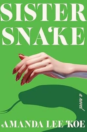
Sister Snake by Amanda Lee Koe, cover design by Vivian Lopez Rowe
Do you see the trend? The shadow/hand puppet emerges again, except this time, we’re getting a shadow that showcases the truth behind the person whose hand is in the image.
Our snake is back. Our great use of font for title and author leaves room for the image to do the talking. That pop of red nail polish? Cherry on top.
I will say that as someone who is hypermobile, I’m a little unsure, still, how the hand is being held with the thumb in that position. I may be overthinking that, given the shadow isn’t even a hand.

Toto by A. J. Hackwith
We’re not in Kansas anymore.
Yes, this is a book that tells the story of The Wizard of Oz from the dog’s perspective.
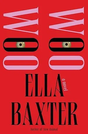
Woo Woo by Ella Baxter, Cover design by Nicole Caputo
The eyes between the second Os in each of the Woos are creepy. They are far too human.
The amount of visual impact a cover can have with virtually no image on it is always remarkable, and this one is such an excellent example. You almost cannot read the book title because of how it is designed, but that’s precisely why the eyes pop.


