The Authors of Fonts: A History of Type Foundries
Recently we explored why Times New Roman, Arial, and Helvetica became some of the most widely used fonts out there, and that got us to thinking: All these fonts are typeface sets that had to be designed at one point, letter by letter. So who does the designing?
Fonts are born in type foundries, which are companies that specialize in the design and creation of typefaces. Although the majority of type foundries today are digital, they led very different lives before the age of the internet, and have a fascinating history.
The Beginning of Print
Before type foundries were even a glimmer in their founders’ eyes and printing was even a thing, books were quite obviously transcribed and bound by hand, making them extraordinarily valuable and expensive. A single scribe could only produce a few books a year, and there wasn’t a lot of book ownership going on up until the 13th century or so, since literacy rates were lower and the texts that were bound tended to be religious in nature.
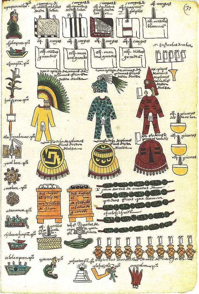
They weren’t necessarily called books then, either. The history of written collections began with scrolls or tablets throughout the world, and then people got creative and began to bind pages into what we know as codices (plural for codex). The construction of a codex varied depending on the culture; Mayan and Aztec codices were long sheets of paper or animal skin folded into pages, and the Romans created a folded parchment notebook around 1 CE.
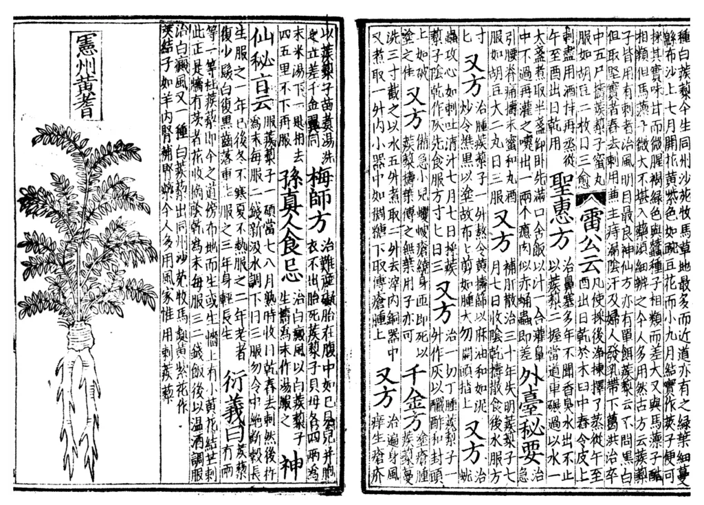
Woodblock printing began in China around the 9th century CE, where an entire page of text was chiseled into a wood block backward, smothered in ink, and had a page pressed against it. If you’d like to see one of those wood blocks, check out this video by the International Printing Museum’s curator, Mark Barbour, who is an excellent source I’ll be referencing heavily throughout this deep dive into print and type foundries that you didn’t ask for, but you know what, you’re already here. Let’s enjoy this ride together. Anyway! Bi Sheng created the first porcelain moveable type in 1040 AD during the Northern Song Dynasty, which is comprised of arranged moveable components (e.g. characters, letters) in order to print paper books.
Moveable type then made its way to Korea, and the world’s first recorded instance of metal moveable type came in 1234 CE from the efforts of Choe Yun-ui, a civil minister tasked with printing a Buddhist text that would have taken absolutely forever to create using wooden blocks. So he used metal characters instead, arranged those pieces in the order needed, doused them in ink, and pressed the pages to them. The project took him six years to complete.
Two hundred years later in Germany, a metalworker named Johannes Gutenberg mechanized metal moveable type by casting the letters in a hand mould for speedier and more accurate production. The type was then arranged on a flat wooden plate, ink applied to the type, a sheet of paper laid on top, and an upper plate pressed down to apply the ink to the paper. This is a gross oversimplification of the printing press process, so please do watch Mark Burbour’s thorough breakdown of how this machine actually worked and why his hand moulds remained in use until well into the 1800s.
In the 1450s, Gutenberg’s press could print around 250 sheets per hour, and it took him three years to print around 180 copies of the Bible. For context: Today, newspapers use offset printing, which prints around 70,000 pages per hour. Although it doesn’t seem impressive now, the effect of these early book printers and typeface creators is enormous, and began the era of mass book production, as well as the rise of public literacy and education. By 1500, some 12 million books were printed in Europe.
The Birth of Metal Type Foundries
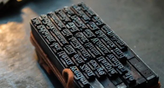
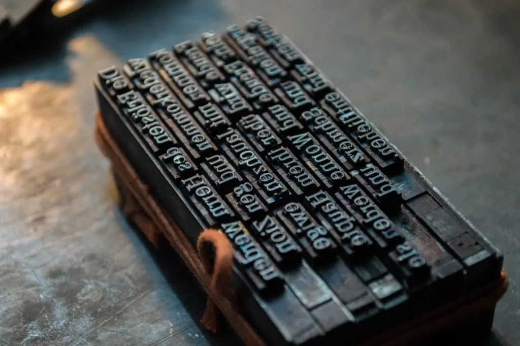
The typeface that Gutenberg’s press used for those first print runs of the Bible was called Textura, also known as Blackletter or Gothic. It was based on the handwritten letter form found in religious texts in the late medieval period, painstakingly type casted by skilled metalworkers like Gutenberg who designed each metal character. They were then manually placed, letter by letter and line by line, onto the wooden plate for ink application.
The first type foundry for the English language was started by William Caxton in 1476, who also devised his own printing press. According to the British Library, Caxton’s press published the first book written in English (remember, Gutenberg’s Bibles were printed in Latin): Recuyell of the Historyes of Troy, or stories about the Trojan War, translated from French, and then went on to publish the first copies of Chaucer’s The Canterbury Tales.
Many other type foundries spawned in the next few centuries, as education access increased and the demand for printed material grew — a demand spurred on by the Italian Renaissance, when Venice experienced a book printing boom. Wealthy patrons in that era revived an interest in finding long-lost works written by the likes of Plato and Aristotle, and the printing presses in Venice made availability and affordability more common. A century earlier, one hand printed book could cost as much as a house: by the 1490s, a printed book cost a teacher one month’s salary.
Metal type foundries began to flourish in printing districts such as Fleet Street in London, and more and more typefaces were created. Let’s pause here for a refresher on the difference between typeface and font. A typeface is essentially a family of fonts. For instance, the Times New Roman typeface has a number of variations that, while we can easily switch between with the click of a button on our laptops now, had to be individually created metal letter by metal letter in various sizes to give you an italic version, a bold version, a condensed version, etc.
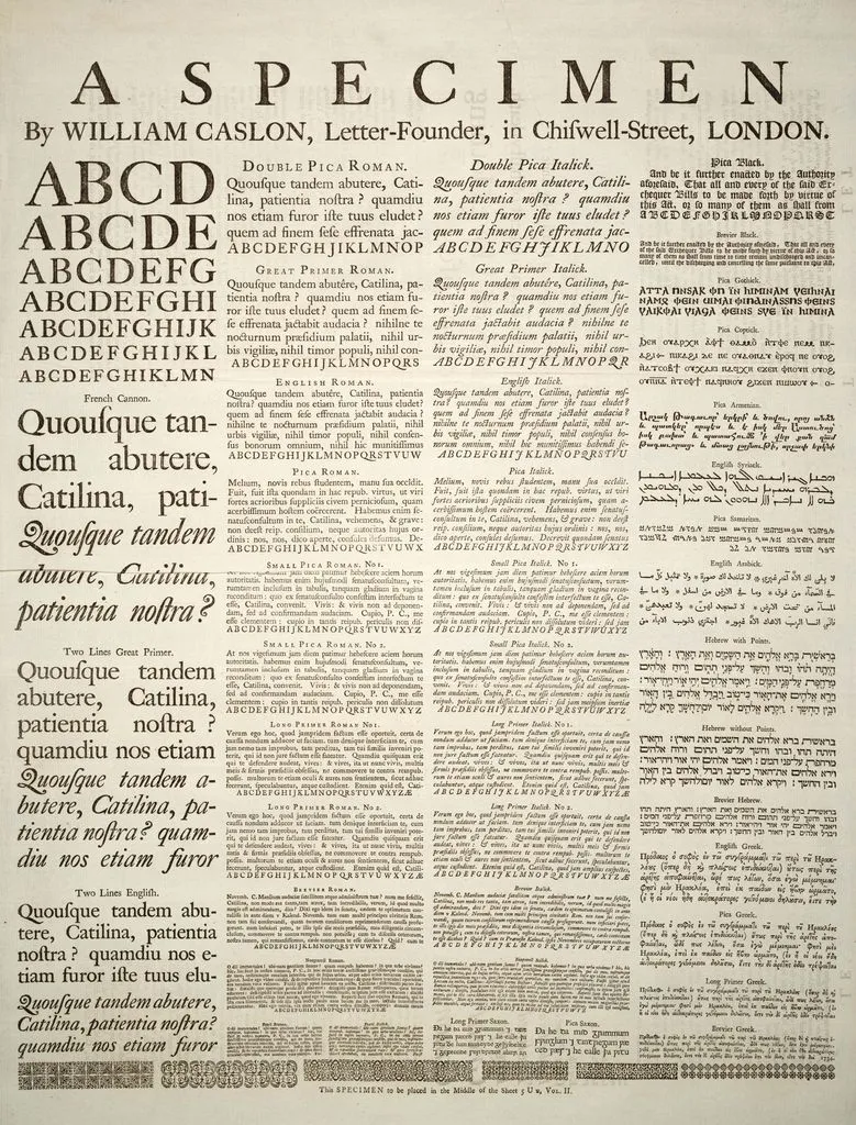
For awhile, English typefaces (and thus, their foundries) fell out of favor and other European typefaces became more popular, such as Dutch types. That is, until another William came into the font creating business in 1720: William Caslon. He created a roman typeface he named Caslon (naturally), and it smashed the competition, becoming the typeface of choice throughout the English speaking world. Caslon (the font) was even used in the first edition of the Declaration of Independence.
From Metal to Digital
You just know someone would come along and automate the handset type casting process. What was once done manually got the automated treatment in the 1800s. David Bruce of New York created a game changing pivotal typecaster in 1838, of which there is remarkably little information anymore, although it was a wholly necessary invention in order to keep up with the print demands of the Industrial Revolution. Arranging every sentence on a page of a newspaper or a novel by hand just couldn’t cut it anymore.
Enter the Linotype. This mechanical typecasting machine, invented by Ottmar Mergenthaler in 1884, utilized keyboards modeled after early typewriters, so the typecaster would type in the text, and the machine would imprint each letter into a matrix, or a bar of metal. Then, they would pour hot metal onto the imprinted bar to create the line of text for printing. Just a year later, the Monotype typesetting machine entered the market, with a key production difference: it produced type at the individual character level, versus a line at a time, and specialized in printing more complicated copy (think math equations and chemical formulas).

These typecasting machines pretty much ruled the roost until the digital age, when technology offered us a way to speed up the printing process even further, like the invention of laser and dot-matrix printing of the late 1970s and phototypesetting, which assembled type on film that was then used to make printing plates. Since printing technology was advancing, font creation had to adapt with it.
The improvement of OCR, or optical character recognition, in the early 1970s also helped propel digital typeface creation forward, but what really turned the page from metal to digital was the prevalence of the home computer. Adobe’s founders invented something called PostScript, a page description language that describes a page’s text and graphics for both computer screens and for printing. Microsoft and Apple created their own page description language called TrueType (more on this here), allowing for scalable vector-based fonts, but type foundries initially hesitated to release TrueType versions of their digital fonts — that is, until Adobe and Microsoft joined forces in 1996 to develop a new format that merged PostScript and TrueType into OpenType.
Up until now, typefaces were designed for good old fashioned print for newspapers, books, and magazines. Once the prevalence of computers took hold the world over, typographers had to begin designing typefaces made for computers. Only this time, they could do it a lot easier than their historical counterparts: after all, they didn’t have to cut them from metal. They could create whole typesets from their desktops, ushering in an era of new and shiny typefaces in the late 1980s/early 1990s.
Famous Type Foundries
Well, here we are, at the present. Because of all this ingenuity, many of the metal type foundries of old are no longer, giving way to the digital type foundries of today. Some live on as hybrids, but for the most part, if you want to see the history of type founding and printing in the western world, you have to head to places like The Type Archive in London, or the International Printing Museum in California. Here is a rundown of some of the biggest type foundries with the largest ink footprints out there.
The Historical Type Foundries
American Type Founders, or ATF, was an amalgamation of 23 different type foundries that joined forces in 1892 in order to compete with the Linotype typesetting machine. That didn’t quite work out for them, but they dominated the American type scene anyway until they went bankrupt in 1933. We can thank them for News Gothic, Century Schoolbook, Franklin Gothic, Hobo, and Bank Gothic.
Bauer Type Foundry, a German foundry established in 1837, gave us a number of typefaces including Futura, Bodoni-Antiqua, Folio, and Venus.
Deberny & Peignot went through quite the ride, starting as a French foundry created in 1923, before being bought by the Haas type foundry, which then merged with the D. Stempel foundry, which then became part of Linotype in 1989, which then got absorbed into the Monotype Corporation *takes deep breath*. Deberny and Peignot gave us typefaces such as Baskerville, Garamond, and Didot.
Haas Type Foundry, a Swiss foundry established all the way back in the 1600s, gave us a number of grotesk (sans serif) fonts such as Helvetica (maybe you’ve heard of it), Clarendon, and Troubadour.
Stephenson Blake was founded in 1818 in Sheffield, England, and this type foundry grew pretty substantially by acquiring at least three other type foundries. They originally designed typefaces such as Britannic, Impact, and Windsor.
The Digital Type Foundries
Linotype and Monotype didn’t just create world changing typesetting machines: They’re type foundries, too. Through various mergers and original designs, Mergenthaler Linotype Company boasted such fonts as Palatino, Avenir, Univers, and Helvetica. It was only a matter of time, however, before its competitor, Monotype, acquired it in 2006, along with a number of other type foundries. Monotype Imaging quite simply dominates the digital type foundry world, and it did the same when it produced metal typefaces. Many of the fonts you and I use every day are accredited to or were acquired by Monotype, including Arial, Bembo, Goudy Old Style, Perpetua, and Times New Roman.
Apple famously created Apple Garamond in 1983, but also gave us the city fonts designed by Susan Kare.
Elsner+Flake is a German type foundry established in 1986 that’s created over 2500 digital fonts for Mac and PC.
The Font Bureau based in Boston and founded in 1989, specializes in creating typefaces for magazines and newspapers, and some of its clients include The New York Times Magazine, Esquire, The Rolling Stone, and The Wall Street Journal.
Google has a massive catalogue of digital fonts that it collects from individual type designers and foundries. They are free and open source, and include fonts like Lato, Roboto, Montserrat, and Raleway.
Other smaller, independent digital type foundries that appear to be popular with graphic designers include Lineto, a Swiss foundry established in 1993 and creator of typefaces Circular and Akkurat; the Colophon Foundry, established in 2009 with locations in London and New York, creator of Apercu and Relative; Grilli Type, another Swiss foundry created in 2009, creator of the typefaces GT Walsheim and GT Haptik; and Just Another Foundry, a German company established in 2004, creators of Lapture and Facit.
Print has evolved in miraculous ways over the last two thousand years, and type foundries themselves have only been around for 600 or so years of it. In that time, however, they’ve given us hundreds of thousands of ways to express ourselves through font styles, both on the page and on the screen.


