Times New Roman, Arial, and Helvetica: The Font Favorites, But Why?
There are hundreds of thousands of font styles out there in the world, and yet the mainstays in English and Latin-based languages typically boil down to just three: Times New Roman, Arial, and Helvetica. They are everywhere, whether we like it or not: from the papers we wrote in high school to the books we read to instruction manuals to advertisements to journals and newspapers. Somehow, this trio has led the pack of font styles for decades, and became the fonts of choice for a multitude of companies, operating systems, and entire industries.
Let’s find out how they became the most widely used fonts ever.
Serif vs. Sans Serif Fonts
In order to really understand why these three are so popular, we need to get to know two common categories for typefaces: serif and sans serif.
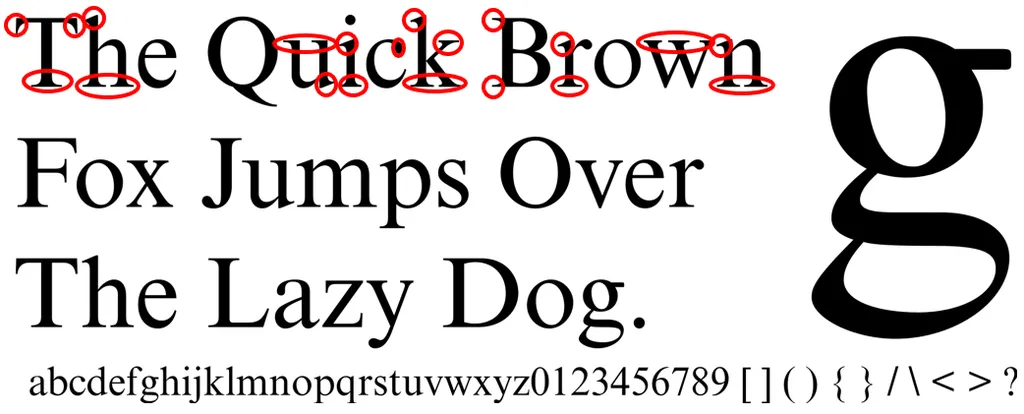
Serif fonts use embellishments and flourishes in their characters, which serves the dual purpose of being both decorative and distinct.

See those stroke flourishes circled in red? Those are serifs, which are also called “tails” or “feet.” The very look of a serif font is soft, with more rounded characters, and the distinctions of the serifs make the letters easier to read and recognize quickly. Some serif fonts you may have used or seen include Times New Roman, Garamond, and Bodoni.
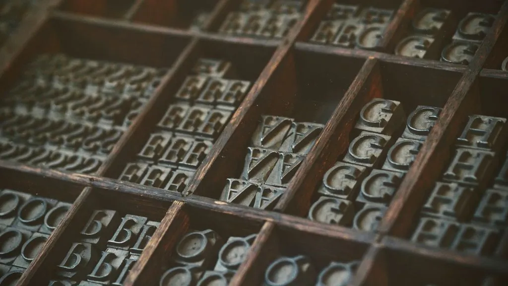
Serif typefaces are older, dating back to the 18th century when they were designed for the printing press. Because of that longevity, they’re often seen as more traditional fonts. If a company is looking to convey trustworthiness and reliability to their consumer base, for instance, they’ll probably choose a classic serif font to communicate that (such as Apple’s Garamond and the Starbucks’s Lander, which they use for their more “expressive” advertising).
Sans Serif fonts have no frills and no fuss, hence the name; sans (“without”) serif. They use clean, simple lines for their characters and lack the “tails” and “feet” of serif fonts. If you have an iPhone, you see a sans serif font every time you’re on it—the iOS uses SF Pro.

These fonts are the modern younger siblings of the serif fonts, and are often used to convey a youthful, updated vibe. The character shapes are more geometric in nature, which means they’re 1) easier to read on screens and 2) scale large or small quite well. Although, to be fair, the notion that sans serif fonts are better for computer screens and serif fonts are better for print is an older one, when screen resolutions weren’t as great and serif fonts lost their distinction the smaller they got. Thanks to today’s higher resolution screens, this is no longer a problem. Many, many logos use sans serif fonts, including Target (Helvetica) and Google, which famously made the switch from a serif font to sans serif back in 2015.
A Quick History Lesson

Times New Roman was introduced to the world in 1932 by type designer Stanley Morison. He was given the challenge of rebranding London’s newspaper The Times with a fresh new font, and worked with draftsman Victor Lardent to create a serif font that was efficient, in order to maximize the amount of words that could fit in a line and on a page (very important for a newspaper), and readable, since print newspapers go pretty darn small with their font sizes.
The Times owned exclusive rights to their font for about a year, and then it slowly began to take off with American publishers a few years later. According to the New York Public Library, monthly magazine Woman’s Home Companion was the first to adopt Times New Roman in 1941, and the Chicago Sun-Times started using it in 1953.
Helvetica originated in Münchenstein, Switzerland, in 1957 as a commission for the Swiss Haas type foundry. Max Miedinger designed the sans serif typeface to revitalize the company’s sans serif offerings with something more modern and international, since their current selection wasn’t doing so hot. Haas type foundry eventually made a deal with German type foundry D. Stempel AG to manufacture Helvetica for traditional print and widespread reach. D. Stempel AG was later absorbed by the Linotype Company (this will be important later, stay with me).
Arial was born in 1982 to creators Robin Nicholas and Patricia Saunders for Monotype Corporation, another company that specializes in typesetting and typeface design. This sans serif font is the first of the bunch to be designed specifically for laser printing and personal computers. If you ever wondered why your Windows computer converts PDFs using Helvetica font to Arial, the most similar font the system can find since it doesn’t support Helvetica, it’s because Arial was literally created to be an echo of Helvetica…which is owned by the Linotype Company, a competitor of Monotype.
Why Do We Love Them So?

We have Microsoft and Apple to thank for that.
Microsoft’s Principle Software Engineering Manager, Greg Hitchcock, wrote extensively about Microsoft and Apple’s cross-license agreement for font technology back in 1989. This would essentially standardize fonts and printer software across the two operating systems, which were respectively named TrueType and TrueImage. Their core fonts would have been more identical…except each computer giant licensed their fonts from different typesetting companies. Microsoft used Monotype, and Apple used Linotype. Thus Microsoft’s core fonts were Times New Roman, Arial, and Courier New, and Apple’s core fonts were Times Roman, Helvetica, and Courier.
(Fun fact: Times New Roman and New Roman are essentially the same font, but the original typeface hardware for The Times‘s font was created jointly by, you guessed it—Monotype and Linotype. They both made sets of the typeface available, just under two slightly different names: Apple chose Linotype’s Times Roman and Microsoft chose Monotype’s Times New Roman.)
So why was Times New Roman one of the chosen few? Because in the early computer days, most documents were printed, and this serif font was widely available and designed for print. On top of Times New Roman showing up on everyone’s Windows computer as the default font, most printed school assignments in the U.S. (please correct me if I’m wrong: I’d love to know what fonts were preferred in other countries!) following the MLA or Chicago style required a Times New Roman, 12 pt font.
The thing is, MLA doesn’t require Times New Roman, and neither does Chicago Style. They merely used this font as an example of an “easily readable typeface” in their formatting recommendations. Since Times New Roman was the default for the computer operating system that most people could afford, it must have been the path of least resistance to standardize all document formatting to Microsoft Word’s default font.
Arial grew in popularity both because of its selection as a Microsoft core font and its design as a sans serif. It was, quite simply, the most accessible sans serif font available to most people with computers, and sans serif fonts were growing in popularity with the increase in computer usage. Although Helvetica is the superior sans serif font to many, Microsoft chose Arial in part because the licensing fee for Helvetica was too expensive. For a good 17 years, Arial was the Windows default font for PowerPoint, Excel, and Outlook, and so it became the font of choice for everyone’s presentation decks, spreadsheets, and emails.
Helvetica had a slightly different trajectory to stardom, which began much earlier than either Times New Roman or Arial. It was created at a perfect time in history, when post-war modernism was still influencing the arts, architecture, and literature, so the media world was ready for a simple, yet versatile typeface that’s easy to read. Helvetica was designed to adapt to any sort of branding, and became the darling of the advertising world, which is why it is everywhere and even earned itself its own documentary. Compound that with Apple championing it as its default font, and you have a font used heavily in graphic design for corporate logos, editorials, and even transportation signage (it’s the font of choice for the New York City subway and the government of Canada).
Changing Times, Changing Fonts
Even though these three musketeers have been leading the charge of font usage for decades, times do change, and so do font preferences. A lot of this is also driven by our increasing screen time and a decrease in the usage of print material, which fonts like Times New Roman were created for. Microsoft Word replaced both Times New Roman and Arial as their default fonts in favor of Calibri, a sans serif font, in 2007. According to Joe Friend, the Senior Program Manager at Microsoft whose team pushed for this change, it was a result of growing digital consumption and an effort to modernize. Calibri was also a newer font designed to improve screen readability.
Print books are also rarely printed in Times New Roman. Although it’s a serif font, and serifs are easier on the eyes for long-form reading, it was originally a newspaper font, and as fellow Rioter Ashley Holstrom noted in her piece on the best fonts for books, most book designers prefer fonts such as Garamond, Palatino, and Jenson.
There you have it, friends. May you leave this article with a greater appreciation for fonts, and may you see Helvetica around every corner. (You will. Oh, you will.)


