What Goes Into Designing A Book? An Interview With Designer Laura Palese
Kelly Jensen: Book Riot readers have certainly thought about the power of book covers, but we’ve talked less about what goes on between the covers design-wise. The first thing worth asking is also the most obvious: can you talk a bit about your background and how you got into designing books?
Laura Palese: Sure. It was actually completely by accident! My first job out of college (well, after a brief stint as a cake decorator) was as an Art Production Assistant at Clarkson Potter, and illustrated book imprint of Random House. At the time, digital photography was just starting to be used in publishing, so most books were printed using slides and negatives. It was my job to log-in the original artwork that was delivered from photographers, and to make sure every image was returned to them after the book was published.
I was an art history major in college and had never taken a graphic design course – I knew absolutely nothing about it. But during my time at Random House I worked very closely with the designers on staff and became curious about what they did. I was lucky enough to work with an incredible group of women, all of whom very generously served as my teachers and mentors. I learned design on the job and supplemented with some continuing education classes at art schools in New York City. Over time I worked my way up from an art assistant to a staff designer.
KJ: What is your process when it comes to design? Do you read the book before diving in? Do you read a part of it and get an idea of what you’d like to do?
LP: I tend to work on a number of projects simultaneously, so unfortunately I don’t usually have time to read the entire book. But I definitely familiarize myself with the material by reading parts of the book, and I’ll often do a bit of research on the author. I usually spend a good amount of time looking at typographic examples pertinent to the book. The majority of what I design are cookbooks. So for example, if I’m working on a book from the cuisine of a specific country, I’ll research current and past typographic trends from that country. Street signage, works of local artists and designers, etc. Pinterest is such an incredible visual resource during this process.
 KJ: How much creative freedom do you typically have when it comes to your work?
LP: I’m lucky enough to collaborate with an amazing group or art directors and editors. Before the start of a project, we’ll have a discussion about how we think the book should look, who it’s for, the likes/dislikes of the author, competing titles in the marketplace, etc. Making a book is an incredibly collaborative process, and there are many opinions that go into shaping how a book looks. So while there’s definitely room for creative freedom on my part, I feel very strongly that the main job of a designer is to take all of the incredibly hard work the author has done, and to try and make it shine.
KJ: What inspires your design work and your personal aesthetic?
LP: Oh, that’s a tough one! I’m so lucky to live in a city where I’m constantly surrounded by beautiful things. I’ll very often see something while I’m out and about incredible typography on a poster, a piece of fabric in a store, amazing restaurant signage) and snap a photo of it. So I guess I’m always mentally cataloging the things I see, for use in a future project. I suppose I tend to gravitate towards design that has the mark of the person creating behind it. I love anything with hand-painted or hand-drawn texture, typography that’s been hand-lettered, found type, etc.
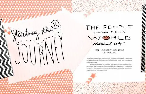
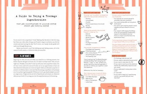
KJ: You designed HERE WE ARE: FEMINISM FOR THE REAL WORLD. What inspired your design choices?
LP: I was so inspired by all the voices that came together to create the book, and all of the incredibly personal stories in it. The material is so powerful and I wanted to try and emulate that in the design. I wanted the reader to feel like they were holding an object that had the mark of a person behind it. So each page features my own handwriting or collage, or pieces of found paper that I hope create an authentic backdrop for the material.
KJ: Do you have any outtakes from HERE WE ARE that you can share? Design ideas that got scrapped early on?
LP: What a great question! I think most designers probably have a graveyard of designs that they wish had made it but never did. In the case of this design, the process was more of an evolution right from the beginning. With the help of the team at Algonquin, we kept adding layers until we were happy with the final design. So there isn’t really a design I can share that didn’t make it. What we started with doesn’t look all that different from how we ended up, just not quite as dynamic. I promise I’m not being secretive! The cover design definitely was definitely a bit trickier, as they always are. I do have some cover design ideas that were scrapped early on, and I actual didn’t end up designing the final version. So I’m hesitant to share early versions since the final design (by Laura Williams) looks fantastic.
KJ: What was the most interesting and the most challenging aspect of designing for HERE WE ARE?
LP: The most challenging aspect was creating all of the illustration and collage. I really wanted to make things that felt authentic, but that wouldn’t overshadow the amazing writing in the book. As I mentioned earlier, my job is kind of to be invisible. To make sure that I design something that’s visually appealing, but most importantly allows the content of the book to take center stage.
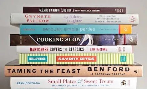
KJ: Cookbooks have been a big part of your portfolio of work. Can you talk a bit about how you begin to design a cookbook? How much do you as designer make choices on not jusy layout, but images, color palates, and so forth?
LP: Making cookbooks is SO fun! I love food, I love to eat and I love to cook, so the process is always incredibly enjoyable for me. The process is actually not very different from what I described above. Before each project, I spend time discussing the book with the editor/art director. We talk about what we think the design direction should be, and then the process remains collaborative until we land on a final design. I’ve been so lucky to work with incredibly talented chefs, food writers, bloggers, etc, all of whom have different personalities, points-of-view, cooking styles, etc and it’s my job to make sure that’s expressed on the page. From a technical perspective, the recipes need to be functional and easy to cook from.
 KJ: What have been some of your favorite cookbooks to work on and why?
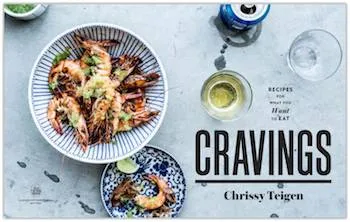
LP: Oh, I’ve worked on so many amazing projects! I just finished a book called Scraps, Wilt & Weeds, which is all about from the leftover scraps of ingredients that we’d normally throw away. The photography is so beautiful, and personally I think it’s so important to be mindful of food waste in my own kitchen. Chrissy Teigen’s book Cravings was so fun. She is hilarious – I love her voice. And her recipes are amazing! A few years ago I worked on a cookbook called Senegal, and I absolutely loved the entire process. I didn’t know anything about Senegalse cuisine or culture, and I learned so much working on the book. The author is so inspiring, and Evan Sung’s photographs are incredible.
KJ: And what’s the best recipe you’ve tried from one of those cookbooks?
LP: Chrissy Teigen’s Thai lettuce wraps are awesome, and I’ve been dying to try Chicken Pot Pie Soup with Crust Crackers.
KJ: Is there a favorite part of your work in designing books? In other words, does one aspect excite you the most?
LP: FONTS! It’s true. I love fonts. At the beginning of every project I spend hours choosing a suite of fonts that will work best for the project. Very often that means getting to buy new ones, which I also love.
 KJ: What are some of your favorite books design-wise out over the last couple of years? What makes them stand out to you?
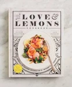
LP: Oh god, there are SO many talented designers out there. I spent a lot of time in book stores looking at new books and their designs. I love any book that Deb Wood designs. She is amazing – I’m such a fan of her work. A cookbook came out last year called Love & Lemons. I think the design is beautiful – I wish I’d done it!