
7 Fictional Books with Data Visualizations To Illustrate the Story
This content contains affiliate links. When you buy through these links, we may earn an affiliate commission.
Ever considered sentence diagramming all of Molly Bloom’s speech from James Joyce’s Ulysses? Most of us would shy away from the thought of that one run-on sentence, but Stefanie Posavec took on the challenge. But that’s because she’s a designer and data artist. In other words, she’s an artist whose medium is data. Posavec has created inventive data visualizations on dance movements, the dictionary, and much more. Notably, she recently published a book called Dear Data with Giorgia Lupi, based on 52 weeks of data tracking and visualizations. Over the course of a year, they would spend a week tracking different things, such as smiles, curses, doors, clothes in their closets, and mail a visualization to the other person, a continent away. For them, data helped them understand themselves and one another a little bit better.
Posavec’s work opened up new possibilities for me: data visualizations and art. Or more specifically, data visualization and fiction. I have assembled a list of seven books (and a bonus) that use data visualizations as a part of their narrative. I have kept a broad definition of visualization to include bar charts, graphs, X-Y plots, and much more.
Tristram Shandy is known as a long-winded, convoluted book where the main character narrates his life in stops and starts. Much of the narration is before Tristram Shandy is even born. The highly experimental work grapples with the notion of truth and language, a postmodern text before modernity. Notably, Sterne used visualizations, such as dashes and asterisks, to enhance the tangled plot. My personal favorite is Tristram’s attempt to plot out his own narrative several times with twists and swirls. Lives, Sterne seems to suggest, are not a straight line but the result of many stops, starts, digressions, and wrong ways.
Double-entry accounting is central to this unusual work. Christie Malry decides to keep a ledger of the universe and himself; a credit for crimes against him and a debit for actions against the world. For instance, when his boss yells at him, he’ll make a debit entry; in response, he might steal office supplies and credit that. And it escalates. This work is included because while charts and numbers are not the most flashy of data visualizations, they are the most basic ones. After all, double entry accounting is a very old system going back to 15th century as a way to understand financial position. This unusual book seems to be a great-great-great-great grandson of Tristram Shandy in its tone and its awareness as a novel. It’s uneven and a little dated at times but a definitely unusual read.
There are two things you have to know about Colin Singleton: he’s a child prodigy and he has a predilection for being dumped by Katherines. Nineteen, to be exact. After the devastation of Katherine XIX’s departure, Colin and his friend Hassan go on a road trip over the summer. Colin decides to create a theorem to describe his relationships with Katherines. The book features various functions plotted on a X-Y axis as Colin tries to figure out a theorem that applies to all scenarios.
This Pulitzer Prize–winning work is a series of interconnected short stories centering around the music industry and producer Bennie Salazar. One of the more unusual parts of the book is a PowerPoint presentation by Alison Blake, a 12-year-old child. Within it, there are series of charts describing her brother and the rest of her family. It’s the emotional center of the book in my opinion. The the charts and graphs beautifully describe the dynamics of the family with special emphasis on Alison’s autistic brother, Lincoln, who is fascinated by pauses in songs. It’s about the pauses between people and how we struggle to understand one another.
After Veronica’s boyfriend leaves her, she begins a downward spiral as she tries to come to terms with the sudden disappearance of her mother when she was a young girl. Counting the rings of wooden planks, observing the cracks in the wall, Veronica uses Venn diagrams to try to make sense of these losses in her life. She writes: “Visualized in this way, ‘from above,’ the world reveals relationships and functions that are not completely obvious” (page 83). She ends up working on an archive of a recently deceased writer named Marisa Chubut, who is also an Argentine exile like Veronica’s mother. These charts help her think through her relationships but also serving as a way to distance herself from others.
In this heartbreaking book, Thandi attempts to come to terms with her mother’s death from cancer. In the work, Thandi tries to negotiate racial, gender, and national dynamics between the U.S. and South Africa, her mother’s birthplace. While employing fewer charts than the other works, she tries to mathematically plot her grief to explain the void that she feels from the loss of her mother.
In this YA novel, Vera Dietz is trying to handle the death of her former best friend and secret love, Charlie Kahn. She’s the only one who can clear his name from a terrible crime. But she has to figure out her own demons and place in society. While the other books used data visualizations to understand relationships, this work makes use of flowcharts that chart decisions. Fundamentally, the book is about how we become the decisions we choose or do not choose to make.
It should be noted that the category is lacking in authors of color. I’m hoping that more and more fiction books that use data visualizations will be published in the near future and that we’ll get to see more and more diverse voices. As a bonus, I’d like to include Big City Map, a GIS mapping project that mapped the comic Brotherman, by Guy Sims (Author), Dawud Anyabwile (Illustrator), Brian McGee (Illustrator). While it’s not using data visualization to advance the plot, it’s still a really cool use of data visualization and the world of literature.
These are just seven books that employ data visualizations in the forms of graphs, line charts, xy plots, flowcharts, and more to help tell their stories. As data visualizations continue to be integral to our society, I expect we’ll see even more innovative ways of storytelling with these tools. I can’t wait to see what happens next. Want books on data science? Here’s a great list of data science books to get you started.
 The Life and Opinions of Tristram Shandy, Gentleman by Laurence Sterne
Tristram Shandy is known as a long-winded, convoluted book where the main character narrates his life in stops and starts. Much of the narration is before Tristram Shandy is even born. The highly experimental work grapples with the notion of truth and language, a postmodern text before modernity. Notably, Sterne used visualizations, such as dashes and asterisks, to enhance the tangled plot. My personal favorite is Tristram’s attempt to plot out his own narrative several times with twists and swirls. Lives, Sterne seems to suggest, are not a straight line but the result of many stops, starts, digressions, and wrong ways.
 Christie Malry’s Own Double-Entry by B.S. Johnson
Double-entry accounting is central to this unusual work. Christie Malry decides to keep a ledger of the universe and himself; a credit for crimes against him and a debit for actions against the world. For instance, when his boss yells at him, he’ll make a debit entry; in response, he might steal office supplies and credit that. And it escalates. This work is included because while charts and numbers are not the most flashy of data visualizations, they are the most basic ones. After all, double entry accounting is a very old system going back to 15th century as a way to understand financial position. This unusual book seems to be a great-great-great-great grandson of Tristram Shandy in its tone and its awareness as a novel. It’s uneven and a little dated at times but a definitely unusual read.
 An Abundance of Katherines by John Green
There are two things you have to know about Colin Singleton: he’s a child prodigy and he has a predilection for being dumped by Katherines. Nineteen, to be exact. After the devastation of Katherine XIX’s departure, Colin and his friend Hassan go on a road trip over the summer. Colin decides to create a theorem to describe his relationships with Katherines. The book features various functions plotted on a X-Y axis as Colin tries to figure out a theorem that applies to all scenarios.
 A Visit from the Goon Squad by Jennifer Egan
This Pulitzer Prize–winning work is a series of interconnected short stories centering around the music industry and producer Bennie Salazar. One of the more unusual parts of the book is a PowerPoint presentation by Alison Blake, a 12-year-old child. Within it, there are series of charts describing her brother and the rest of her family. It’s the emotional center of the book in my opinion. The the charts and graphs beautifully describe the dynamics of the family with special emphasis on Alison’s autistic brother, Lincoln, who is fascinated by pauses in songs. It’s about the pauses between people and how we struggle to understand one another.
 Empty Set by Verónica Gerber Bicecci, Translated by Christina MacSweeney
After Veronica’s boyfriend leaves her, she begins a downward spiral as she tries to come to terms with the sudden disappearance of her mother when she was a young girl. Counting the rings of wooden planks, observing the cracks in the wall, Veronica uses Venn diagrams to try to make sense of these losses in her life. She writes: “Visualized in this way, ‘from above,’ the world reveals relationships and functions that are not completely obvious” (page 83). She ends up working on an archive of a recently deceased writer named Marisa Chubut, who is also an Argentine exile like Veronica’s mother. These charts help her think through her relationships but also serving as a way to distance herself from others.
 What We Lose by Zinzi Clemmons
In this heartbreaking book, Thandi attempts to come to terms with her mother’s death from cancer. In the work, Thandi tries to negotiate racial, gender, and national dynamics between the U.S. and South Africa, her mother’s birthplace. While employing fewer charts than the other works, she tries to mathematically plot her grief to explain the void that she feels from the loss of her mother.
 Please Ignore Vera Dietz by A.S. King
In this YA novel, Vera Dietz is trying to handle the death of her former best friend and secret love, Charlie Kahn. She’s the only one who can clear his name from a terrible crime. But she has to figure out her own demons and place in society. While the other books used data visualizations to understand relationships, this work makes use of flowcharts that chart decisions. Fundamentally, the book is about how we become the decisions we choose or do not choose to make.
It should be noted that the category is lacking in authors of color. I’m hoping that more and more fiction books that use data visualizations will be published in the near future and that we’ll get to see more and more diverse voices.
Bonus
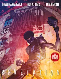 As a bonus, I’d like to include Big City Map, a GIS mapping project that mapped the comic Brotherman, by Guy Sims (Author), Dawud Anyabwile (Illustrator), Brian McGee (Illustrator). While it’s not using data visualization to advance the plot, it’s still a really cool use of data visualization and the world of literature.
These are just seven books that employ data visualizations in the forms of graphs, line charts, xy plots, flowcharts, and more to help tell their stories. As data visualizations continue to be integral to our society, I expect we’ll see even more innovative ways of storytelling with these tools. I can’t wait to see what happens next. Want books on data science? Here’s a great list of data science books to get you started.


 The Life and Opinions of Tristram Shandy, Gentleman
 Christie Malry’s Own Double-Entry
 An Abundance of Katherines
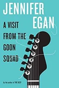 A Visit from the Goon Squad
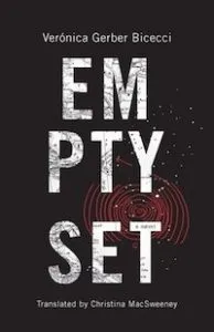 Empty Set
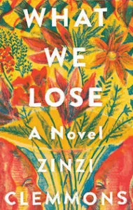 What We Lose
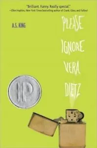 Please Ignore Vera Dietz


