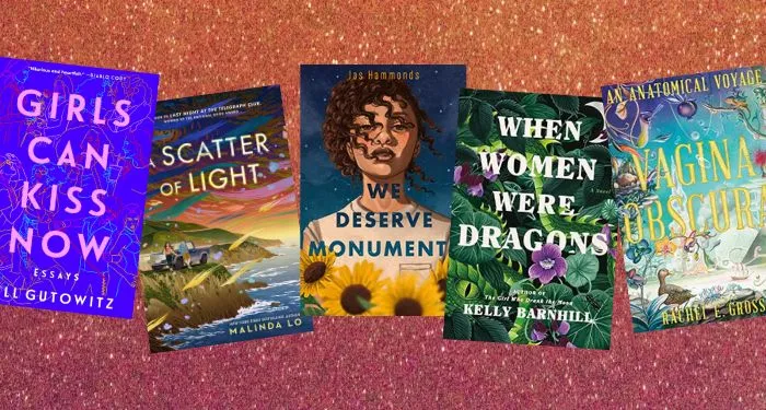
The Best Book Covers of 2022
What are the best book covers of 2022?
Where 2021 was the year of the book blob, this year there’s been both a push back against the cover design trend, as well as a movement away from it being the defining book cover design of the year. Certainly, there are still the colorful blobs, but they’re not as abundant as they were just a year ago. And despite what design blogs have speculated to be the cover trends of 2022, the reality is, no single trend seems to define this year. A lot of what we’ve seen play out in previous years continues on this year, making it especially interesting to consider what the best designs were in 2022.
What goes into determining a good book cover is both subjective and objective. It’s subjective in that it’s going to appeal to some readers more than others, especially if those readers have a proclivity for certain aesthetics: illustrated vs. photographic, single images vs. montages, stark covers vs. busy covers, covers which are font driven vs. those which aren’t. It’s also objective: good art is good art, and for books particularly, good art makes a book come off the shelf. It sells the story, and objectively good art both stands out and fits in. Readers who like a certain type of story can use cover art to find their next read, as much as those covers can help elucidate a book’s genre, tone, and mood.
We’ve rounded up our picks for the best book covers of 2022. They include something for everyone, with books from across genres and styles.
All of the covers below include credit to the design team, as best as finding that information is possible. This is the annual reminder that information should be easily available on author websites, publisher websites, and other ready sources for readers.
The Best Book Covers of 2022
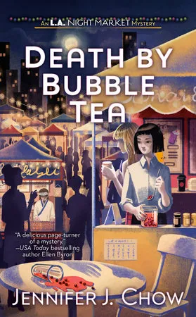
Death by Bubble Tea by Jennifer J. Chow, cover art by Jane Liu
The first time I saw this cover, I gasped. It embodies how reading a cozy mystery feels and is one of the best executed covers I’ve seen for a book within that genre. The setting and color scheme bring in a fun and inviting feel, but then you get to the expressions on the main characters’ faces. You realize that there is more to this scene than meets the eye, and that something serious is about to happen.
—CJ Connor
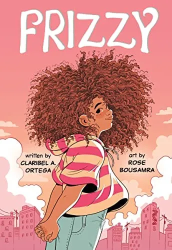
Frizzy by Claribel A. Ortega, illustrated by Rose Bousamra
I preordered this graphic novel the second that option was available based solely on my reaction to the cover. Look at this beautiful Latina girl and her gorgeous hair! I love the way her shirt and background are the same color story in such a lovely pastel mood, and her hair gets its shining moment.
—Jamie Canavés
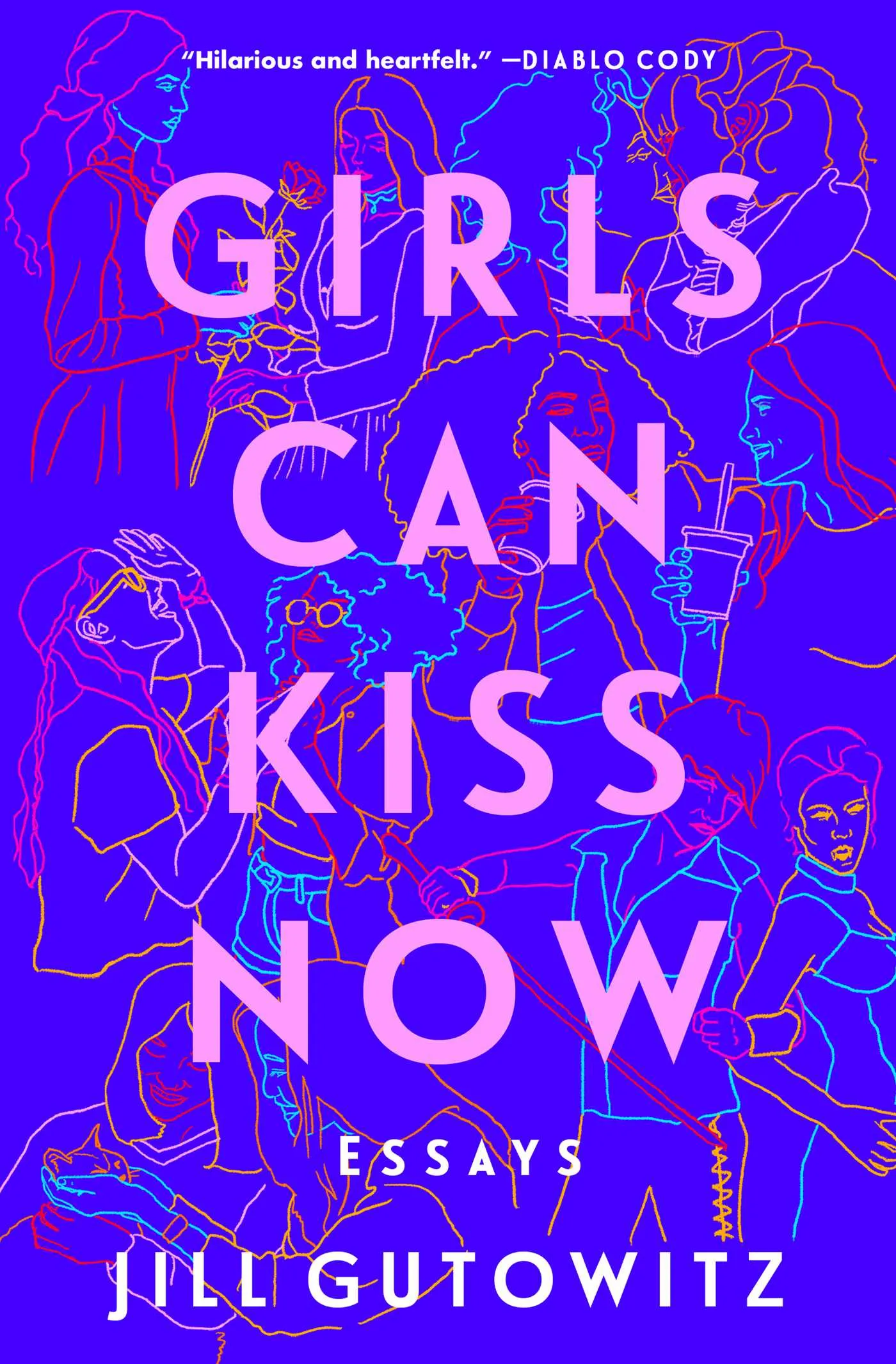
Girls Can Kiss Now: Essays by Jill Gutowitz, designed and illustrated by Kelli McAdams and art direction by James Iacobelli
I tend to love a simple but bold book cover, and this essay collection certainly has a striking title clearly displayed. But the real beauty of this cover is in the details. When you look closely, there’s so much more to explore. The color combinations really pop, and I could spend a long time looking at the illustrated figures acting as the backdrop for this cover. Stunning cover art — and it’s a great essay collection too! Funny and moving and nostalgic in all the best ways.
—Susie Dumond
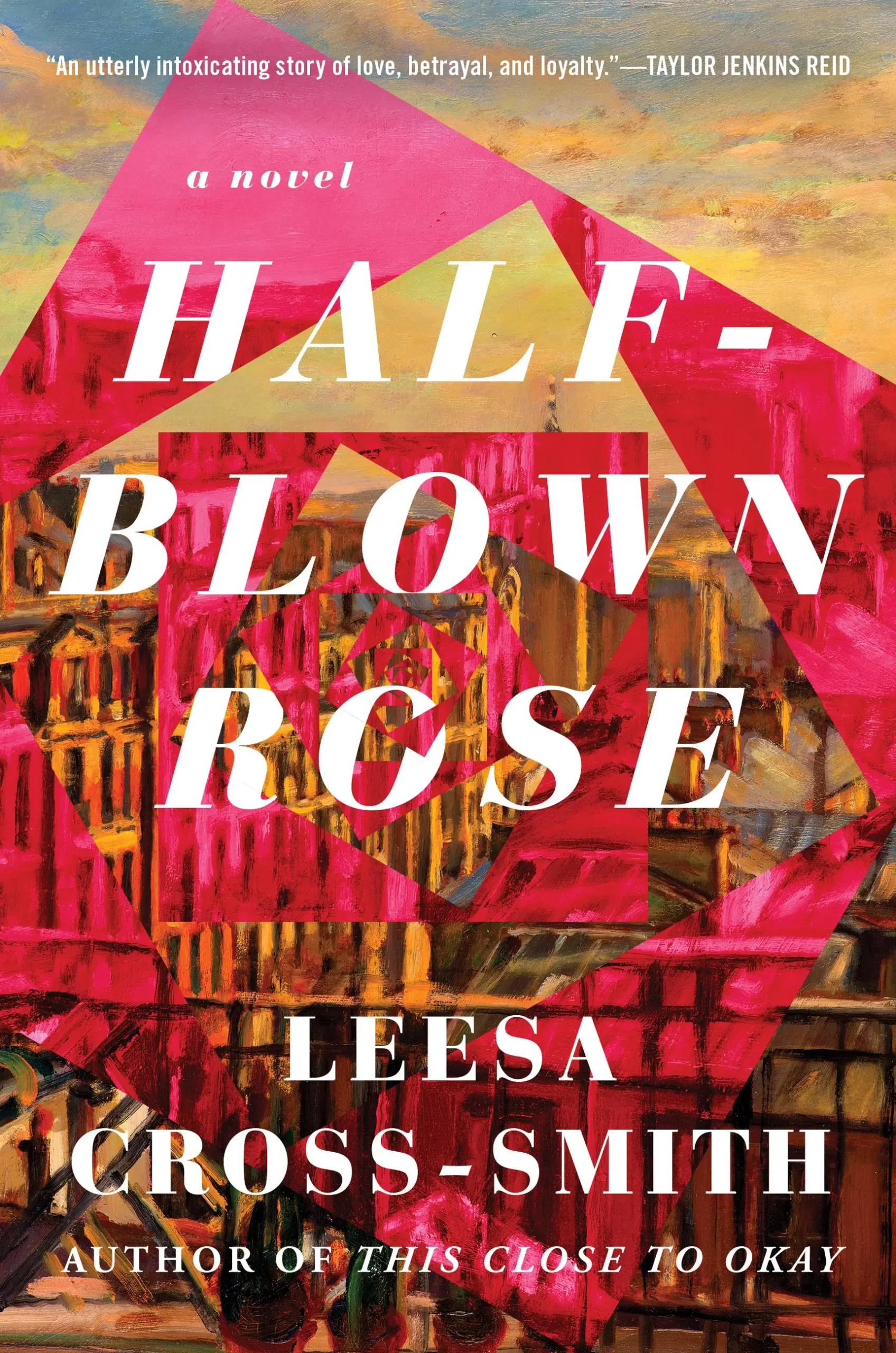
Half-Blown Rose by Leesa Cross-Smith, cover design by Laywan Kwan
In a world of blobby book covers, I really appreciate the angularity of this one. I also appreciate how much it communicates about the story. First, you see the titular rose, which is actually a reference to Jane Eyre. That reference speaks to the self-determination of Half-Blown Rose’s protagonist Vincent. Then you see a cityscape, and that’s the Paris backdrop of this lush and leisurely novel. Third, you can notice the painterly effects that blend the city into the rose; Vincent’s art career has brought her to Paris. It’s romantic, artistic, and positively dreamy.
—Isabelle Popp
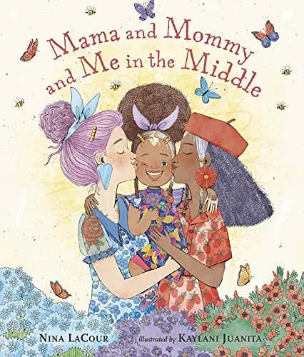
Mama and Mommy and Me in the Middle by Nina LaCour, illustrated by Kaylani Juanita
I’ve read every single one of illustrator Kaylani Juanita’s children’s books, but this one is my favorite. Her cover illustration for it makes me immediately melt. It’s the absolute sweetest, so soft and beautiful, and it perfectly encapsulates the book.
—Margaret Kingsbury
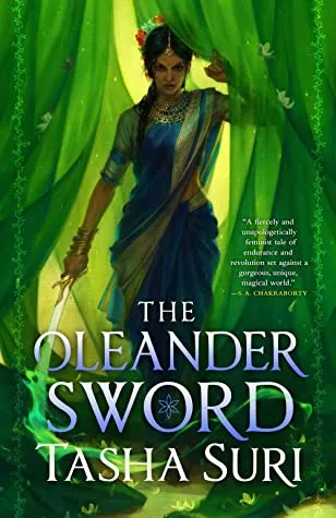
The Oleander Sword by Tasha Suri, cover design by Lauren Panepinto and illustrated by Micah Epstein
The cover is giving female rage and retribution and I am here for it. The green flame from the sword cuts directly through the O on the cover and licks around the author and title. I just love it all, from the small flower details on the curtain to the impeccably drawn outfit and the thin border of vines that frame the cover.
—R. Nassor
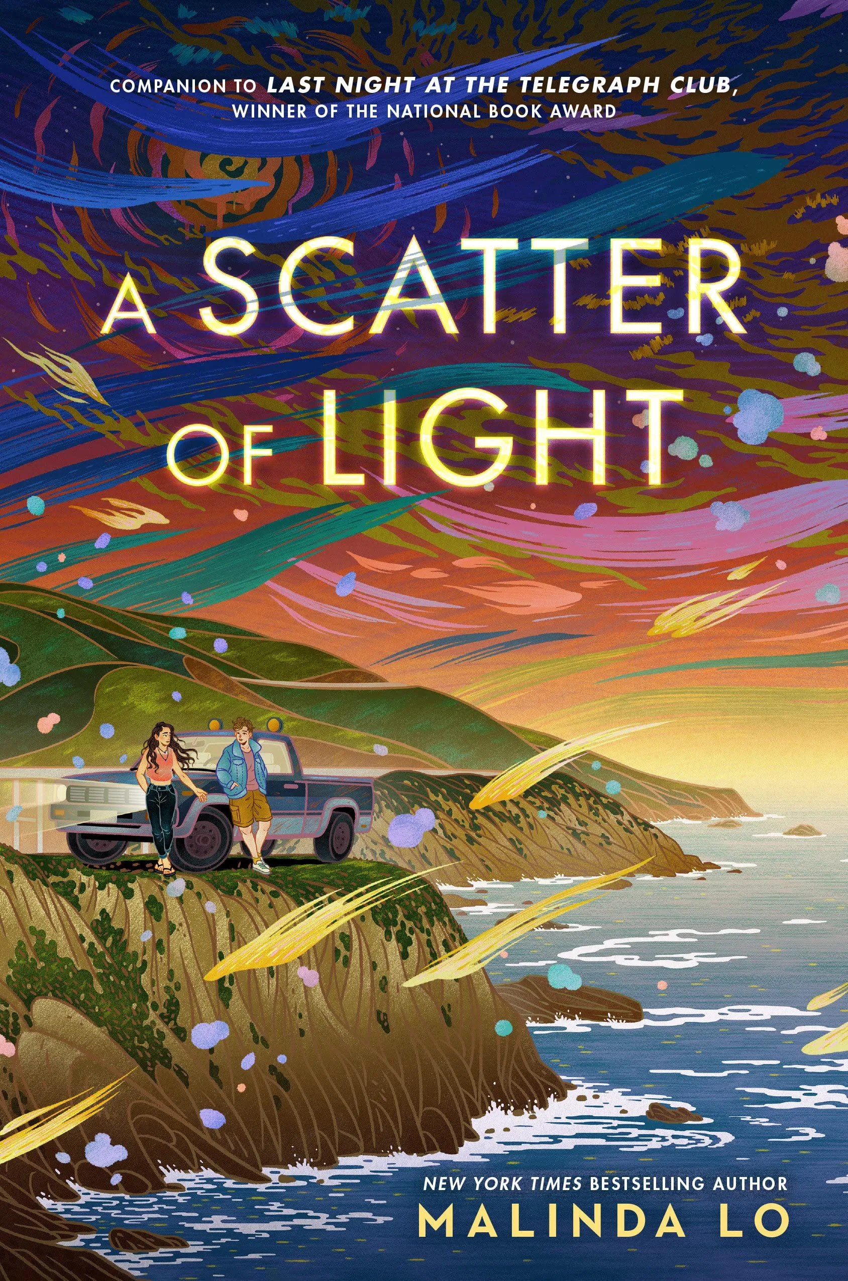
A Scatter of Light by Malinda Lo, designed by Anna Booth, art by Feifei Ruan
My favorite cover of last year was Last Night at the Telegraph Club by Malinda Lo, so it should come as no surprise that Lo’s new book is this year’s favorite. First of all, there’s just how immediately striking it is because of how colorful it is, and how the swooping lines add an abstract element — which ties into art mentioned in the book. And, of course, I have to mention the truck, because I wrote a whole post called Why Are There So Many Pickup Trucks in Queer YA Books? What really gets me, though, is this specific moment frozen in time on the cover: Aria reaching out towards Steph, Steph looking at her hand. At this precise moment, it’s impossible to tell whether Aria will have this affection returned, and it’s such a yearning, vulnerable tableau.
—Danika Ellis

The Shadow Glass by Josh Winning, cover design by Julia Lloyd
This cover perfectly evokes nostalgia for ’80s fantasy cult classics like Labyrinth and The Neverending Story. The fake wearing around the spine and the gorgeous silver title font give it a sense of authenticity. It would not feel out of place as a movie cover next to real films from that era. My one complaint is that because the cover (and the story itself) was so enticing, it made me wish The Shadow Glass was a real movie so I could watch it!
—CJ Connor
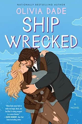
Ship Wrecked by Olivia Dade, cover design by Diahann Sturge
If every illustrated clinch cover was this good, there would be no need for other designs. The gorgeous blue background allows both the characters and the lettering to pop on the cover. Having two fat protagonists with undeniable chemistry on an illustrated romance cover is excellent in and of itself, but when it is this well done, you have to celebrate it.
—R. Nassor
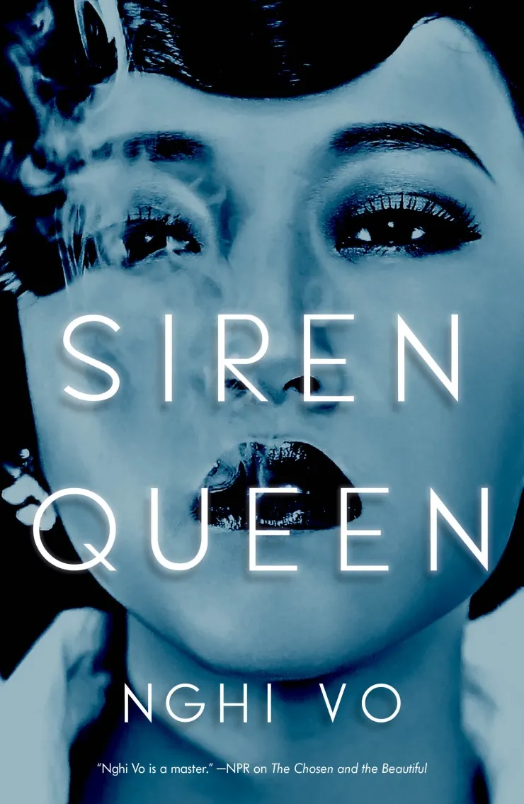
Siren Queen by Nghi Vo, cover design by Julianna Lee
Sometimes a “simple” cover is by far the most effective. They could have leaned into big, intricate golden age Hollywood patterns and illustrations, all glitz and embossing and glitter. But instead they went for this. A dreamy, blue-silver overlay. A gorgeous woman who you know instantly is a Hollywood starlet, but she holds your gaze with a challenge in her eyes. Smoke leaking out of lipstick lips. How can you not pick up this book? Genius.
—Leah Rachel von Essen
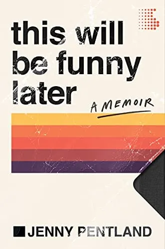
This Will Be Funny Later by Jenny Pentland, cover design by Robin Bilardello
It has been a bang-up year for celebrity memoirs, and Pentland’s book is among them (though maybe near-celebrity is a better label for her specifically).
In addition to the stories being bang-up, the covers have been, too. I love this simplicity of this ’90s VHS style cover. It’s nostalgic, while also being very much of the era when Roseanne was a huge hit. The color palette is perfect, the lower-letter titling evocative, and its pop culture roots clear.
—Kelly Jensen
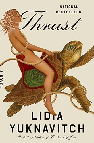
Thrust by Lidia Yuknavitch, cover design by Lauren Peters-Collaer
This illustration is absolutely wild, and I say that with the deepest love, because so is this book. This novel is about portals, time travel, and the threat of climate change. It’s queer and weird and kinky and shows all the ways we could rewrite our world if we paid attention to the voices of the marginalized people throughout history. This cover fits all of that perfectly — from the copper coin-like head to the turtle to that coiling, twisting rope, not threatening but connecting, embracing — and I love it.
—Leah Rachel von Essen

Vagina Obscura by Rachel E. Gross, cover art by Armando Veve
The longer you look at this futuristic cover for a book about the vagina, the more incredible it becomes. The details are out of this world, the allusions clever, and of course, the thoughtfully-placed vulvas a true delight. The colors are perfect, and even if the book’s content weren’t enough to sell you on it, the cover and title certainly would. Rarely does narrative nonfiction look like this.
—Kelly Jensen
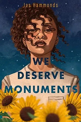
We Deserve Monuments by Jas Hammonds, cover design by Beth Clark and Sarah Kaufman, art by Laylie Frazier
This is one of those covers so beautiful that I would hang it as art in my home. It’s visually stunning, with beautiful colors and movement and depth. I’m so glad this YA novel about a queer, biracial teen searching for herself amongst family turmoil got a cover as gorgeous as the book itself.
—Susie Dumond
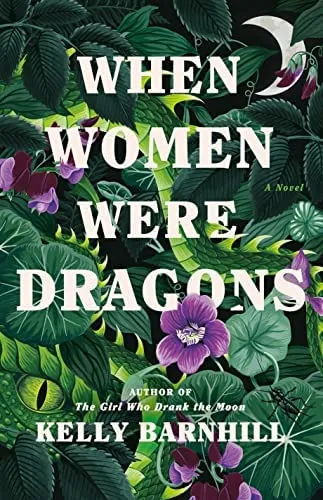
When Women Were Dragons by Kelly Barnhill, cover design by Emily Mahon, art by Charlotte Day
The way it’s just so green! The scales amongst the leaves! The pops of color provided by the flowers and the stark contrast of the white lettering! I love everything about this cover.
—Annika Barranti Klein


