
Why are Books That Shape? From Codices to Kindles, Why This Rectangle Stays Golden
This content contains affiliate links. When you buy through these links, we may earn an affiliate commission.
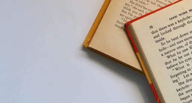
Anyone who has ever tried to organize their bookshelves can tell you that books are not a standard size. In fact, even books that fall under the same category (mass market paperbacks, trade paperbacks, hardcovers) can vary wildly. It makes a perfectly matched shelf very difficult.
 Despite all of those different sizes, though, almost all books have a certain proportion. From books that could hang off your keychain to dictionaries you can hardly lift, they are almost always rectangles taller than they are wide, at around the same proportions (width:height of about 5:8). And this isn’t a new invention of mass printing: according to The Book by Keith Houston, the oldest books in the world have about the same proportions, though they were often slightly taller than our books now.
Why is that? Although triangular books are pretty silly, why isn’t it more common to have square books? Or long rectangles? Why does this particular rectangle set the standard? It turns out that there are a lot of forces converging to make this shape ideal, and to get the whole picture, we’ll have to look from three angles: the anatomy of a reader, the history of publishing, and—in a brief departure from the world of books—the magic numbers behind printing.
Despite all of those different sizes, though, almost all books have a certain proportion. From books that could hang off your keychain to dictionaries you can hardly lift, they are almost always rectangles taller than they are wide, at around the same proportions (width:height of about 5:8). And this isn’t a new invention of mass printing: according to The Book by Keith Houston, the oldest books in the world have about the same proportions, though they were often slightly taller than our books now.
Why is that? Although triangular books are pretty silly, why isn’t it more common to have square books? Or long rectangles? Why does this particular rectangle set the standard? It turns out that there are a lot of forces converging to make this shape ideal, and to get the whole picture, we’ll have to look from three angles: the anatomy of a reader, the history of publishing, and—in a brief departure from the world of books—the magic numbers behind printing.
 The other crucial piece of human anatomy that comes into play while reading is our hands. The proportions of a book look pretty similar to that of our hands, which makes sense because they should fit together. While the first books being bound were usual put on pedestals to be read, books now are meant to be held, which means they should be optimized to that shape—which may also explain how books have gotten shorter since their first incarnations.
 Despite all of those different sizes, though, almost all books have a certain proportion. From books that could hang off your keychain to dictionaries you can hardly lift, they are almost always rectangles taller than they are wide, at around the same proportions (width:height of about 5:8). And this isn’t a new invention of mass printing: according to The Book by Keith Houston, the oldest books in the world have about the same proportions, though they were often slightly taller than our books now.
Why is that? Although triangular books are pretty silly, why isn’t it more common to have square books? Or long rectangles? Why does this particular rectangle set the standard? It turns out that there are a lot of forces converging to make this shape ideal, and to get the whole picture, we’ll have to look from three angles: the anatomy of a reader, the history of publishing, and—in a brief departure from the world of books—the magic numbers behind printing.
Despite all of those different sizes, though, almost all books have a certain proportion. From books that could hang off your keychain to dictionaries you can hardly lift, they are almost always rectangles taller than they are wide, at around the same proportions (width:height of about 5:8). And this isn’t a new invention of mass printing: according to The Book by Keith Houston, the oldest books in the world have about the same proportions, though they were often slightly taller than our books now.
Why is that? Although triangular books are pretty silly, why isn’t it more common to have square books? Or long rectangles? Why does this particular rectangle set the standard? It turns out that there are a lot of forces converging to make this shape ideal, and to get the whole picture, we’ll have to look from three angles: the anatomy of a reader, the history of publishing, and—in a brief departure from the world of books—the magic numbers behind printing.
Anatomy of a Reader
The first factor in deciding the size of the book is looking at the user of this object, which—as far as I can tell—is 100% humans. We read by flicking our eyes back and forth over the text (“saccading”), and our eyes can only handle a certain length of line: too long and they get lost on the way back to the next line; too short, and we waste a lot of time and distract ourselves by flicking between lines too quickly. In The Elements of Typographic Style by Robert Bringhurst, he sets this limit at 45–75 characters per line, with 66 being ideal. This is the same reason that wider publications, like newspapers and magazines, set text into columns, although they have their own standards of what a perfect line length is. The other crucial piece of human anatomy that comes into play while reading is our hands. The proportions of a book look pretty similar to that of our hands, which makes sense because they should fit together. While the first books being bound were usual put on pedestals to be read, books now are meant to be held, which means they should be optimized to that shape—which may also explain how books have gotten shorter since their first incarnations.
The History of Publishing
Speaking of early books, to really understand how books became the shape they are, we have to delve into the history of publishing. Before books, there were scrolls, and although many of these scrolls read from top to bottom continuously (most Greek scrolls), some read from left to right in columns (most Egyptian scrolls). By folding between these columns and stitching them together on one edge, the first codices were created, which were the precursor to the modern book.These early codices of course relied on the original scrolls to determine their size. Typology of the Early Codex by Eric Turner analyzed 892 books made between the 1st and 6th centuries, and found that their sizes were mostly dictated by the height of their original scroll and the codex creators’ “dislike for the overlapping joints between the pasted-together sheets of the scrolls.” These codices were beginning to look like books, and they were already around the right shape, but they still weren’t what we’d think of as an average book. A History of Book Illustration by David Bland notes that the original 1st century codices were in columns—usually 4 of them—but by the 4th century, each page was only 2 columns, and sometimes just one. There were practical considerations for the size of each page. Books were rarely wider than they were tall, because that would put too much strain on the spine (Houston). Houston also mentions a possible consideration was in the size of the vats where the original paper was made, before it was folded into pages, and which couldn’t exceed the arm span of the vatman.
Although I stick by books being designed around human being’s anatomy, there are actually a few other species that played their part. In the switch from papyrus to parchment, this meant using goat, cow, and sheep skins, which—when trimmed of their curves—are rectangular. They also fold easily into four folio quires, which are neatly arranged with flesh against flesh and hair sides facing each other. (Thank you for that gruesome tidbit, Houston.) Book sizes at this time were usually referred to by the number of times the original paper was folded, though because those original pieces of paper varied, this didn’t tell you much about the actual size of the volume. (In 1398, Bologna, Italy, had a carved stone with the standard page sizes displayed. This very academic website refers to the “Bologna stone” with a straight face, which I cannot handle.) Most books published before 1500 were “quartos” or “folios,” which means they were very large books. They were a luxury item, and weren’t meant to be portable. Houston describes how Manutius began to print “handbooks” or “portable books” in 1501, pioneering and popularizing the “octavo” that we still use today. (He also cut out the overwhelming amount of publisher and editor commentary, and invented italics!) By that time, books looked pretty similar to what we have now. Not just the right general proportions, but also the handheld size that we have come to expect. It’s not just anatomy and history, though. There’s one more class we have to take to understand the “golden” rectangle that is the book: math class.
The Magic Numbers of Books
I will freely admit: I am not a numbers person. In fact, when researching this post, it took me totally off guard to realize that there was a mathematical answer to why books are shaped that way. If you want a deeper introduction to this topic, swing by the Wikipedia “Canons of page construction” page. (Yes, even the Wikipedia page intimates me.) Here’s the short answer, though: there are some proportions that are either mathematically practical for a page to be, or are considered the perfect proportions aesthetically. In Divina Proporción Tipográfica (“Typographical Divine Proportion”), Raúl Rosarivo took a drafting compass to Renaissance era books and concluded that they followed a “golden canon of page construction.” This “golden number,” or “secret number,” was 2:3. This also served to divide the pages into ninths, which made margins easy to fix—though the margin on the bottom is wider than the one on the top. This can be argued as a plus, though, because this allows a book to be held from the bottom without obscuring the text (Paul Renner in Paul Renner: The Art of Typography by Christopher Burke). This isn’t the only “golden” math happening, though. While Rosarivo’s golden number is 1.5, the golden ratio is about 1.618, and it also surfaces in book design, from the Gutenberg bible to British Penguin paperbacks (Houston). The golden ratio is not just used in book construction, though: it’s observable in nature and is used in art, architecture, and even music.Personally, though, I am less of a fan of these “golden” proportions and instead embrace the Pythagorean Constant. This is the square root of 2*, and when used in printing, it means that a page can be folded in half infinitely without losing its proportion (Institut d’Histoire du Livre). Considering that books are made by folding a larger piece of paper and then binding the edges, this seems like good reasoning to me. This is the proportion that goes into A sizes of paper, which are the standard sizes of printer paper in most of the world, other than the U.S. and Canada (Houston). I can now tell you that I have opinions about the standard sizes of printer paper in Canada, which is a new development. And that wraps it up for what makes books the size they are! As for Kindles, their proportions range depending on the model, but the Kindle 2 was almost exactly Rosarivo’s “golden number,” and the current Kindle Paperwhite is just barely over Pythagorean’s Constant. Books (and ereaders) continue to shift around in size slightly, but between the anatomy of their readers, the realities of printing, and the aesthetic and practical consideration of the math involved, these rectangles are here to stay.
Works Referenced:
- A History of Book Illustration by David Bland
- The Elements of Typographic Style by Robert Bringhurst
*Editor’s Note: Revised from 2 squared