Why SAGA Is Such An Effective Gateway Comic
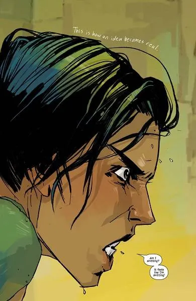
“Am I shitting? It feels like I’m shitting!” What a welcoming to the world of comic book storytelling. Recently, I was talking to a friend who got into reading comics through Saga. Anyone familiar with the works of Brian K. Vaughan would hardly be surprised by this, as he’s basically the medium’s equivalent of an after-school special drug pusher who’s more than happy to offer up that first free hit to get you coming back for more.
Even more than just the immediately compelling, and preconception-upending nature of the story itself, it’s the level of craft on display from artist Fiona Staples that lures one in with her siren song of comic storytelling craft. Beyond creating exceptionally expressive and naturalistic characters, the way she lays out and paces the story is deceptively brilliant and done so in a manner that teaches you how to read comics almost subconsciously. Obviously, the rich characters and depth of world-building in this science fiction Romeo & Juliet are the nicotine of Saga, but the subtlety of Staples’ approach is the key to that addictive hit. So, I decided to go back and look under the hood of the first issue of this lauded gateway to the medium for so many to see what it is that works so effectively in drawing people into comics for the first time.
Flipping expectations on their head, Vaughan and Staples open the first issue with a swear-filled and undeniably funny splash page; the aforementioned “shitting” quote uttered by Alana. If your preconceived notion of comic books is muscly dudes in spandex punching things while spouting corny quips, well, this pretty clearly lets you know this ain’t that kinda party. Opening with a splash page is often a smart way to instantly engage with a reader, and for someone who perhaps isn’t well acquainted with the flow of reading panels, a great “in” to the story. The only thing to digest here is a disarming handwritten font of a narrator, Alana’s beautifully rendered look of intensity, and of course, the humorous and unexpected proclamation of how she’s legitimately unsure if she’s having a bowel movement. Take note, too, that the color palette here utilizes a gradient of yellow, a radiant color that often instills a sense of optimism and joy. It’s soothing, reminiscent of the sun’s rays, and a welcoming entry into the unfamiliar that contrasts well with the apparent distress of the character in the intense foreground that incorporates a lot of green, an analogous color to the dominant yellow that makes for a soothing and naturalistic match. That might all sound boring, I get it, but everything about this opening page is working towards pulling you in and getting you comfortable even as it’s trying to defy expectations.
I was really curious if my friend found following the flow of panels difficult or intuitive, as a common complaint I hear from non-comics readers is that they don’t know what order to read them. She told me she didn’t at all and now looking through the first issue, it’s pretty clear why that was: Staples keeps it deceptively simple. Saga #1 consists of forty-four pages, with four full-page splashes, one double-page splash, and thirty-eight multi-panel pages. Of those multi-panel pages, none of them are ever more than five panels. The result of this is a quick pace that pairs well with Vaughan’s pithy dialogue and prevents any stuttering of crowded pages that feel like a slog. It just moves. There aren’t any tricky layouts, like a multitude of stacked panels on one side running opposite a tall single panel, or elaborate double-page spreads with multiple panels making it unclear if you should read left to right or up and down. Instead, Staples largely riffs on variants of the five-panel grid, almost always allowing for one larger panel to let the page breathe.
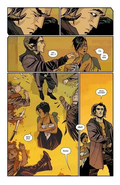
Page fifteen is about as tricky as the layouts get and it’s still remarkably intuitive. What it also demonstrates is one of my favorite examples of comic book magic; namely, the way comics can play with time. The top two panels exist in a short beat, but allow the reader to take as much time as they need to be in the moment. Obviously, Marko opens his eyes in a matter of seconds, the setting and circumstance dictate that, but it effectively reinforces the transition from panic to uneasy surprise that pull the reader in to empathetically relating to Marko in the moment where he thought his whole family was about to be mowed down in a hail of magic and gunfire only to discover all is seemingly okay. That panel transition allows you to take all the time you want in living in that moment in-between; that magic space called the gutters where the reader dictates the laws of time and physics. The large fourth panel creates an establishing shot that informs you of the current state of the characters’ surroundings, but then plays with time again in a completely different way by having the word balloon overlap the gutter between the two panels, forcing you to quickly move on to the next one without giving you room to breathe. That balloon bridges the two panels together in a way that you have to move immediately into the new space and introduces you to the way comics are read in a really subtle way.
Additionally, that final panel is a good example of a “page-turn reveal,” where the final image indicates that characters see something that you, the reader, don’t and the only way to experience this same information is to turn the page and keep reading without stopping. It’s a technique that sounds simple, and it is, but it’s one that’s pretty unique to comic book storytelling. The closest relative to this might be a chapter-to-chapter transition in novels, like where R.L. Stine will tell you there’s a hideous monster at the front door coming to murder everyone only to begin the next chapter by confirming that it was in fact just the protagonist’s little sister in a mask, you idiot. In comics though, it happens multiple times a chapter (i.e. an issue) and controls the tempo at a near subconscious level. This one page might not seem like an all-important linchpin to the issue, but it delivers a lesson in pacing, gutters, page-turns, and layout with aplomb.
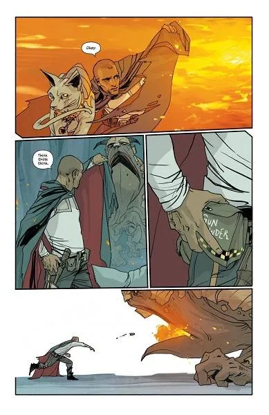
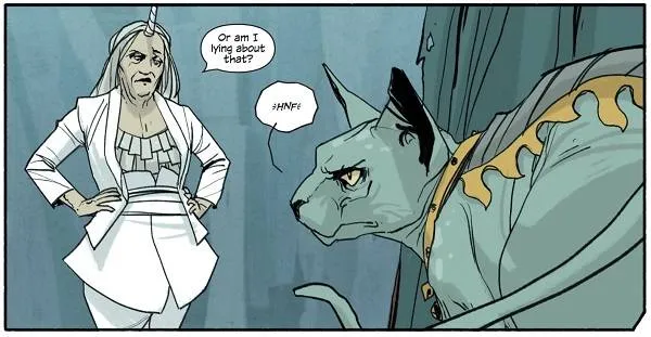
There’s a lesson on every page of Saga #1, but it’s never homework. You don’t even know you’re learning a new language if you’ve never engaged with comics before. Throughout the issue, you’ll see all manner of techniques at play, like the different types of transitions Scott McCloud lays out in Understanding Comics: The Invisible Art, a must-read for comic craft nerds (shout out to my peoples!). In fact, the sequence introducing The Will and Lying Cat basically utilizes every type of panel-to-panel transition there is. I won’t bore you further by pointing out an example of each, but go back and take a look at those seven pages and notice how panels flow into one another all the while distracting you with the substance of a badass galactic hitman and his lie-detecting giant cat. It’s like a sleight of hand where Vaughan and Staples are putting the fun stuff right in your line of sight (jokes, action, bizarre creatures), while doing a bunch of trickery in the background (playful perspective, five types of transition techniques, balloon placement) to make it seem like natural magic.
At the end of the day, Saga is as heralded as it is because the story is phenomenal, the characters are lush with depth, Staples’s art is beautiful, and there’s a giant cat that calls people out on their bullshit. It has served as an “in” for many comic book novices and it’s no wonder why after taking a brief look back at the first issue; it packages all of the technical nuance inherent to the medium in a subtle and instantly engaging larger than life tale. Vaughan and Staples show you everything that’s great about comics without you even realizing that’s what they’re doing.


