By the Cover: Elizabeth H. Clark, Associate Art Director at Roaring Brook Press & FSG
This content contains affiliate links. When you buy through these links, we may earn an affiliate commission.
 There’s a lot that goes into the production of the books you love, you know, in addition to all the writing. Publicity, sales, editorial, production… there are so many parts that come together to make a book happen and get it into your favorite local bookstore. And there’s one in particular we notice quite often, but never really dig deep into.
The cover.
Just who is it that makes our books look so lovely? Can you tell when a book is designed by a particular designer or illustrator? You’d be surprised. Welcome to By the Cover, where I’ll be spotlighting some of those artists that make your books look so gorgeous.
ELIZABETH H. CLARK is the Associate Art Director for Roaring Brook Press and Farrar, Straus and Giroux. She also spent some time designing books at Hyperion, and has worked on titles by Lindsay Smith, Samantha Bee, and New York Times bestselling author Leila Sales.
Let’s get to know her!
How did you get your start, working in publishing and designing books?
I’ll be honest: I got lucky as hell. I graduated from Boston University’s School of Fine Arts a couple years after 9/11 when jobs were scarce, and every time I sent out my resume, I felt like I was shooting it into a black hole. I wanted to stay in Boston, but I quickly learned that if I was serious about finding work, I’d have to step out of my comfort zone.
After months of radio silence, I landed an interview at Disney Publishing Worldwide in New York City, where I was eventually offered a position as an assistant book designer for Hyperion Books for Children. I’m pretty sure my knees buckled when I got the phone call.
I had the good fortune to design at Disney Publishing for seven years, steadily moving up the ranks into a senior position. From there I moved into an associate art director role at Alloy Entertainment, a high-profile book packager that publishes with a number of houses in the city.
And about three years after that, I landed my job here at Macmillan Children’s as an associate art director for Roaring Brook Press and Farrar, Straus and Giroux.
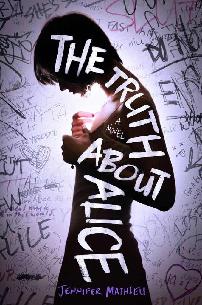 Do you have a favorite project in particular? What about it made it so special?
Last year I designed the cover for The Truth About Alice, a YA novel by Jennifer Mathieu, about a high school student who triumphs over being bullied and slut-shamed. The themes are pretty heavy, so I wanted to create a package with an immediacy and grittiness to it, but that still felt approachable for young readers.
Here, I like how the softness of the girl’s pose sits against the harsh graffiti background. Creating the graffiti was also a lot of fun—I wanted it to look authentic, so I collected handwritten samples from my coworkers and Photoshopped them together until they looked like something you’d see in a bathroom stall.
I still have a hilarious pile of dirty words and phrases tucked away in my desk drawer.
How many books do you find yourself working on each year? Do you often get a chance to read the entire book before working on a cover?
I design about 30 books a year and roughly two-thirds of those titles are young adult. It’s important to read as much of the manuscript as possible because a good cover captures more than just the content of the book: there’s also the mood, the tone, and the author’s voice.
But if ideas start popping into my head halfway through a manuscript, I’ll put it down to start exploring; and on rare occasions, I’ll have to read the book twice before I know where to begin
Does it matter if you don’t fall in love with the book?
The most important things in my process are a story with strong imagery to draw on and a great title to work with. In general I’m not a huge fan of fantasy, but if you give me the opportunity to put a badass-looking dragon on the cover of a book? I’m so ready for that.
How many mock-ups and comps do you generally whip up, before leading up to your final?
This varies from project to project, but like most designers, I’m aiming for quality over quantity. I’d much rather present a small number of strong, unique comps that I believe in, than a variety of half-hearted ones. At the best of times, I’ve created only three comps and had them immediately narrowed down to a favorite, which ultimately became the final cover. At the worst of times, I’ve created over fifty, and then, even after the final cover was approved, been asked to start completely over. This is when it’s most important to remind myself: I LOVE MY JOB. And I really do.
Any advice for aspiring book designers?
No one goes into publishing to get rich quick, so my best advice is to be patient.
Designing books is a pretty specialized skill, so if you start early and market your talents, in time you’ll get noticed and be rewarded. Be proactive and advocate for yourself; if you hear about an upcoming project that interests you, ask your creative director if you can take a stab at it. Ask to work on a variety of books early on, and devote yourself equally to every kind of project that you’re assigned. If you only excel in one genre of book, you’ll only get assigned that genre, and then your portfolio will lack diversity.
Lastly, remember that your inexperience is also your superpower. Hiring a recent graduate into an existing design team is educational for both sides. There’s a lot of value in being green, especially in children’s books—the younger you are, the closer you are to the target audience. Share your knowledge of today’s YA reader and what you think is trending, school people in new Photoshop tricks, and blow everyone away with your fresh, young ideas. It’s only a matter of time before you turn into a corporate robot like the rest of us.
Just kidding. Sort of.
Do you have any favorite unused covers you can share with us?
Honestly, I consider myself very lucky to work at a place where the strongest cover usually wins. But there are a few concepts I hope to revisit one day, if a fitting title comes along. A girl can dream, right?
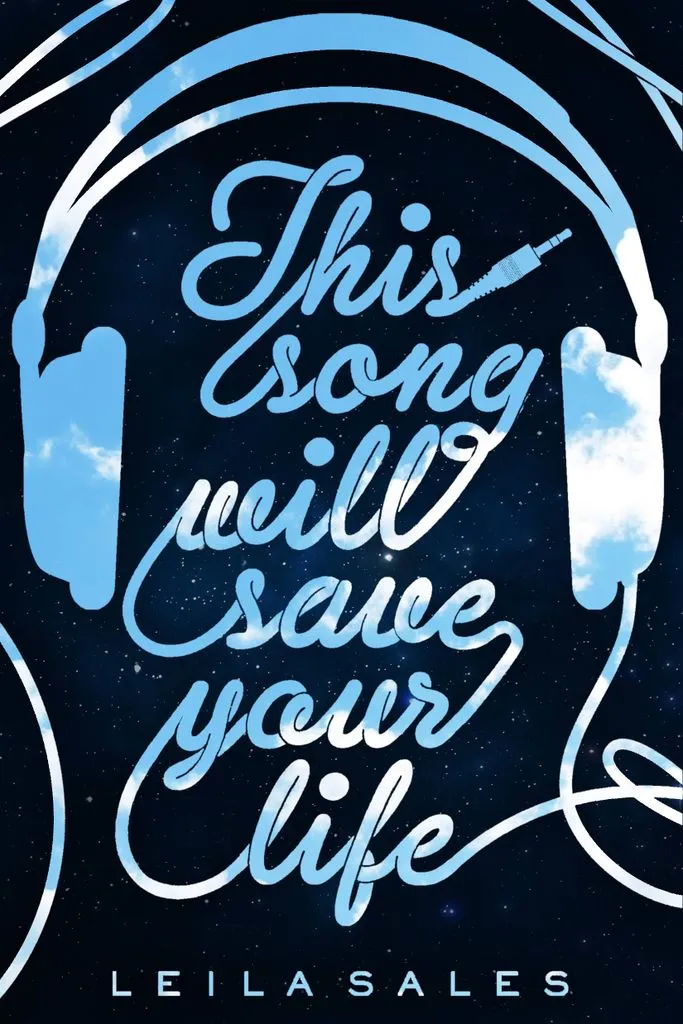 This Song Will Save Your Life: I thought this was a fun, graphic approach, but the sales team was concerned with legibility. Sometimes it’s hard to hear feedback that’s totally legitimate.
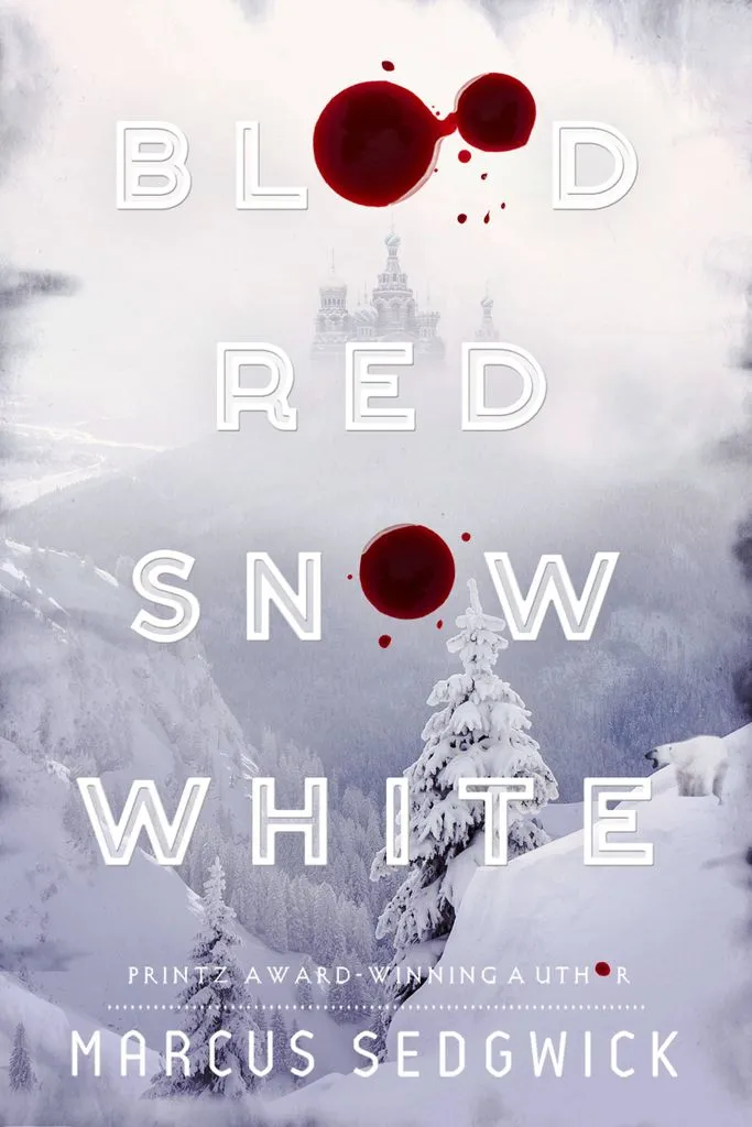 Blood Red Snow White: This comp never got its feet off the ground for a number of reasons, but I still think it’s pretty.
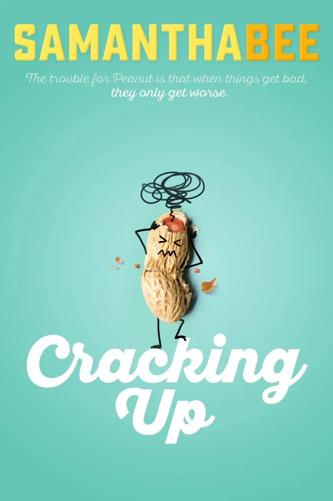 Cracking Up: Losing this battle early on was a blessing in disguise—there’s already a peanut cover on the shelves right now. Inevitable heartbreak.
And finally, can you show us some of your favorite projects? We’ll share them below.
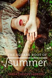
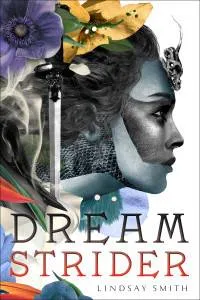
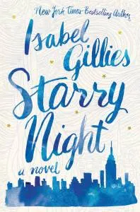
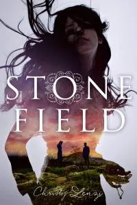
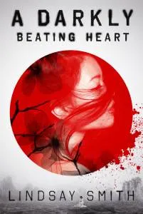
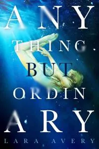
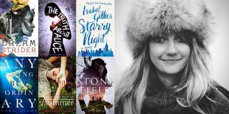
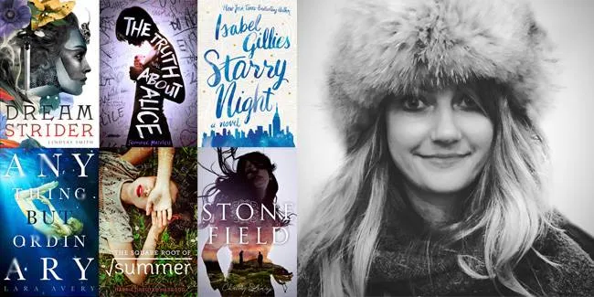
Yes! Dreamstrider by Lindsay Smith, Starry Night by Isabel Gillies, Stone Field by Christy Lenzi, Anything But Ordinary by Lara Avery, Square Root of Summer by Harriett Reuter Hapgood, and A Darkly Beating Heart by Lindsay Smith.


