Oyster for iPad: An Early Review and Tour
About a month and a half ago, Jeff gave us an early review of Oyster – the new service that functions as a Netflix for ebooks. At the time it was invite-only, and also only available as an iPhone app. A lot has changed in between then and now, including the launch of an iPad app. This was crucial to the early success of Oyster, as most people won’t be reading full-length books entirely on their iPhones. It’s also now open to the public, and I wholeheartedly recommend getting yourself an account. Like Netflix, it’s free for the first month, and then $10/month thereafter.
I’ll give a few notes on the user experience as a whole, and then give you a quick tour of the app.
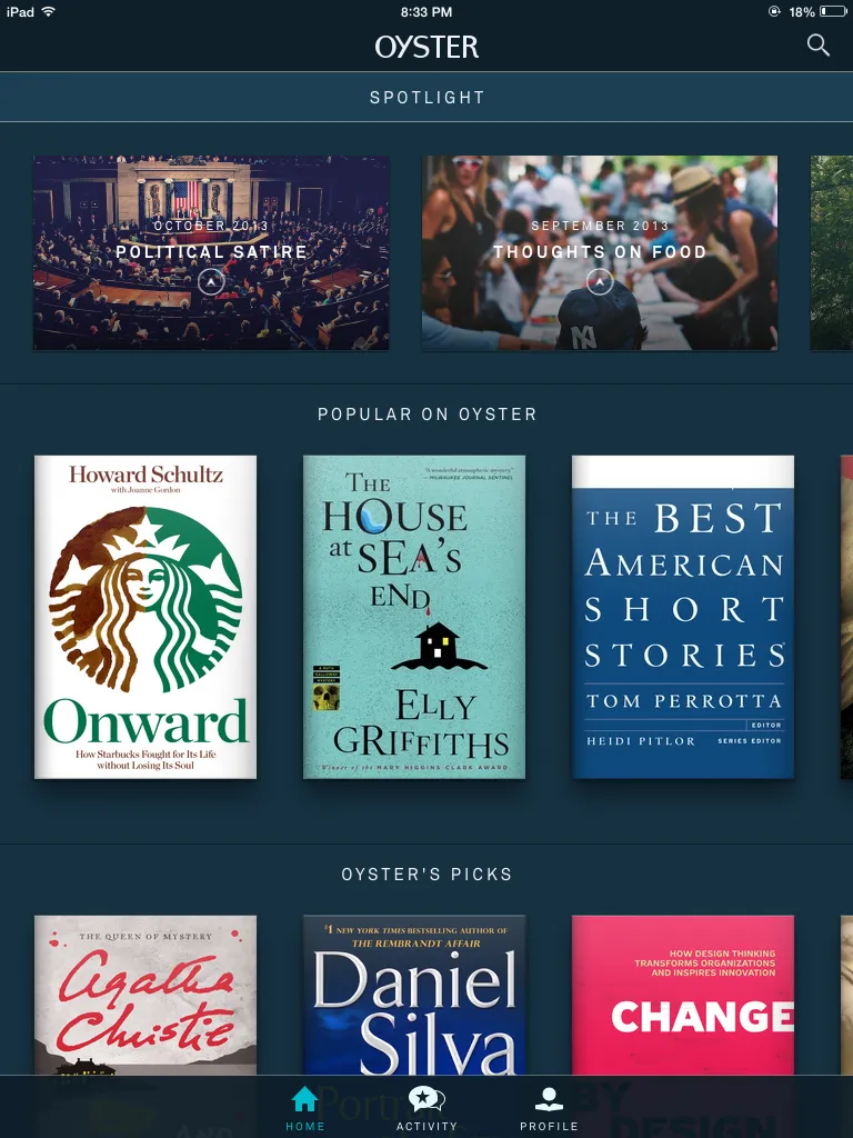
- Like Jeff noted in his first review of Oyster, the book discovery process has never been easier. On Amazon, if you don’t know what you’re looking for, you won’t have much luck. It’s the same with library lending and iBooks. The excellence of Netflix is in its discovery process, and Oyster stole many of those most popular features, as you’ll see below.
- The large screen of the iPad helps this discovery process even more. On an iPhone, you’re limited to seeing one or two covers at a time, which is fine, it’s just a lot easier with a bigger screen.
- One more note about discovery (it’s really the biggest positive for Oyster): there’s absolutely no commitment to a book. You can try out and DNF as many books as you’d like without feeling guilty about having wasted money or feeling angry because you just sat for 3 months on the library’s e-lending list. It’s instant access for one monthly fee.
- I personally would prefer a smaller screen for actual reading. Feels like I’m holding a giant book in my hands when reading on the full-size iPad. I think the iPad Mini is the sweetspot here.
- The selection seems pretty great so far. You won’t get a ton of new releases, but that doesn’t matter much to me. Like Jeff, I discovered dozens of books to add to my list within about 10 minutes of browsing.
- One limitation is the inability to highlight or make notes on the titles you’re reading. I would imagine this feature would be coming in the future, though, so I’m not too worried about it.
Let’s take a spin around the block to see what it looks like on a tablet (click the images to see a larger version):
 Right out of the gate, it’s just a beautiful app. Much more so than Kindle or iBooks on a tablet. They took the conventional wisdom for what a reading app should look like and started over. At the top, you’ll notice spotlight features. Each of those features a handful of selected books within that category.
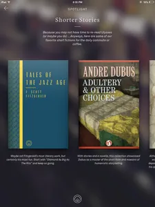 This is a look at the “Shorter Stories” featured section. It integrates beautifully with the look of iOS 7. Another bonus is that you get the book cover along with a short description right there. One thing that gets lost on Kindle devices is that beautiful cover art, so this is great to see.
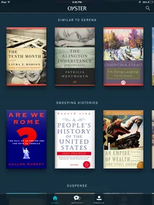 Below the featured sections, you get into Netflix-like categories of most popular, new to Oyster, editors’ picks, and then by subject. What’s especially nice is that it gives you a section of “Similar to (something I just read),” which is another brilliant steal from Netflix.
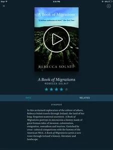 When you click an individual book, it brings a nice cover, a rating, a description, as well as publisher, year published, and print pages. From here, you can add to your queue as well as share the book to your social networks.
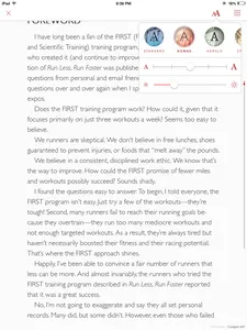 The reading experience itself is also aesthetically pleasing. Like on Kindle devices, at the bottom you get pages as well as minutes remaining in a chapter. The time remaining, however, only pops up when you tap once to bring up this reading menu. The viewing options are pretty standard, but instead of fonts/color tones, it gives you themes. My favorite so far is “Nomad,” which is a sans-serif font on a graph-paper background. It looks awesome.
Flipping pages is a little unconventional, as it’s done by swiping up/down versus left/right. You can still tap the right and left sides of the page, but for some reason it felt better to do the swiping.
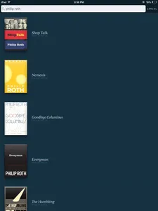 If you’re looking for a specific book, that’s super easy to do. You can search by author, title, subject, etc.
Overall, it’s just a great-looking and functioning app for book lovers. Get your hands on it ASAP!
____________________________
Sign up for our newsletter to have the best of Book Riot delivered straight to your inbox every week. No spam. We promise.
To keep up with Book Riot on a daily basis, follow us on Twitter, like us on Facebook, , and subscribe to the Book Riot podcast in iTunes or via RSS. So much bookish goodness–all day, every day.
