

Which YA Cover Design Wore It Better?
Which YA Cover Design Wore It Better? was originally published in our YA newsletter, What’s Up In YA. Sign up for it here to get YA news, reviews, deals, and more!
I love talking book cover design. Despite the saying not to judge a book by its cover, we do. It’s usually the first thing we see on a book, so it’s only natural that the goal of a designer and publisher is to make that cover appealing.
More often than not, the cover design you encounter on the hardcover edition of a book remains the same in its paperback iteration. But not always. Sometimes there’s a makeover which rebrands the author or series, or there’s simply a better image to convey the story’s contents.
Let’s take a look at four recent hardcovers that got paperback makeovers. Which one wore it better?
For each of the below, the original hardcover design is on the left, while the paperback is on the right.
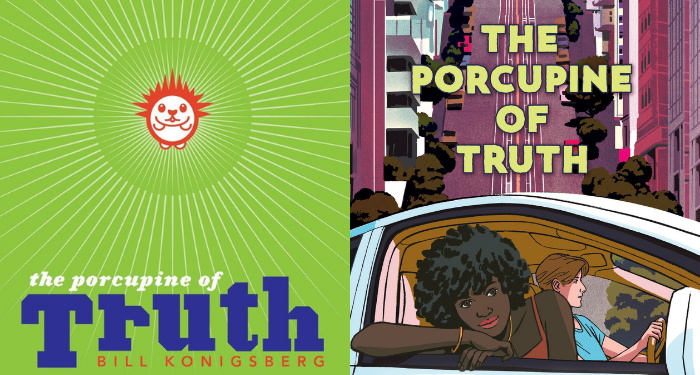
The Porcupine of Truth by Bill Konigsberg
The original cover for Koningsberg’s reads young to me. It’s bright and energetic, but it doesn’t necessarily showcase anything about the book itself. There’s a cute lil porcupine at the center, but the font for the book title is really the focus (at least on the word “Truth”). It’s in no way a bad cover; it just doesn’t share much at all.
The new paperback cover is a huge change. I love that it’s clear this story has some city element, be it a full setting there or as part of the plot. The two characters each have their own energy, and the expressions tell us there’s going to be a relationship story of some sort at the heart of the book. For me, the centering and deemphasis on the title is a win here. I’m 100% focused on the girl in the car’s passenger seat.
Both covers are solid, though I think the paperback tells a little more of the story.
The Midnight Lie by Marie Rutkoski

Marie Rutkoski’s newest series is getting a fresh look after the first hardcover, which you can see in the paperback. I like that some of the elements carried over, particularly the snake and the flowers (though it’s a different type of flower).

The paperback edition gives me a lot of The Diviners vibes, especially with the font used for the title. But otherwise, I think the hardcover on this one is much more appealing. There’s less going on, and the way the title is wrapped around the bottle at the center is clever. I’m also not sure I’m entirely understanding what the expression on the person is on the paperback — I’m not finding myself intrigued by that face in the same way I’m intrigued by the pair of snakes on the hardcover.
The new paperback is out now, while the second book in the duology, The Hollow Heart, will release in September.
When The Stars Lead To You by Ronni Davis
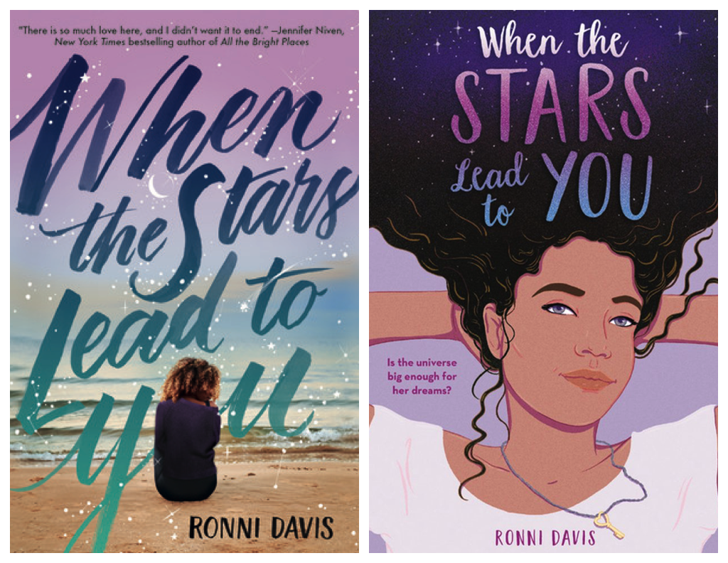
Both the hardcover and paperback editions of this debut YA novel are solid, strong, and intriguing to me as a reader. The first is clearly font-driven, but with the starry background and the person taking the space of the “O” in “you,” sitting alone on the beach, I’m drawn in with the mystery of what it’s about.
The paperback, which deemphasizes the title, instead emphasizes the main character is a girl of color. She’s got a dreamy look in her eyes, and the stars from the hardcover design carry over into her hair. The necklace makes me curious as well — what might it mean? Is that a piece of the story we’ll see?
I think both are solid covers, though the paperback makes clearer that the main character is a person of color. In a lot of communities and to a lot of readers, this will make it what stands out.
The Things She’s Seen by Ambelin Kwaymullina and Ezekiel Kwaymullina
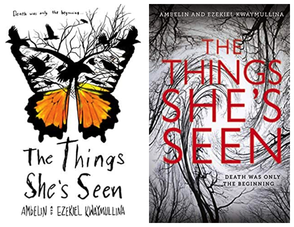
This book’s been on my to-read shelf since I learned about it, and I need to get to it. But I won’t go into what it’s about, because I think looking purely at the covers is worthwhile in discussing that aspect of the book…and because I think both the original hardcover and paperback share quite a bit, too.
I adore that hardcover design. The butterfly melding into menacing birds? I don’t think I’ve seen something like that before, and I love how it sets the stage for what will be a thriller of a read. The font used for the title helps with that as well. The spare use of color — only the bottom part of the butterfly wings — gives a particularly eerie vibe.
The paperback takes the elements that give the book’s feeling and reimagines them. Though there’s no longer the metamorphosing butterfly-to-birds, the swirling, barren trees certainly capture that same slight sinister vibe. The only spot of color comes from the centered, straightforward font of the title and that it’s red only heightens the tension. Though the tagline is on the original hardcover image, it’s more pronounced in paperback: “Death was only the beginning.” That really pulls me in.
Both covers are rad, both give off the indication this is a thriller/mystery with some horror elements to it, and both would make me pick it up. The paperback *might* appeal more to adult readers than teens, if only because it mimics a lot of the designs we see in that genre for adults (and likewise, teens who love adult thrillers might gravitate toward this one for the same reason).
What do you think? Which covers draw you in a bit more? What makes a book cover *work* for you?