The (Not) Lost Art of the Cover
Current cover trends are really starting to get to a lot of reader attention. Just last week, Maureen Johnson made a casual comment on Twitter about gendered book covers. She started a conversation that took on a life of its own. The #coverflip project got a lot of people thinking about what the cover art says about the book inside. It got me to thinking about the lost art of the book cover. I say lost, but that’s not true. There are still beautiful book covers out there. You just have to know where to look.
Here are a few publishers that consistently put out covers that make me want to read the book, no matter what it’s about.
Europa Editions
The Europa Editions covers are a thing of beauty. They are simple, classic, and make excellent use of color. They mix artistic styles effectively, while maintaing a certain continuity throughout their catalog. The logo is easily recognized, the fonts are consistent, and I absolutely adore the way the spines all match. It’s my favorite section of the bookshelf.
Farrar, Straus & Giroux
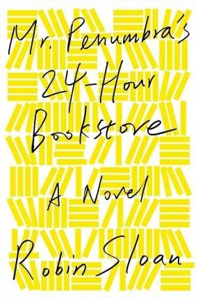
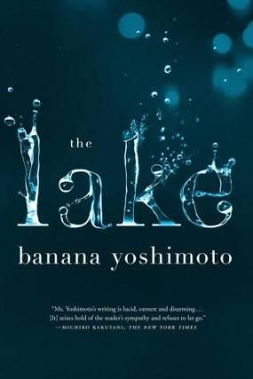
Bold colors, spare use of text, and simplicity of design are the keys to the success of so many of FSG’s covers. I’m also a sucker for books on book covers. The symmetry on the HHhH cover is nice, too.
Melville House
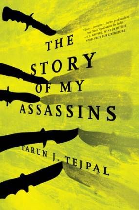
Melville House is such a great publisher for so many reasons, but I’d have to say that their consistently amazing cover art is right at the top of the list. Both of these covers benefit from good use of color, simplicity, and depth (that’s the best way this not-an-artist can describe the fact that neither cover looks flat).
Vintage
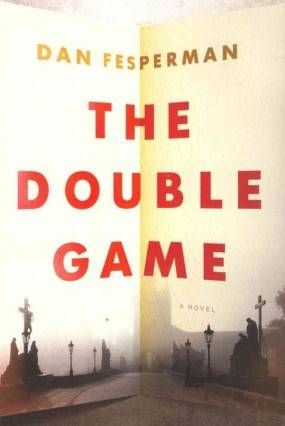
Vintage’s covers don’t always make me happy. Sometimes I feel like they try too hard. But they’re on the mark more often than they aren’t. I love the way that the paper is folded in half on the cover of The Double Game, and I just have a feeling that the cover is an accurate portrayal of the book. The second cover doesn’t seem as closely related to the text, but I actually think that it might be perfect. The title is bit misleading, too, right?
Pretty much all of these covers come from 2012 or before. Which of this year’s books have the best covers?
__________________________
Sign up for our newsletter to have the best of Book Riot delivered straight to your inbox every two weeks. No spam. We promise.
To keep up with Book Riot on a daily basis, follow us on Twitter or like us on Facebook. So much bookish goodness–all day, every day.


