
Read Harder: A Book With a Cover You Don’t Like

Despite the old adage “Don’t judge a book by its cover,” we’ve all been known to do it from time-to-time. Or, okay…maybe all the time. How often do you reach for a book you’ve never heard of on the shelves at the bookstore just because you like how it looks on the outside? Book cover design can be amazing, but don’t let it limit you too much. Pick up a book with a cover you don’t love for the 2021 Read Harder Challenge.
Hear me out! First of all, book covers, like all art forms, are massively subjective. And book cover design is definitely an art form. Plus, just because a cover doesn’t suit your fancy, it doesn’t mean the content inside is not worth reading. Often, it’s just the opposite. For example, there are plenty of book covers that I personally do not like that are objectively good covers, with eye-catching design that ties into the themes of the book. If you’re looking to deepen your TBR in 2021, don’t limit yourself by only selecting books with covers you love. Here are some suggestions.
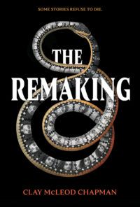
The Remaking by Clay McLeod Chapman
Book covers are all about personal taste. For example, this one is beautiful. But it activates my snake phobia in a big way. Despite my aversion, I put this one on my TBR because the blurb just sounded way too intriguing. The story is the before-and-after imagining of an urban legend, from origin story to after-effects.

Hidden Figures by Margot Lee Shetterly
Another much-maligned style of cover is…the movie-tie in! You’re familiar with the concept, I’m sure. A favorite book gets a major motion picture release and suddenly the iconic cover art is replaced with a picture of Leonardo DiCaprio or something. Pick up Hidden Figures even if the Hollywood version is the only one you can find on shelves.
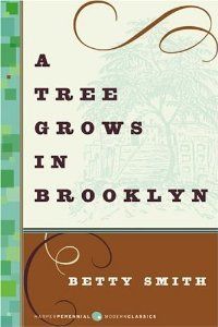
A Tree Grows in Brooklyn by Betty Smith
This book is an undisputed classic. Like many classics, the cover leaves a bit to be desired. You can’t tell much of anything about the story from the illustration, and the font choice gives off strong “10th grade English class” vibes. Which is further proof that you really can’t always judge a book by its cover.
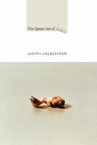
The Queer Art of Failure by Jack Halberstam
This book cover reminds me of the packaging for computer printer paper I might’ve come across in my dad’s office circa 1999. The book within, however, is really interesting!
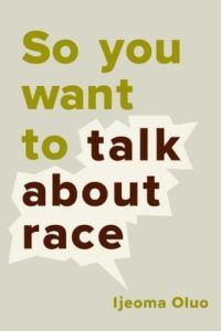
So You Want to Talk About Race by Ijeoma Oluo
A book cover can be perfectly well-designed and simply not draw the eye. So You Want to Talk About Race has a simple design that focuses on a speech bubble around the text. The cover isn’t flashy. The book is also a must-read that every white person should have on their TBR.
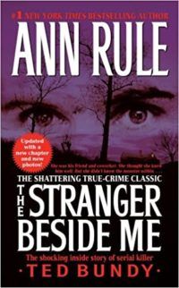
The Stranger Beside Me by Ann Rule
This true crime classic written by journalist (and former friend of Ted Bundy’s) Ann Rule could use a modern update. While the serial killer’s eyes make an eerie focal point, the font is giving off major mass market paperback vibes.

Steering the Craft by Ursula K. LeGuin
Any writer should relish the opportunity to learn from the great Ursula K. LeGuin in her own words…even if those words are housed in a cover that resembles an inspirational poster from a doctor’s office.

Kindred by Octavia Butler
I’m not wild about covers with photographs instead of illustrations, but I am dying to read this classic science fiction novel by the legendary Octavia Butler. It’s about a young Black woman living in 1976 California who suddenly travels back in time to the antebellum South. (For what it’s worth, there’s also an illustrated version of the cover if you share my preference.)