

Still No Half Stars: The Pros and Cons of the New Goodreads Book View
Goodreads recently introduced a new look for all of its book landing pages. It’s still in beta, so it may change before it gets finalized. For now, Goodreads users can opt in to the new view, but still switch back to the old version anytime. Goodreads is also soliciting feedback on the new layout. If you do switch to the beta version, you can click on the small black “beta” button in the bottom right corner of your screen and an option to send feedback will pop up.
Goodreads hasn’t been especially receptive to feedback in the past. Despite every Goodreads user I’ve ever known complaining about it, half stars are still not an option. You’d think that if they can design a whole new page layout, they could deign to give us half stars. But it seems that the lack of half stars is just Goodreads’s grumpy signature now, and the company plans to die on this hill.
In any case, I spent a while poking around in the new layout, exploring all its quirks. Like with most upgrades, it’s got some fantastic new features and some annoying ones.
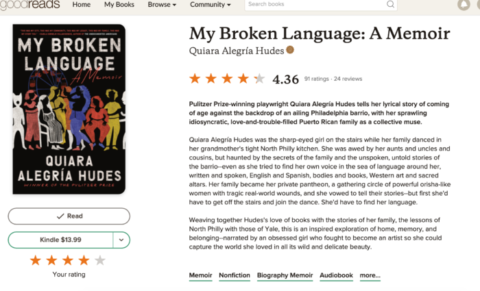
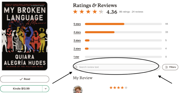
Here’s what the new book layout looks like:
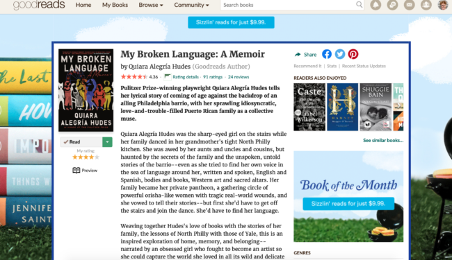
For comparison, here’s the old version:
Let’s get into the pros and cons!
The Pros
Aesthetic Appeal
This is the biggest thing the new layout has going for it. It’s no small thing, either. As someone who spends a ton of time on Goodreads for work, I can personally attest to how much nicer the new version is. The old version is full of extraneous extras that have little to do with the book itself. Not just ads, as you can see above, but links to other articles and lists. It’s very busy. The new version is beautifully simple and streamlined. It centers the book and the reviews. Reviews are what Goodreads is all about anyway, and this new layout makes scrolling through them much nicer. Unlike in the old version, as you scroll through the reviews, the cover remains fixed on the left side. It’s a much more pleasant experience all around.
When I asked my fellow Rioters for their opinions on the upgrade, Leah Rachel von Essen rightly pointed out that it would be even better if the title and author appeared fixed on the left side as well: “I really like the fixed nature of the cover, but, for accessibility and convenience, the title and author should also be on the left and fixed, even if they’re smaller there than they are on the right. Covers can be hard to read and it would be ideal if you could see the title and author no matter where you are on the page.”
Upgrades are a great opportunity to increase the accessibility of a site, and Goodreads has a chance to do that here. I hope they take it.
Better Placement of Review Search Function
Everyone uses Goodreads for different reasons. I use it both personally and professionally, and one thing I do all the time in both capacities is search review texts. The new version makes this so much easier! The search box is easy to find, right at the top of the reviews. It’s not buried under a bunch of other stuff. It’s a huge boon for readers like me who use the search function to find content and trigger warnings in reviews.
Streamlined View of Your Personal Review
In the old version, here’s what you see on the landing page for a book you’ve read and reviewed:
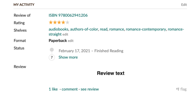
Basically, there’s a whole lot of information there, and while it’s not clear from the above photo, it takes up a lot of space on the screen. Here’s the new layout:
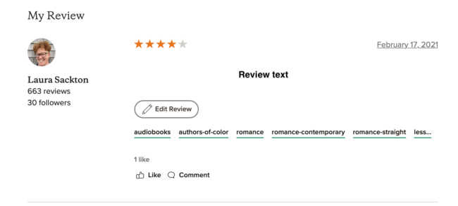
In the new layout, a user’s personal review looks a lot more like any other review. It’s still easy to click that large “edit review” button to see more details about your history with the book (what format you read, when you read it, etc.), but it’s not all right there. I like this a lot better. I’m not on Goodreads to read my own reviews; I’m there to get data about books, to see what my friends are reading, and to read other people’s reviews. I like that I can still see how I’ve shelved the book, but I’m glad all that additional data is gone.
A fellow Rioter mentioned that she doesn’t like that the dates you read the book no longer appear in the preview of your review. The date that appears is the date you reviewed the book. I usually review a book right after I read it, so this doesn’t bother me. It’s a good reminder that everyone is going to have a different reaction to the upgrade. What works for me might annoy you, and vice versa.
Fun Stats!
This might be my favorite part about the new layout, although it’s not especially useful. Check out this little stat bar, which appears just below the publisher’s synopsis and book details:
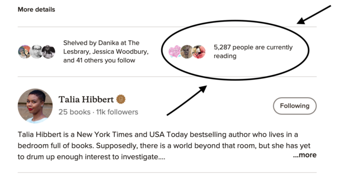
I know there is no reason I need to know that 5,287 people are currently reading Get A Life, Chloe Brown. But it delights me! I’ve had so much fun with this stat. It adds a bit of whimsy to the whole book landing page. It’s entertaining to see how many people are also reading whatever I’m reading. I do wish I could actually click on that stat, especially when I’m reading a book that only one or two other people are reading. I read a lot of fairly obscure books, and I suspect it would be a good way to meet new readers with similar tastes.
I also like how easy it is to see at a glance how popular a book is with my friends and the people I follow. In the old version, you had to do a bunch of scrolling to see how many of your Goodreads contacts had shelved a book. The new version gives you a quick snapshot right up front.
Cons
Less Book Data Immediately Visible
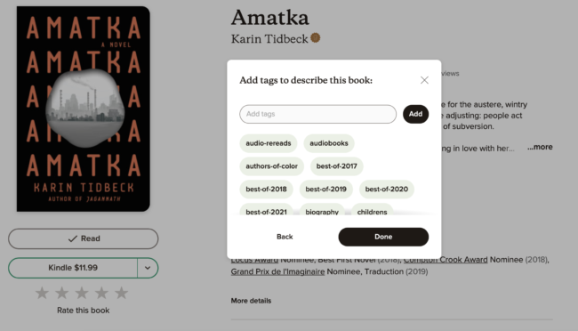
In the new version, there’s a whole lot less book metadata immediately visible on each book’s landing page. I suspect this will be one of the biggest complaints from folks who use Goodreads for work, and not just as a fun way to track what they read. Here’s how it looks in the old version:
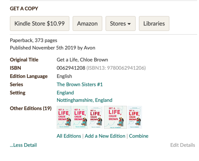
As you can see, without having to click on any buttons to expand the display, there’s a ton of data available: page count, publisher and publication date, ISBN, whether the book is part of a series, and how many other editions exist. Compare that to the new version:
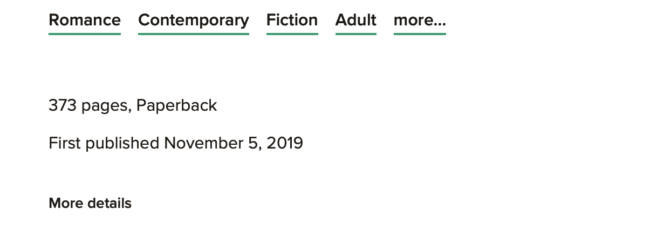
Wow, that is not a lot of detail. They don’t even tell you who the publisher is! You do get more info when you click on the “more details” button:
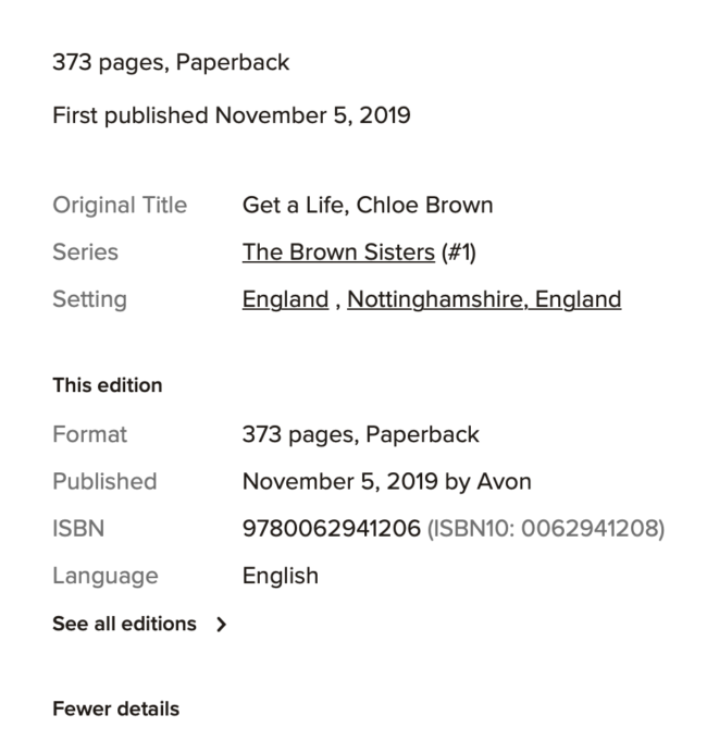
However, even when you expand the view, there’s still a lot lacking. My biggest complaint is that you have to click through to an entirely new window to get any information about other editions of the book. I often want to know at a glance whether there’s an audiobook available or not. It was easy in the old version; in the new version, it’s a huge pain.
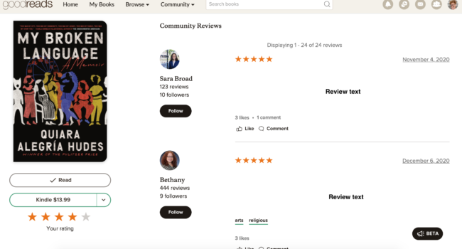
Reviews by Friends & Following Sorted Randomly
This is my biggest complaint about the new layout. In the old version, Goodreads displays the reviews of friends and people you follow in a manner that makes sense to me. First come the written reviews of friends, followed by friends who’ve just given the book a star rating, followed by friends who’ve added it or marked it as to-read, but haven’t left a review or rating. After that you see the reviews of people you follow in the same order: written reviews, ratings, people who’ve just shelved the book. This order means that the thing I care about most — written reviews by friends — is the first thing I see.
I have no idea what’s going on in the new version. Let’s look at Get A Life, Chloe Brown as an example. Forty-one of my friends and people I follow have shelved it. First I see a 5-star review, no text, from a friend. After that come three written reviews from people I follow. Next are two written reviews from friends. Then I scroll through a whole bunch of ratings, no text, from friends and people I follow. I have to keep hitting a little “display more reviews” button. After clicking it three times, I find six more written reviews from friends.
I honestly like that Goodreads has meshed together friends and following here. I don’t make a distinction between those two groups anyway. But it’s infuriating to keep clicking and scrolling to get to actual reviews by people I know. I’ve been trying to figure out how it’s sorted. By date? Nope! A friend reviewed the book on April 13, 2021, but her review shows up near the bottom. Popularity? Nope! The first review I see doesn’t have a whole lot of likes or comments. It appears entirely arbitrary.
Goodreads serves a lot of functions in my life, but the thing I enjoy most about it is reading what people I know, or whose options I respect, have to say about a book. The way reviews are displayed in the new version make this much harder to do.
It’s A Lot Harder to Review a Book After Marking it Read
I saved the worst for last. I have my own opinions about the aesthetics and overall functionality of the new display. I’m sure some readers will agree with me, and others will have different ideas about what works and what doesn’t. But this, I think, is a big step in the wrong direction, functionality-wise.
When you mark book as read in the old display, here’s the screen that pops up:
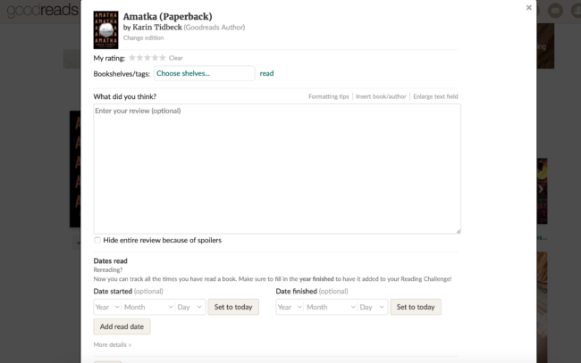
You’re immediately taken to a screen where you can rate the book, shelve it, write a review, and mark the date you read it. Everything is in one place. It’s easy.
Here’s what you get when you mark a book as read in the new display:
All you get here is the option to choose how you want to shelve the book. After you click “done”, you can then scroll down through the book’s landing page, click on “write a review” and rate and review it in a separate window. It makes no sense! It’s unnecessarily complicated!
I will say that I didn’t even notice this until someone pointed it out to me. This is because I almost always mark books as read from the “currently reading” tab on the let side of the Goodreads homepage. As far as I can tell, the pop-up you get when you mark a book as read that way is the same as ever. But if you’re trying to rate and review a book you haven’t already marked as currently reading, it’s a whole process, and not a nice one. If the idea is to make it easier for readers to review books, this is a big fail.
In Conclusion
Overall, I like the new layout better. It’s more restful on my eyes, and a lot nicer for browsing reviews. But it has some serious functionality flaws, which I can only hope Goodreads will address before it’s finalized. A pretty new layout isn’t nothing, but it’s not everything, either. Goodreads has been in need of some serious updates for years. We’re still waiting on those half stars. The search function is so bad that I laugh at it on an almost-daily basis. And as the case of Goodreads Charles illustrates, the site has a disturbing tolerance for homophobia and other forms of discrimination that aren’t strictly against their review guidelines.
I still use the site despite some recent intriguing alternatives, such as StoryGraph. Both professionally and personally, Goodreads is one of the best tools out there for tracking my reading, keeping up with what’s happening in the book world, and gathering data about books. I’m not mad about the upgrade, and like all other tech upgrades, eventually I’ll get used to it, flaws and all, and forget what the old version felt like. But I can’t say I’m excited about it. Goodreads could make some real substantive changes with this upgrade, and they don’t seem to be doing so. Despite how much I like the feel of it, the underlying issues remain.