

How Inclusive Is That Diverse Book Cover, Though?
YA book covers and middle grade book covers are getting better and better, and they have been since advocates have really pushed the industry to represent the people for whom these books are written. We’ve seen an increase in diversity when it comes to content, as well as when it comes to covers.
On my personal book blog, I’ve been rounding up covers featuring teens of color for years, and 2021 might be where I finally have to slow down because the list has gotten so long. That, of course, is a solid problem to have.
It’s one thing, of course, to center a tween or teen of color on the cover, be it a stock photo, a photo commissioned for the book cover, or an illustration. It’s another thing — and something that still stands out quite a bit — to see a wide array of skin tones represented on ensemble casts. Perhaps it’s fair to the book’s content that all of the major characters are white, begging the question of why that choice was made, but perhaps, too, it’s not considering that today’s readers are not all fair and ivory white and perhaps a little differentiation is realistic.
Luckily this, too, is getting better.
It’s not just skin color we’re seeing better representation on in middle grade and YA books, either. It’s also queerness — there have been some tremendous book covers that don’t shy away from highlighting queer people alone or with friends, family, and/or love interests. These book covers were once far more subtle, as the trend of “lesbian hands” can attest.
These are necessary strides in representation and necessary strides that showcase today’s intersectional tween and teen lives.
But there’s still something missing when it comes to these diverse book covers: disability representation.
Disability representation in 2020 YA book covers really opened my eyes to what was possible, and now, looking at diverse ensemble casts on middle grade and YA book covers, it’s impossible not to see the lack of visual disability representation.
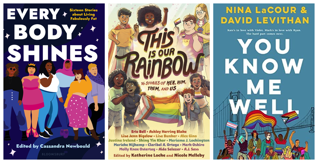
The above image showcases three diverse ensemble casts on book covers releasing in 2021. The first, Every Body Shines, is a fictional anthology about living in a fat body and features a number of fat characters in varying ethnicities front and center. The center cover, This Is Our Rainbow, is a middle grade anthology of LGBTQ stories and again, showcases a number of body shapes and sizes, as well as skin tones, and it also makes clear these are queer characters through many symbols. The last cover is the paperback reissue of You Know Me Well, and it, too, while cutting off an entire row of its teens from the neck down, makes clear queerness and racial diversity are represented.
All three covers are diverse, but all three covers are lacking disability representation. They’re diverse, but they’re not necessarily inclusive.
Please note: authors don’t tend to have much say in book cover discussions, and those who get incredible book covers like the above which feature an array of skin tones, body sizes, and clear marks of queerness, are likely thrilled to have what is inside the covers represented on the outside. This isn’t an issue that falls upon them to address; certainly, they can bring it up when a cover sketch reaches their inbox, but because of how publishing is structured, chances are they may not have their voice heard.
And maybe that’s the issue in and of itself.
Additionally, these covers do not stand alone as outsiders but represent the issue quite clearly.
Publishing is still a white, cis het, able-bodied industry. There are strides being made, commitments being established, and other real and PR-friendly initiatives to ensure that a wider array of people can be part of this career field. But, given how many barriers there are to employment in publishing — starting with the fact that the largest publishers are centered in one of the most expensive cities in the world — means that disabled people are at a disadvantage from the start. Their voices, insights, and experiences are not seen because they aren’t seen, and despite how much work is done online to educate able-bodied people about disability, both visible and not, there has not been the same rise in profile for this inclusivity on book covers.
Disability representation on covers — particularly covers like those above — doesn’t mean suddenly putting wheelchairs (which aren’t always done well or accurately) in the image. It doesn’t mean putting prosthetics on characters or giving them what are culturally recognizable signs of disability.
It means getting creative and showcasing how many ways there are to live in and within a disabled body.
Imagine one of the images above featured a teen with a hearing aid.
Or maybe one of those teens has an iPad with a strap around their neck or shoulder, a tool to help them communicate verbally.
Perhaps there’s a visible ostomy bag on a teen wearing a crop top.
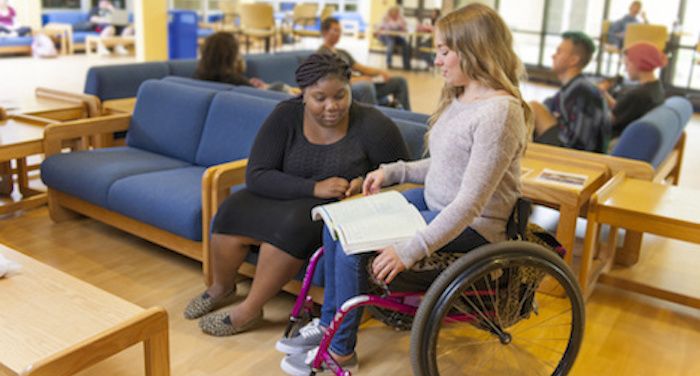
Certainly, a teen in a wheel chair or teen on crutches works, but reality is, there are countless visual cues for disability, and publishing isn’t taking the time to include them on their diverse book covers. Imagine the teenager picking up a book about body acceptance and seeing an assistive device they use right there on the cover. Suddenly, this book is absolutely for them. Even if that tween or teen doesn’t use the device themselves, a friend or family member may, and its inclusion on a diverse cover is a big step toward normalizing and encouraging understanding — and use! — of tools that make the able body–centered world more accommodating.
Book cover illustrators and designers come from a wide range of backgrounds, and tapping into the talent pool of disabled artists is one step toward ensuring better representation (and accurate representation) on covers.
But maybe we’ll also see the tides changing as it becomes clear publishing’s long-standing reign in New York City isn’t necessary. As remote work became vital during the pandemic, publishing shifted, letting those in the industry work from home or anywhere they chose to spend quarantine. The need to be in the city? Simply a tradition upheld that excludes so many voices and experiences that publishing needs in order to truly change itself as an industry.
Let’s cheer for the diverse book covers we’re seeing, particularly those for tweens and teens. It took too long to get to this point, and it took longer still for these books to show varying races and sizes, two things that are far from perfect in and of themselves.
But let’s pause and continue to push back against the idea these covers are inclusive. To be inclusive is to be intersectional, and while intersections are obvious in many instances, without any inclusion of disability, they’re still severely lacking.
Readers are noticing, caring, and continuing to beg for a better job to be done.