Goodreads Launches New Homepage
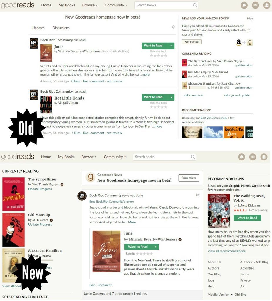
Goodreads announced yesterday that their new homepage is in beta and users can start trying it out now. The new desktop page keeps most of what you already love about Goodreads, but now it has shorter load times, bigger book covers, and your most-used sections are bumped up to the top.
Here are the biggest changes you’ll see if you check it out:
- Book covers are larger in your feed to give the site more of a browsing-the-bookstore feel. You’ll also see a preview of the book’s summary along with your friend’s review. Updates and Discussions are no longer in two separate tabs in your feed, but will both appear in a single feed. Plus your feed now has endless scroll!
- The old Goodreads had one very long sidebar on the right that included quotes, shelves, etc. The new Goodreads has two shorter sidebars with more book covers to check out.
- Your Currently Reading shelf is much bigger and on the left. It still shows your progress in a book if you’re tracking it.
- Recommendations are much more prominent and now on the top right, with only one featured title at a time, with more information about that title.
- Your 2016 Reading Challenge is right under your Currently Reading shelf. Books you recently added to your Want to Read shelf are right below that.
You can take a look at the new version of the homepage on your account by clicking here. Don’t like it? You can still use the old version by clicking here, or by going to the menu at the bottom of the right sidebar and clicking Old Site.
Goodreads is collecting feedback on the beta version through a Feedback tab on the bottom right of the screen and a user survey.
This is currently a desktop-only rollout and there are more features to come. You can keep up with the updates and learn more about what they’re working on in this Goodreads discussion.
What is your first impression of the new Goodreads homepage?


