

Dear Netflix: Don’t Photoshop Our Anne
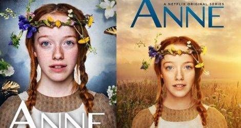
Anne, the new CBC/Netflix adaptation of Anne of Green Gables by L.M. Montgomery, has been getting a lot of hype. The series premiered on CBC on March 19th, and it’ll be available on Netflix on May 2nd and already there have been subtle differences between how the series is marketed towards CBC audiences versus the Netflix audiences–most notably in the respective trailers. Those differences have been interesting, but harmless. And then my friend Melanie Fishbane (author of the upcoming YA novel Maud, yes, about that Maud) and the biggest LMM fan I know shared this image:
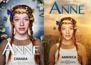
This side-by-side comparison of the show’s promo posters has been making the rounds on Facebook, and can be traced back to this tweet. On the left, we have the CBC promo image. On the right, the Netflix image. Or as the added captions note, Canada vs. America (U.S.). The first obvious difference is the background color, but the more you look at the Netflix image, the more obvious it is that someone thought that fourteen-year-old Amybeth McNulty needed some serious Photoshop magic. (She really doesn’t.) Looking at these images is like playing a game of “Find the Difference!” In the Netflix version, Anne’s face has been elongated, her freckles lightened, and her teeth straightened. The circles under her eyes have been smoothed away, and it would seem that even her eyes are farther apart.
The promo posters each offer a different mood. Having seen both the CBC and Netflix trailers, I see how the darker CBC background seems to fit the tone those trailers present. It would appear that the new series acknowledges the pain and darkness in Anne’s struggle, which make her rich imagination all the more vibrant. The brighter and warmer Netflix background, on the other hand, is just more aesthetically pleasing. What’s absolutely not cool is that Photoshopping, though. It’s as though the Netflix poster says that all of those details they’ve “fixed” are imperfections when in reality, they are exactly what make Amybeth McNulty’s portrayal of Anne so perfect. The Netflix image has made Anne look less like Anne.
Furthermore, why does Netflix think that American viewers want that airbrushed and tanned version of Anne? (Don’t just say Trump.) Well, we absolutely don’t. Give us our vibrant, eccentric, imaginative, quirky, perfectly imperfect Anne with her luminous, arresting gaze. She may not be Megan Follows, but I love her just the way she is, and the CBC poster proves that we don’t need her any other way.