


How a Cover Is Created: THE WICKER KING From Concept to Creation
You know the saying, “Don’t judge a book by its cover”? It’s a nice sentiment, but let’s all admit it: we totally do. As the cover is a reader’s first impression before even cracking the spine, the design process is an important part of the publishing process.
So, what all goes into the creation of a kickass cover? What makes a designer choose digitally rendered design vs a model? How involved is the author? Imprint Senior Designer at Macmillan Children’s Publishing Group, Ellen Duda, walked me through her design process for one of my favorite covers of 2017, The Wicker King by K. Ancrum.
FYI: In a nutshell, The Wicker King focuses on the friendship between August and Jack, whose codependency on each other reaches a breaking point after Jack begins experiencing hallucinations that gradually worsen. (Minor plot spoilers are below)
Book Riot: Ok, so how does the design process actually begin? Did the author come in with an idea or did you start from scratch?
Ellen Duda: Every book is different. At the beginning of a project, the designer usually has a conversation with the editor about how complex the design of the interior should be. Sometimes authors indicate if they want art, but that doesn’t happen often. In the case of The Wicker King, the author had placed “artifacts” as chapters in the first draft, so we knew from the beginning that there would be notes, police reports and a few photos. However, once I read the manuscript I fell in love with K. Ancrum’s writing and how she used these “artifacts” to tell pieces of the story. I felt we could add more artifacts and compliment her beautiful writing with a visual experience. From that point onwards I was so inspired that I dove into the design head first.
BR: The Wicker King uses a model for the cover—what makes a designer choose between an actual picture of a model vs. a digitally rendered cover?
ED: Usually a designer will choose to have a photoshoot with a model if there is a very specific scene or character you want to capture. There is endless amounts of stock photography on the internet, but if you ask any book designer, it’s torture to sift through hours of photos looking for the “perfect” shot. Sometimes having a photoshoot is just easier.
BR: How do cover models get chosen?
ED: We had a casting call for The Wicker King, because we needed a range of images and emotions from the models. I had a vague idea of what kind of “artifacts” would be in the interior and had to see which models could portray the characters. It was very easy to choose the model who “played” August, because besides fitting the physical description, he had good emotional range and was good at taking direction.
The following are some snapshots of the cover creation process:
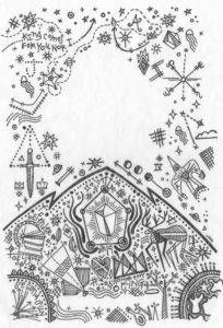
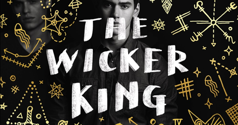
ED: The concept for gold drawings around the boys was an early idea I had. I really latched on to the fact that Jack couldn’t stop drawing these cross hatch marks. This led me to thinking about what the drawings of a hallucinatory boy would look like. I wanted the drawings to feel “crazy” and claustrophobic, so you got the sense that these hallucinations were taking over. All of the drawings reference visions that Jack has: Blue Rapture, many legged animals, Raven, jellyfish, The Champion, two suns.
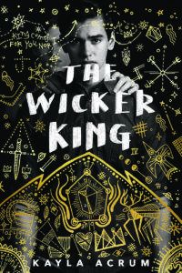
EB: When it came to the photoshoot with the boys, we played around with the relationship between August and Jack. Originally I thought to put Jack front and center because he is The Wicker King, but we knew this was August’s story and were afraid readers would get confused by seeing Jack. Once we switched to August as the main focus, I wanted to make sure we conveyed the idea that he was under the control of Jack. One idea we had to portray this relationship was showing August with just Jack’s hands on his shoulders.
We wanted the reader to see his face first and then the hands, but this ultimately looked a little too creepy and didn’t totally convey the possessive nature of the relationship. I tried another version of the title lettering too that was meant to feel like Jack had written the title and the drawing, however we liked that the bolder type stood out more. This type version also showed more of August’s face and the editor felt there was more mystery when we covered part of his face with the type.
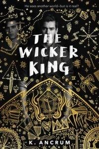
ED: Ultimately we chose the final cover because you were able to get the cramped feeling from the illustrations, you can see the anguish in August’s face and Jack is hovering nearby in the shadows. I really love how this cover came out and I want to make a special shout out the the photographer Michael Frost who took some gorgeous photos for this book. He made my job so much easier!
The Wicker King is available now.