By the Cover: Adam Silvera and Liz Casal + More Happy Than Not Paperback Cover Reveal
There’s a lot that goes into the production of the books you love, you know, in addition to all the writing. Publicity, sales, editorial, production… there are so many parts that come together to make a book happen and get it into your favorite local bookstore. And there’s one in particular we notice quite often, but never really dig deep into.
The cover.
Just who is it that makes our books look so lovely? Can you tell when a book is designed by a particular designer or illustrator? You’d be surprised. Welcome to By the Cover, where I’ll be spotlighting some of those artists that make your books look so gorgeous.
____________________
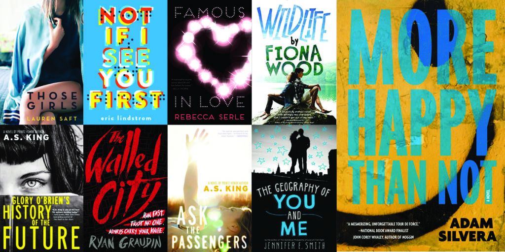
LIZ CASAL is a freelance cover designer living and creating in Brooklyn, New York. You’ve likely seen her work on a number of recent YA books, including Wildlife by Fiona Wood, Those Girls by Lauren Saft, Glory O’Briens History of the Future by A.S. King, Not if I See You First by Eric Lindstrom, This Raging Light by Estelle Laure, and The Statistical Probability of Love at First Sight by Jennifer E. Smith.
In addition to designing the covers for numerous bestselling books, she works on branding, posters, and more. You can learn more about her and check out some of her work on her official website.
In this special edition of By the Cover, we’re joined by New York Times bestselling author of More Happy Than Not, Adam Silvera, as we talk to Liz about her design process, and the repackaging of his bestselling book.
Adam: Hey Liz! Thanks for taking a quick recess from your desk to tell us all a bit about the sorcery behind designing book covers!
Liz: Thank you for tearing me away from my desk for a minute. Sometimes I feel attached to it. Because sometimes the desk is my lap.
Eric: So how did you get your start designing book covers, Liz?
Liz: I was born a visual designer and didn’t realize it until computers became a thing. Many hours spent with Microsoft Word WordArt (don’t knock it), KidPix, and some off-brand software my cool aunt Susie would bring me from her tech job got me going. After designing my high school newspaper and literary magazine, I went to college (still not realizing I should be a designer).
I graduated from Emerson College with a BFA for writing, literature, and publishing, and realized my last year that I wanted to be a book designer. I called it “merging my passions” on my cover letters. I graduated into the Great Recession, but I landed a paid internship at Little, Brown Books for Young Readers.
They held me captive from 2008 until 2015, and I worked my way up from art intern to senior designer. I went freelance in January 2015 when I realized I wanted to keep designing, not art direct just yet.
Eric: Adam, what did you think when you first saw the finished cover for More Happy Than Not?
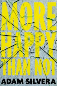
Adam: I loved it so damn much. It’s weird because in our initial discussions about what we wanted the cover to look like we sort of avoided using a smiley face because we were nervous it was going to skew a little young, possibly even middle-grade. We thought maybe it should look a little sci-fi because of the book’s memory-alteration procedure or maybe even give it a comic book look since the narrator is such a fan of comics. But none of those felt actually true to the heart of the book. Liz sent us more samples and one was a really gritty happy face that perfectly conveyed how happiness can be messy and even a little haunting, and felt true to the Bronx setting of the book. I’m still in love with it.
Eric: How many iterations did the original hardcover design go through, Liz? Are there any outtakes you can share with us?
Liz: I have 64 comps in my “More Happy Than Not HC comps” folder. Many of them are iterations of the same concept, but still! We were going in circles. And then Adam wanted a happy face. 🙂
Adam: What’s the process like for a paperback makeover?
Liz: The process for a paperback makeover can be harder than the original hardcover design because of design fatigue. Simply, when a designer runs out of juice. After designing dozens of comps and getting one approved, having to start all over again can be the worst thing ever. One way to avoid design fatigue is to hire someone else for the redesign. Or rehire me because design fatigue can’t touch me (as long as I like the book, and I like your book a lot).
The process usually starts with figuring out how deep the makeover is going to be. If a book cover is a face, is it getting some “Kim Kardashian kontouring” or full-on Nick Cage Face/Off? Salvaging remnants of the original is good for “brand recognition,” but total redos are great for attracting new readers. You need to ask some questions at the beginning. Why are we doing this? Who needs to read this book that hasn’t already? Is the cover working for booksellers? Are people not into happy faces anymore?
For the More Happy repackage, we started by recycling the original color scheme and fonts in different illustrated and photographic directions. We ended up with something totally new. We went Nick Cage. I think this cover will have adult crossover appeal. Will also appeal to happy face haters. And hopefully everyone who likes really good books.
Adam: You’ve designed Jennifer E. Smith’s awesome covers, such as The Statistical Probability of Love at First Sight and This Is What Happy Looks Like among others, so when we asked you to try out a cover with silhouettes such as those, did you have any personal inspirations that led you to the new paperback cover?
Liz: I love using silhouettes because you can get a lot of visual information across without disturbing a reader’s idea about what a character looks like. I like to make the silhouettes kiss. Because it is very cute. Some people think silhouettes are a cop-out. Well YOU try to find a stock image that conveys a crazyass teenage love triangle involving gorgeous teenagers of different ethnic backgrounds and sexes and sexual orientations and fashion tribes. Embrace the silhouette, people!
Adam: Embrace the silhouette indeed! I love how this design hinted at the complicated love triangle, but we ultimately passed on it because while it was familiar it didn’t seem like enough of a departure to draw in new readers. It was a good lesson to learn!
Eric: Is it difficult to work on covers that feature models, as opposed to using stock photos or illustrations?
Liz: The major question: is there a budget for a photo shoot? For most book covers there isn’t. So you need to find a stock image that works. When I begin a search, I don’t always do it with a specific concept in mind. I usually just type in some parameters and click through hundreds of pages of images. The ones that strike the right chord are saved in a lightbox. Out of 2,000 images, maybe 2 are contenders.
Another thing I hear from readers is that the cover image does not match the character in their mind, and therefore I have failed. I try really hard to get the character description right, but that doesn’t always work because people’s brains are made of different stuffs (that is a scientific fact). And what is a thing to me is not a thing to you. Here’s a quote from one of my favorite movies, Angus: THERE IS NO NORMAL.
This is why you see so many covers with really close-cropped faces, disembodied parts, just shoes, etc. There are many ways to get a human element on the cover without crushing a person’s hopes and dreams.
Adam: That totally makes sense! And we were SO CLOSE to using this cover too until I remembered my own hesitation as a closeted teenager to pick up books featuring homosexuality because I wanted my story’s content to be private. I checked in with one of my favorite gay teens—the target audience!—and he also really loved the cover but echoed my concerns. Sometimes covers can be revolutionary, but there’s nothing wrong with it being safe for those who can’t be caught reading it.
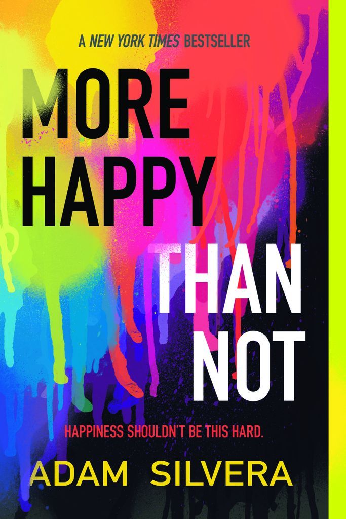
We went back to the drawing board one last time and we landed on my absolute favorite direction, which feels very broad to me for all audiences. The tone is perfect and matches that of the hardcover. I’m a huge fan of the divide between the title and how the explosion of colors is overpowering the darkness, sort of how happiness and hope can reign over unhappiness with will and time. What inspired this gritty (and perfect!) cover?
Finished Cover for the Paperback of More Happy Than Not
Liz: The title for this book served as the inspiration. It’s the visual equivalent of More Happy Than Not. More Lightness Than Dark. More Life Than Death. More Stuff Than Not Stuff. So basically you, Adam, came up with this “perfect” direction and didn’t even know it!
Eric: Any alternative covers for the paperback you can share?
Liz: Sure!
Eric: In addition to Adam’s amazing book, you’ve had a pretty amazing career working with a lot of fantastic authors, many that we’ve just talked about. Any advice for aspiring book designers, who want to follow a similar path?
Liz: If you want to be a book designer, you need to learn the programs, become a font expert, and be aware of design trends/pop culture/the book I’ll Give You The Sun (which every art director for the last year+ has referenced). Then you need to get an internship at a publishing company to gain experience.
BUT HERE IS A VERY SECRET INSIDER TIP: kids these days are going into digital design, NOT print or book design. The pool of young book designers is getting smaller and smaller. So if you want to be a book designer, now is a great time to break into it.
Adam: Thanks so much for the dozens and dozens of comps you created for this More Happy Than Not, for both the hardcover and paperback!
The paperback will be out on April 26th, 2016 and I can’t wait to show everyone the incredible cover you designed for my next book, History Is All You Left Me!
