

The Lost Art of Comics Corner Boxes
If you’ve ever taken a gander at some older comics, particularly anything from Marvel from the 1960s to the ’80s, you might have noticed a little box in the upper left hand corner featuring at least one of the stars of the comic, or maybe even a whole batch of floating superhero heads. These boxes were probably also crammed full of additional information, like the publisher’s name, the price, the month and year of release, and possibly even the Comics Code Authority seal.
These boxes in the corner are called…corner boxes, logically enough, and they’re a longstanding comics tradition that has mostly vanished these days. But how did they get started in the first place, and where did they go?
To understand the point of the corner box, you need to picture comics being sold not on the beautifully spread-out display racks of your local comic book store — and certainly not online — but on newsstands and in spinner racks. When you can only see the top inch or so of the cover, that real estate becomes very valuable, and so of course the publisher wants to make it clear to the reader that Superman or Spider-Man is in this issue.
Comics are obsessed with minutiae, and so it’s not hard to track down the very first corner box, on 1939’s, uh, unfortunately problematic Action Comics #16.
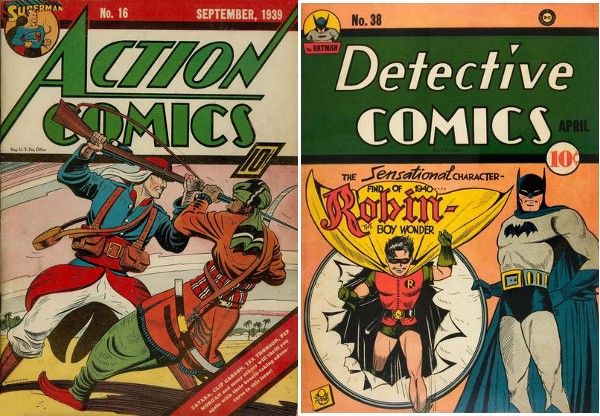
At the time, Action Comics was an anthology; Superman was the lead feature, but there were multiple stories in the book, and sometimes National, the publisher that would eventually become DC, wanted to showcase them. But they still wanted readers to know that Superman was in the book. Hence the dawn of the corner box, or technically more like a corner ball at this point. This was gradually adopted by other anthologies, like Detective Comics, and used even when the star was featured on the cover already.
By the late ’40s, the corner box had been mostly dropped, though. And then, in the early ’60s, came Marvel, the Fantastic Four, and Spider-Man:
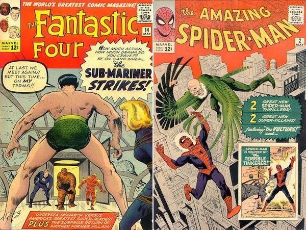
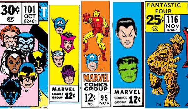
Fantastic Four #14, with a cover by Jack Kirby, featured the floating heads of its stars in the corner box, while The Amazing Spider-Man #2, with a cover by Steve Ditko, boasted a bust of ol’ Webhead. Both issues hit stands on February 12, 1963 and were cover dated May 1963 (comics were traditionally cover dated two to three months ahead so that they looked “new” for longer, and that tradition has stuck around), so there has been some debate over which artist came up with the idea, but when asked about it in the letter column of FF #18, Stan Lee attributed it to Ditko, and Kirby never contradicted him.
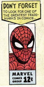
Cover boxes thus became Marvel’s thing. Marvel was very, very savvy about branding right out of the gate, and they understood that these boxes could serve as branding both for the characters in the books, and for Marvel as a whole, since they were the only publisher consistently doing this. They even replicated that Spider-Man corner box in their house ads inside the books, reminding readers to “look for one of the greatest trademarks in comics.”
Marvel often used corner boxes to showcase the entire lineup for a team, which was probably why they used the floating heads gimmick so frequently — it was an easy way to show the entirety of the X-Men or the Avengers in a small space. They also used it to highlight the stars of anthology books, like Iron Man and Captain America in Tales of Suspense or Hulk and Namor in Tales to Astonish. Other times, they’d use it to feature the most popular character in a team book; the Thing, for example, gradually eclipsed his costars on Fantastic Four, which you’d think would make the guy a little less cranky.
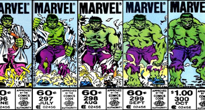
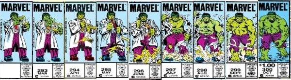
Once the tradition was firmly established, artists could play around with it. One of the most famous instances of this happened on the covers of The Incredible Hulk #292–300 in 1984. In the story, Bruce Banner started out in control of the Hulk’s body, only to gradually lose that control and grow increasingly wild. The corner boxes of those issues (drawn brilliantly by Al Milgrom) serve as a tiny flipbook that most readers picking it up on a monthly basis probably wouldn’t have noticed, but are incredible (zing!) when you look at them together.
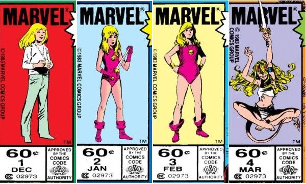
A similar devolution happens to the title character on the corner boxes of the Magik miniseries in 1983, and even DC got into the game with an ever-shrinking hero on the corner boxes of Power of the Atom in 1989.
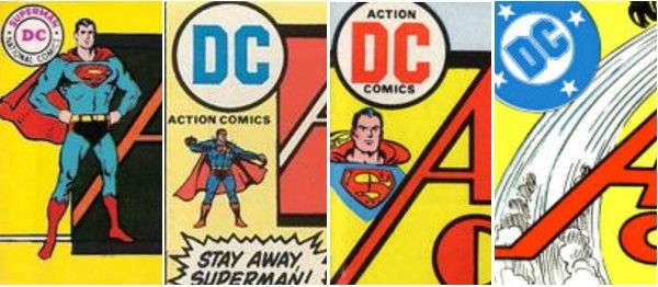
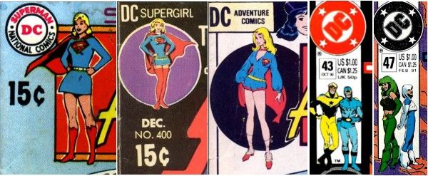
What’s that? Oh yeah, DC eventually got into corner boxes again, too…sort of. Though they spent the ’50s and most of the ’60s with just their logo in the corner, by the late ’60s they were experimenting with…let’s say corner iconography. Looking at Action Comics through the ’70s shows nearly a dozen different approaches, from various drawings of Superman to various logos to various combinations until they finally landed on the iconic “bullet logo” by itself, which I also have a lot of nostalgic love for in my heart, and which mostly stayed in place up to the 2000s. They’d also sometimes put Superman’s costar in the right hand corner, which is also perfectly good real estate.
Other DC books flirted with corner boxes too: Adventure Comics charmingly showed off a few of Supergirl’s costumes during the period in the ’70s where she wore new reader-submitted outfits every issue, and Justice League America had some cute duos featured off and on in the late ’80s. But it was never really DC’s thing.
Basically, Marvel took something DC pioneered during WWII that had faded from popularity, put a twist on it, went all in on some bombastic branding, and made the whole concept so iconically theirs that even when DC tried it again, it looked like they were copying Marvel. And then all of it fizzled anyway during the ’90s speculator boom and bust, and today it’s a nostalgic relic that a very niche audience loves passionately.
In other words, the history of corner boxes is basically the history of superhero comics, but only one inch tall. I’m so charmed by this, I can’t even tell you.
These days, corner boxes are a rare, nostalgic reference, though last summer artist Mark Brooks started campaigning to bring them back, sparking articles and YouTube videos homaging the tradition. (I am particularly indebted to this fascinating deep dive for this article.) Comics are so in love with their own history that I wouldn’t be surprised to see a return, or at the very least a month of themed covers from Marvel. But whether they come back for good or not, we’ll always have Spidey’s giant head.
Finally, I will leave you with what is unquestionably the greatest corner box art of all time, from the cover of Archie Meets Punisher, drawn by Stan Goldberg:
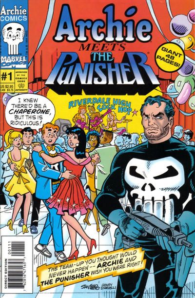
Beautiful.