


By the Cover: Meet Regina Flath, Senior Designer at Simon Pulse
There’s a lot that goes into the production of the books you love, you know, in addition to all the writing. Publicity, sales, editorial, production… there are so many parts that come together to make a book happen and get it into your favorite local bookstore. And there’s one in particular we notice quite often, but never really dig deep into.
The cover.
Just who is it that makes our books look so lovely? Can you tell when a book is designed by a particular designer or illustrator? You’d be surprised. Welcome to By the Cover, where I’ll be spotlighting some of those artists that make your books look so gorgeous.
REGINA FLATH is a graphic designer and illustrator with a passion for books: reading them, designing them, and illustrating them. She is the senior designer at Simon Pulse, an imprint of Simon & Schuster. Regina will have her picture book illustration debut in 2016 with Emily Grace and the What-Ifs.
When she’s not making books, she’s usually making something else, like herbal medicine, homemade lotion, socks, handspun yarns, or dinner. She lives with her husband, Dennis; daughter Violet; and two crazy cats.
How did you get your start, working in publishing and designing books?
I was VERY fortunate in how I got started. I initially went to University of the Arts in Philadelphia majoring in Illustration, thinking I’d be a full time freelancer illustrating picture books (side note, I’m now a part time freelancer illustrating picture books, so hurray for that!). About midway through I realized that I would go bananas if I had to be home working all the time and that I needed an in-house position somewhere to feel the most fulfilled.
I started talking to Elizabeth Parisi (who was creative director at Scholastic at the time and I believe still is, though her title may have changed a bit) and realized that book design was something I could really do well and be happy doing. So from that point on, I did two projects for every one I was assigned in school: One illustration project and then a corresponding design that made whatever illustration I did into a book-context piece.
By the time I graduated I had two complete portfolios, design and illustration. We had our senior portfolio day and I met an art director who HAPPENED to be looking for an associate designer over at Houghton Mifflin Harcourt. I interviewed with her a few weeks later and was hired just a few days before graduation.
As I said, VERY fortunate! The rest is history!
Do you have a favorite project in particular? What about it made it so special?
My favorite project thus far has been the Diary of a Haunting series.
This is an IP project that was started by Michael Strother over at S&S Pulse, the imprint that I work in. Each book is a documentation of some kind of paranormal activity. The first book, for which the series is named, was such a special project because I got to work on a super creepy cover (my favorite kind!) AND give it amazing special effects!
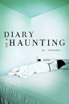 The jacket is printed on a clear acetate, which allows the effect of a creepy, wall crawling ghost lady to appear and disappear in a room when you take the jacket on and off.
The jacket on it’s own is reminiscent of spirit photography because the acetate gives a sort of film-negative effect. Not only is the cover cool but the interior features images throughout.
BUT THAT’S NOT ALL! I also animated the cover, which was super fun and allows the acetate cover effect to be enjoyed in a digital space too.
I just finished the cover for book 2 in that series, which will be revealed some time in the new year.
How many books do you find yourself working on each year? Do you often get a chance to read the entire book before working on a cover?
I work on about 30-40 books a year, about 25 a year that are hard cover originals. Oftentimes I do read the entire book before working on the cover, as it’s my preferred way of tackling a cover.
However, sometimes there isn’t a full manuscript ready, only an outline or a concept (and sometimes other key elements are missing like the title of the book!). Any time I work on a book, the ideal situation is that I can read the manuscript before I start.
Most of the time the editorial department has some idea of what they want on the cover, but I like to provide a lot of different directions and my reading and interpretation of the book can sometimes provide ideas that editorial hasn’t thought of.
Does it matter if you don’t fall in love with the book?
Absolutely not. It’s not my job to love the book, just to make it look good. It’s a point of professional pride for me that I can make good covers for books that I don’t personally like.
How many mock-ups and comps do you generally whip up, before leading up to your final?
That varies from project to project. Some projects go from my first idea to final in one shot, others take months and I’ve done up to 100 different comps for one book!
Do you have any favorite unused covers you can share with us?
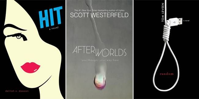
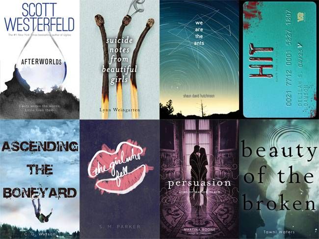
Yes! A cover that has gotten a lot of love lately is for Hit by Delilah S. Dawson. We went through a LOT of covers before the one you’re familiar with.
At first, it was a very graphic direction with a portrait of a girl with a gun hidden in her eye. The book is about a girl who gets roped into being an assassin for a bank, posing as a mail carrier and then shooting the debtor.
Then, when that was deemed TOO graphic (the other kind of graphic) with the gun in the image, I did a shoot with a great model who posed as a mail carrier with just the hint of the violence with a smoking package.
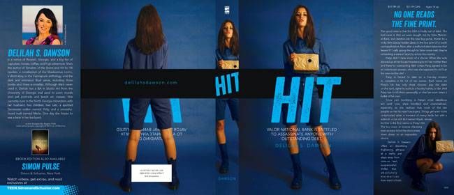
My idea was that if you didn’t see the gun, just the bullet hole and a bit of smoke, it’d make the viewer into the debtor and make for a compelling image. Unfortunately, that too was rejected as being too tongue-in-cheek.
In the end, I did the credit card with the title in the the card design and just a few drops of blood in the corner, which every one quite likes!
Sometimes, as I said above, it can take a lot of different directions to get to the final!
I also am able to share the first cover for Random by Tom Leveen.
This is a really intriguing book that deals with a boy who was a victim of cyber bullying, which led to his suicide, and asks whether or not you’re participating in the bullying if you’re just a bystander.
The USB noose was deemed too dark, so we went for the portrait with the pixel-face instead.
Finally, I included the paperback cover for Afterworlds by Scott Westerfeld because that image was actually the very, very first comp I made when working on the hardcover!
While the hardcover ended up going with a more stark look, you can see the DNA of that original comp (now the paperback cover) there: the teardrop.
What’s the process like going from designing a hardcover to working on a paperback release of that same book? Sometimes the covers are drastically different. Can you share a favorite example?
At Pulse we often have different designers work on the paperback if it’s changing from the hardcover. Sometimes I will do my own repackages though, like the one I did for Delilah S. Dawson’s Servants of the Storm. We needed a new look for the paperback and I just loved the book (and the original cover) and it just happened that I was the one on the team who had the bandwidth for the project.
It was definitely a good creative exercise to try to make a new cover for a book I had already worked on. It was very much like doing a new set of comps for a cover that had been rejected: looking at the book from as many new angles as possible without repeating myself.
Any advice for aspiring book designers?
Read! A love for books translates into your designs in a way that can’t be taught and makes you a valuable designer to the editors who can always tell if you’ve read the book.
And always keep creating. One of my most favorite books to recommend to aspiring creatives of any field is Twyla Tharp’s The Creative Habit.
The piece of advice that always comes back to me from that book is, and I’m badly summarizing it, to keeping working, all the time, even when you don’t feel “inspired”. Sometimes just starting is all you need to make something amazing happen. You don’t need to wait for the right time, or the right materials, or a divine stroke of inspiration. Just keep creating, every day.
And finally, can you show us some of your favorite projects?
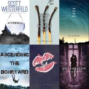
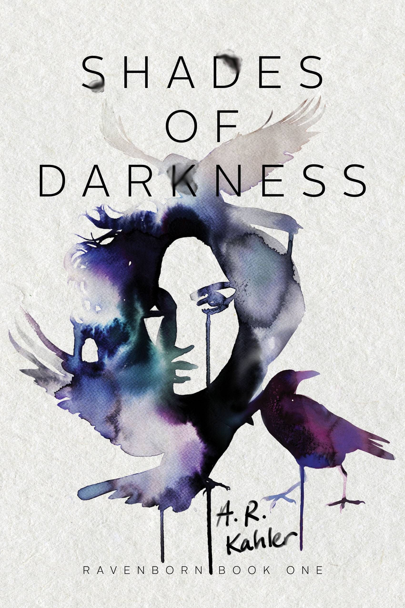
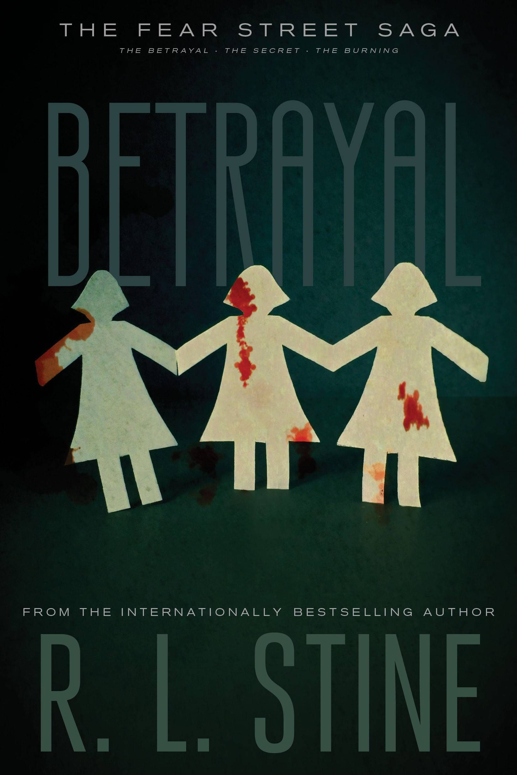
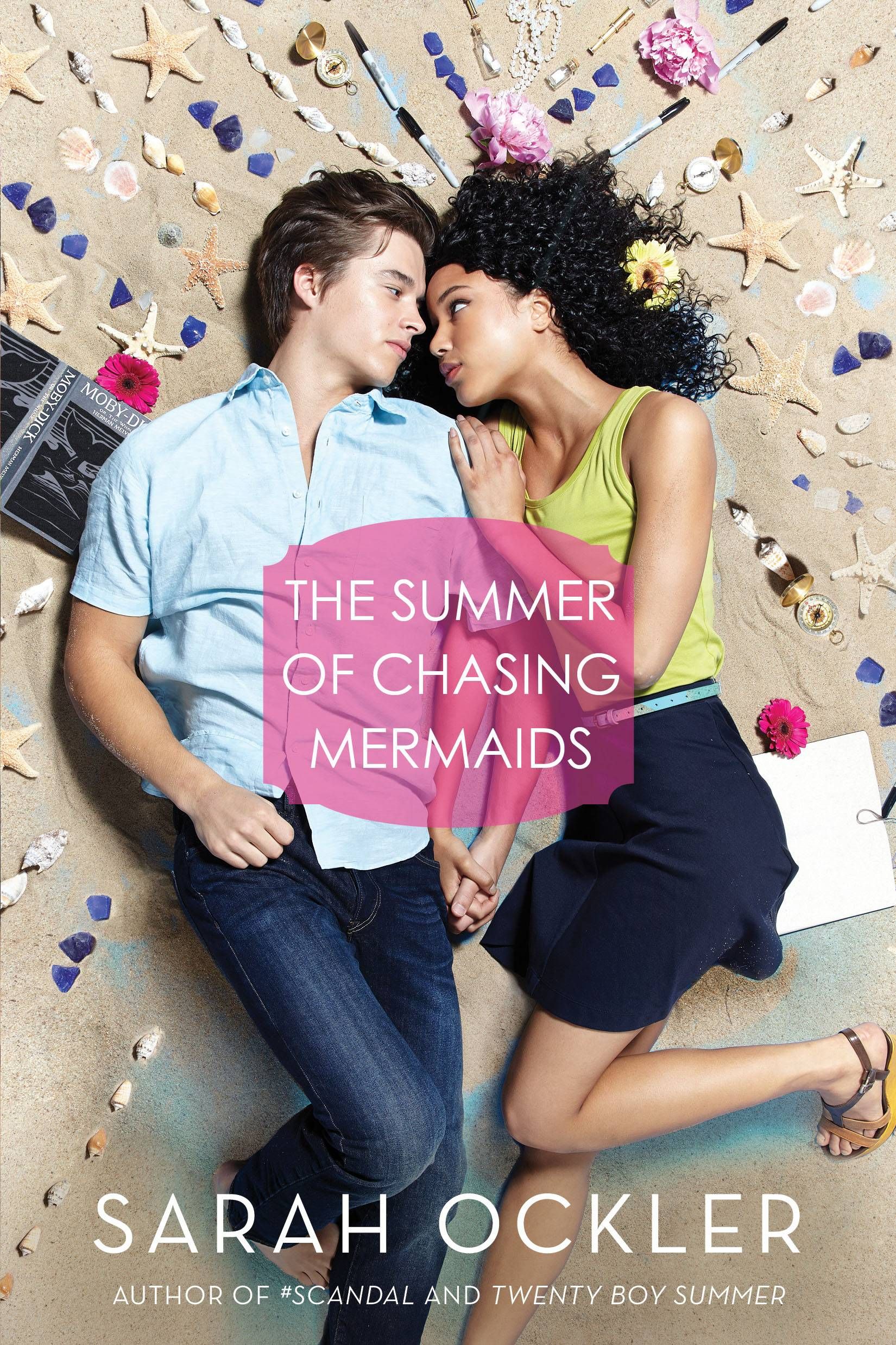
I included a selection of my favorites! The full wrap jacket of Anne & Henry, Betrayal (by the legendary R. L. Stine!), Shades of Darkness (illustrated by college-Regina’s hero, Stina Persson), Zeroes (no explanation needed there!), and Summer of Chasing Mermaids (which was a photo shoot I got to execute exactly to my concept and that I’m super proud of!).


—
Want to learn more about Regina and check out more of her work? You can visit her online at reginaflath.com and follow her on Twitter at @reginaflath.