


Book Designs Booksellers Hate!
One thing that professionally shelving books for years will do is give you very specific likes and dislikes when it comes to book designs. You discover exactly which covers appeal to you the most, and which designs you wish would be retired for all time. Here are a few book designs that booksellers (and librarians) hate–usually because they’re impossible to keep looking good.
What a beautiful cover! For now…
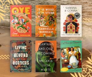
1. Die-cut covers. This is probably something that most readers don’t think about, but covers or dust jackets with cut-outs are a shelver’s nightmare. Even in new bookstores, it’s just a matter of time before the corner of one book catches the edge of the die-cut and rips it. In the case of Colorless Tsukuru Tazaki, boxes would often come already damaged just from sliding against other copies slightly in transit. As pretty as they can be, die-cut covers just aren’t practical.
Trying to shelve The Potato Cookbook still haunts me.
2. Non-rectangular books. Books shaped like other things. Look, I get it: you wrote a cookbook about potatoes. It seems clever to make it potato-shaped! It will sure stand out! Well, it will stand out in the sense that it will stand out from the shelves by falling onto the ground. How am I supposed to shelve an oval? Or that kids’ book about the pyramids that’s shaped like a giant triangle! OH! Or worse: that book about skyscrapers shaped like a skyscraper! That’s too tall for any shelf!
Rest in peace, hardcover. Too tall to last.
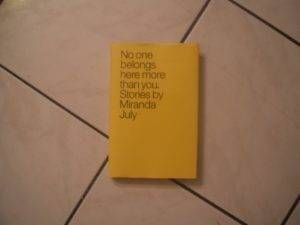
3. Weirdly-sized books. Okay, so at least they’re rectangular, but we have standard book sizes for a reason. That reason is so that bookshelves can be at a standard size. If you insist on making your book an inch taller than the standard size, it doesn’t fit on the shelf! (Looking at you, “comfort format” mass markets/pocket books.) Books like No One Belongs Here More Than You get their dustjacket and edges mangled from being forced on the shelf by customers too many times. Why would you do this to an innocent book, publishers?
WHYYYY
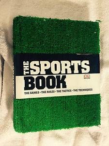
4. Books covered in fur. Or astroturf. We once got The Sports Book in used without the tag without the strip of paper that has the title on it. It was just a book covered in astroturf. Who’s going to buy that?? (It did sell, eventually. Because a customer wanted to buy the copy with the strip of paper and we convinced them to take the once without for half the price.) And maybe this is just a personal pet peeve, but I find shelving books covered with fake fur shudder-inducing. (Yes, they exist. See: The Wild Things.)
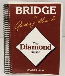
Of course we’re all familiar with Audrey Grant, the go-to Bridge book author, probably the most well-known of the format.
5. Spiral bound books. Nothing looks worse on a shelf than an anonymous spiral bound spine. For things like cookbooks and bridge books, it makes sense once you get them home, but like most of the things on this list, it just doesn’t make sense in a bookstore or library shelf setting.
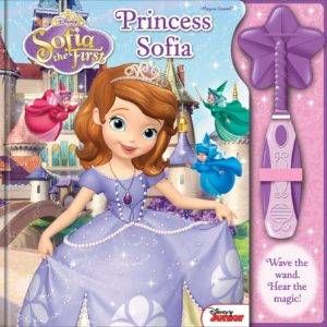
That wand is going to be detached and lost in the shelves, I know it!
6. Books with toys attached. I don’t mind books that come in a box with toys, but books with things like speakers jutting out from the cover–or a wand attached with a thin elastic band–are impossible to shelve neatly. They end up making the shelf all lean to one side, if they can even fit on the shelf at all. Maybe those books are meant to be categorized more as toys than books, because they definitely aren’t built for shelves. (Oh, and a used bookstore problem: those Lego books with a minifigure in it, but used ones always come without the mini, so half the book is just cardboard filler.)

All of Malcolm Gladwell’s hardcovers endlessly attract smudges and dirt.
7. Covers that are impossible to keep clean. There’s a certain kind of rubbery cover that is a nice enough texture, except that it shows every fingerprint of every person who’s ever touched it. Any matte white cover ends up smudged and dirty-looking–often just from being shipped to the store, before they’ve even hit the shelves!
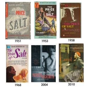
So many names. So many alphabetization options.
8. Books published under multiple authors and titles. Where are you supposed to shelve The Price of Salt by Patricia Highsmith aka Carol by Claire Morgan so that they’re together? Or if the new edition of a book gets renamed after the movie title, how is that alphabetized? It’s anarchy! (And don’t get me started on authors that republish their books with different names–I’m looking at you, Nora Roberts. I’m pretty sure you’re purposely trying to get people to accidentally buy the same book twice.)
the pin
The bottom book was “Billy the Condominium Cat” before sticker placement.
9. And finally, books with the title or author placed where library stickers usually go. This is one I don’t have to worry about in the bookstore, but we do sometimes have trouble putting sale stickers on books that fill the entire cover with the author and title text, meaning any sticker will obscure the information.
This has four different dust jackets layered together, just waiting to be torn when shelved.
Believe it or not, this is just a sampling of bookseller and librarian woes when shelving. I had to narrow it down.
Do you have any of your own book design annoyances? I stuck to just practical concerns here (to avoid getting starting on a movie covers rant), but let me know if I missed any of your book design pet peeves!