

What Makes A Good Comic Book Cover?
You’re not supposed to judge a book by its cover, right? Well, in the world of comics, you’re basically being begged to do just that. With a plethora of series all aligned on the rack or tablet in front of you, each with their own dynamic burst of form and figures, a comic’s cover needs to stand out from all the others to hopefully lure you in like a siren’s call. Sometimes it feels like you’re trying to pick out the actual holy grail from a sea of pretenders lest you decay in rapid fashion by…uh…a curse? (Why did picking the wrong grail kill you in The Last Crusade anyway? Couldn’t it just have not made you immortal instead? Seems harsh.) A good comic book cover is essential in trying to lure you into trying something you may not have previously had any interest in. A good cover, through a single image, lets you know that you would enjoy reading the comic it graces. A good comic book cover, says something.
Spoiler warning: a good comic book cover, like literally all art, is subjective. What clicks for you may be drab and ineffective for someone else. It might be a bit of a “I know it when I see it” situation, but I still think there are some constant and integral components to turning a one-page picture into something that begs to be explored. A pretty important factor is composition, how an artist arranges the elements of art (line, color, form, texture, space, etc.) to create a balanced and pleasing final image. Comics are, arguably, a little unique because covers also often tell a story; or at the very least, hint at a story. As such, there are multiple approaches to cover art.
Once upon a time covers would provide a tantalizing look at the plot found within. Here’s an example:
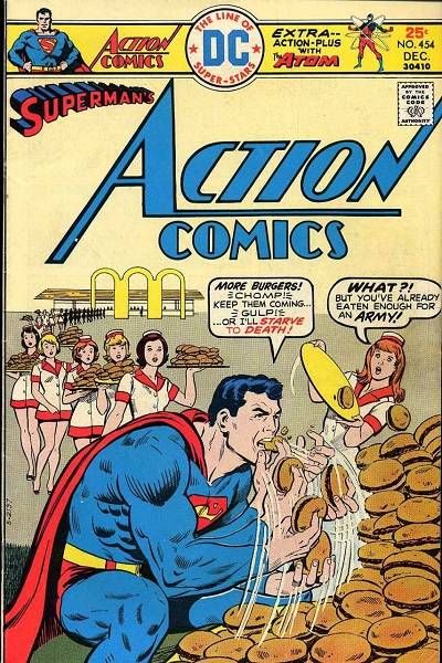
Action Comics #454 cover by Bob Oksner
Now, let’s get the obvious out of the way: this cover is flippin awesome and that’s an objective fact, don’t @ me. In addition to being a well rendered and nicely composed cover, it forces the potential reader to ask, “Okay, why would Superman die if he doesn’t eat 10 million hamburgers?” and also, “Why is Superman living my dream life?” Throughout most of comics’ history this was a standard approach to covers; show a glimmer of what the story and the challenges it presented to the characters were about through a sensational scene. While you can still find covers these days utilizing a similar technique, it’s a lot rarer than it used to be. Because comics are solicited months ahead of their release date, publishers often commission covers from artists without really knowing what happens in that specific issue. Not only is it not unusual for this artist to be someone different than the series’ primary art team, it’s almost preferable considering the workload of many artists who do interior art as well as the need for the cover to make a unique statement all its own. What you see a lot of today is a radically different art style on a cover than what you’ll find inside that depicts a completely unrelated scene than what you’ll find inside. That’s pretty screwy, when you think about it. So don’t. Comics will break your brain enough once you learn about the nuts and bolts of the direct market.
Considering how many comics have covers that need to be striking by both design and necessity, another common approach is essentially a pin-up image. These types of covers generally fall into two categories for me: the generic “character floating in undefined space” cover and the far more transcendent iconic pin-up that captures the core of a character. Obviously, your mileage will vary as to what you consider “iconic” but something like Jenny Frison’s Wonder Woman covers are a solid example of turning what is essentially just a static image of the character featured in the comic and into something that sums up the spirit of both the character and the series.
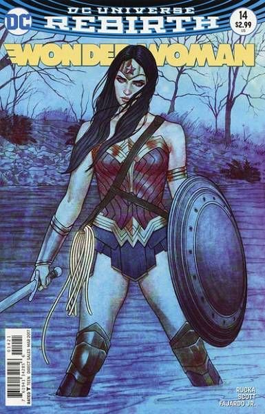
Wonder Woman vol. 5 #14 variant cover by Jenny Frison
Frison injects palpable strength into the image while also hinting at the ominous. Wonder Woman is squinting here, a look that conveys a sense of wanting to understand and evaluate her foe before acting, but maintains a sense of determination. You absolutely get a sense of who Diana is, a warrior at the ready, but not that’s headstrong ready to fight before necessary. That’s a lot more effective than say something like this that looks like the only instruction the artist was given was “I dunno…uh…X-Men.”
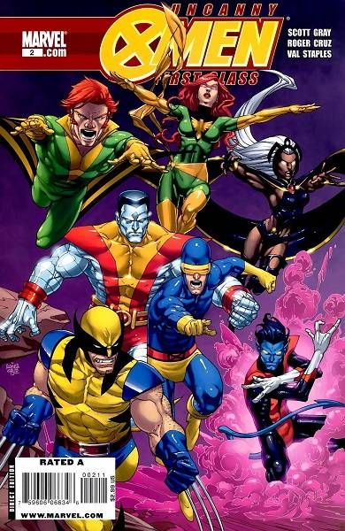
Uncanny X-Men First Class #2 by Roger Cruz
It’s rendered well enough by Cruz, but it literally says nothing other than the X-Men jump into battle sometimes? None of the characters are relaying any sense of personality beyond their powers and hell, Banshee’s the only one with pupils here. They exist in a nebulous space that says little about what’s in this issue that’s different than any other issue. Cruz is at least the artist doing the interior art, so I suppose at least it gives you a hint of the type of character posturing you’ll find there.
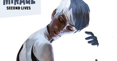
When it comes to these types of iconic pin-up covers, I’m also a noted grade-A sucker for imagery utilizing negative space, such as this Dr. Mirage cover by Jelena Kevic-Djurdjevic :
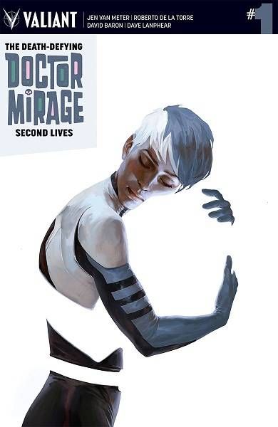
The Death Defying Doctor Mirage: Second Lives #1 by Jelena Kevic-Djurdjevic
Now THAT is a haunting and beautiful cover that manages to encapsulate the themes and tones of a comic in one single striking image. It hints at the story inside while also telling its own mini-story of how what isn’t there is omnipresent. That’s what I’m talking about.
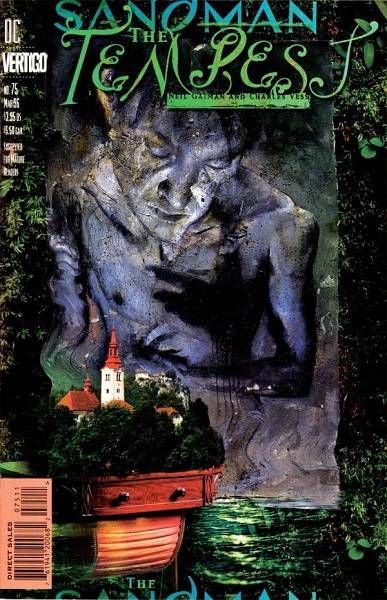
When I was learning about scenic design, I had a teacher that used “image cards” which were nothing more than clippings from magazines glued on index cards. These clippings were just portions of a larger image and never featured a fully formed image on their own; for example, one might feature a portion of a dress with bits of a red carpet and flashes of cameras and another might be a part of a chain-link fence in the rain. The point was to examine how the elements of an image out of context made you feel. Did this index card feel like “anger” or did it feel like “tranquility”? Did this card represent “mania” or “jubilation”? You get the idea. It’s this sort of thematic approach to comic covers that speak loudest to me and there are fewer examples better than Dave McKean’s covers for The Sandman.
-

- Sandman #75 cover by Dave McKean
-

- Sandman #20 cover by Dave McKean

-

- Sandman #1 cover by Dave McKean
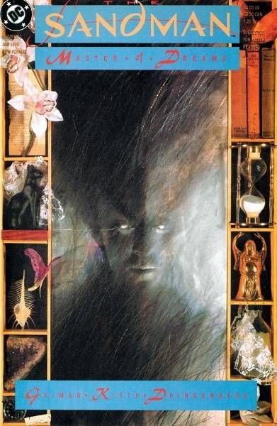
McKean incorporates mixed media into these covers to create the image card monster beauties of my dreams. They all are indicative of the tales found behind them and each exist as a striking piece of art all their own. To this day I can’t think of any series with covers that so perfectly match the tone and themes of what’s inside. (If you haven’t checked out Dust Covers, the collected Sandman covers, I highly recommend it.)
Obviously, even the most aesthetically gorgeous cover may be completely tone deaf in its depictions. A comic featuring a teenage female hero aimed at a younger audience definitely shouldn’t feature a hypersexualized or otherwise exploitative depiction of anyone on their cover. A good cover, as the entry point to a comic that a bystander cannot opt out of while scanning a rack of comics also shouldn’t feature racial slurs or acts of hate You’d think that’d be obvious, but hoo boy does it happen more often than it should There are plenty of recent examples and controversies surrounding these types of covers, and they’ve been well-reported on, but in the discussion of what makes a “good” cover this highlights a pretty important point: a good comic book cover appropriately encapsulates its contents, be it through a literal recreation of story or a thematic representation. You want a cover to spark your imagination and make you pick it up because the inside holds more of this. Otherwise, they’re just pictures without purpose.


