

Fashion Disasters: Roy Harper
Some comic book characters who have been around for decades have iconic costumes that have stood the test of time. Some have progressed through a series of stylish ensembles to reflect their ever-changing time periods.
And some, apparently, get dressed in the dark.
Here on Fashion Disasters, we’ll showcase those poor slobs who just can’t seem to get it right. First up: Roy Harper!
Roy was first introduced way back in More Fun Comics #73 (November 1941) along with his mentor, Green Arrow. As Ollie’s kid sidekick Speedy, he dressed exactly like his mentor but in red:
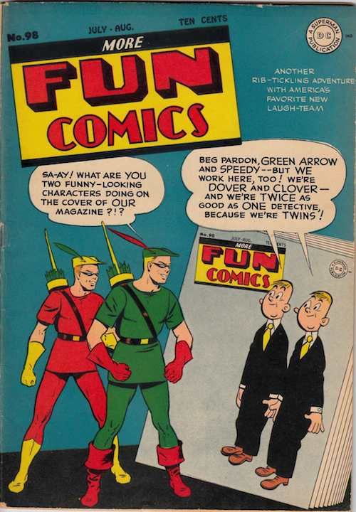
And, like, it’s fine, I guess? The oversized belted T-shirt and leggings combo is very much what I wore as a little kid in the ’90s, but hey, it’s affordable and comfortable! He’s accessorized with the hat (LOVE), dishwashing gloves, and a pair of boots borrowed from Dr. Fate, with whom he and Ollie shared a book. It’s an uninspired copy of what was already a boring costume, but it’s not appalling.
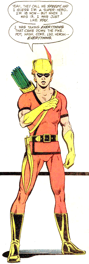
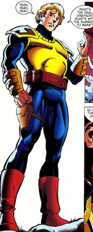
After his infamous battle with drug addiction in the early ’70s, Roy modified his look slightly to a wrap top with a daring décolletage. Again, it’s not terrible, but all those lines conflict—the diagonal straps of his quiver, the black outline of the wrap, the belt, the hem of his shirt. Although, considering some of the more recent outfits he’s worn, I probably shouldn’t be complaining about too many lines with this one.
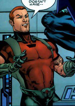
(Also please enjoy Roy’s extremely accurate description of being 13.)
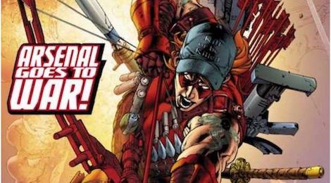
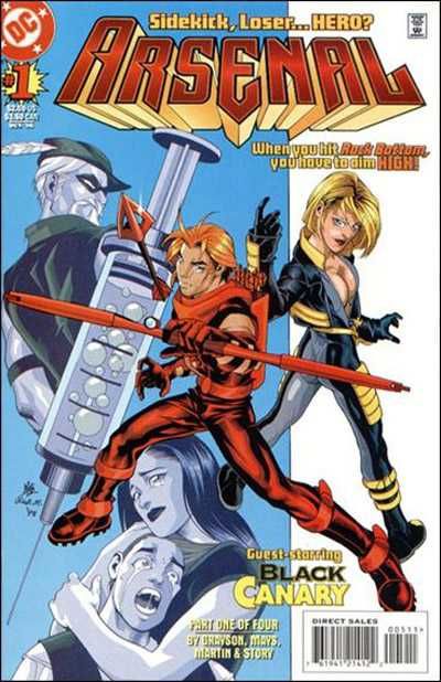
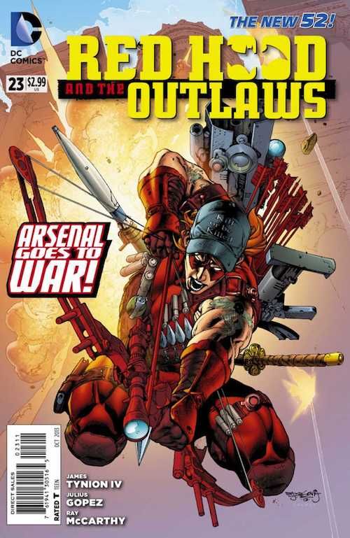
Oh, Roy. Oh, Royford. Oh, my sweet summer child. What are you doing? Roy’s first costume under his big boy codename Arsenal features some of the worst trends ’90s comics had to offer, including nonsense pouches, a headsock with the top cut off to let his hair flutter in the breeze (there are costumes where I like this, but, like…if your chin needs protection, why not your skull?), and armor where armor shouldn’t be—in this case, a solitary crossbow-laden forearm. Also, big ol’ armpits. And fingerless gloves. And I’m pretty sure that’s a boomerang on his chest and not an arrow. This is a mess.
On the other hand, he’s the only dude on this cover who doesn’t have a mullet, so it could be worse.
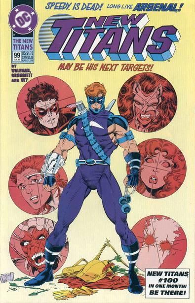
This costume (which I’ve always thought of as football padding even though that’s supposed to be a metal breastplate, for some unexplained reason) manages to somehow be both ugly and boring. Like, the point of streetwear as a superhero costume is that it’s at least stylish? Or comfortable? But this manages to be visibly neither while also combining all the non-matching browns Roy could find.
A supervillain looked into Roy’s mind and decided he wanted to be just like his then-dead foster dad, so he gave him a costume exactly like Ollie’s, but in red. This is actually a fantastic costume…because it’s Ollie’s. But in red. This is kind of a theme for Roy.
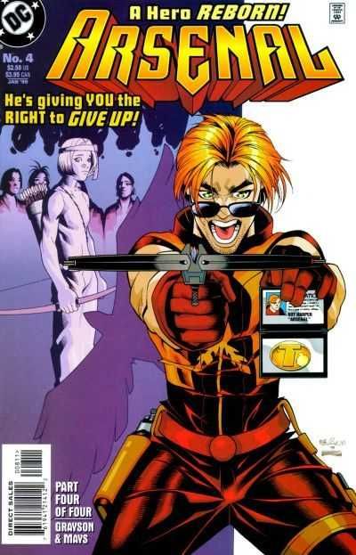
This is probably the best costume Roy ever had that wasn’t a direct copy of Ollie’s. Or, at least, it looked really striking when drawn by its original designer, Rick Mays…and sort confused when drawn by anyone else? (The first one above is the Mays version.) But Roy tried. Even if it strikes me as really out of character that Roy put that arrow pointing up and not down.
Please note that this is also the start of Roy’s apparent contractual obligation with DC to incorporate a douchey element into his costumes forever. In this case, it’s the 24/7 sunglasses.
“Realistic” streetwear got really popular in the early-to-mid–2000s and Roy went neutral with this look. It manages to be both boring (pants, jacket, zzzz) and overly busy (those boots!!!), but it’s fine. Whatever. His belt is a robot and as an archer he’s going to really regret not protecting the inside of his upper arms, but the short sleeves + holster straps do things to his shoulders that I’m certainly not complaining about.
But. The soul patch. The souuuuul paaaaaaaaatch. Why, Roymund, why?
![]()
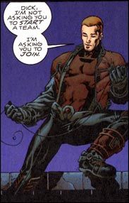
And we’re back to copying Ollie again! It’s weird that when Roy joins the Justice League, Hal gives his best friend’s son an identical costume to Ollie’s, but about three times too tight, right? With a giant R on his belt buckle to peer pressure him into changing his codename to “Red Arrow” to be more like Ollie? Like Hal’s midlife crisis is taking the shape of roleplaying his own youth with his friend’s son? It’s uncomfortable, right? It’s not just me?
Anyway that R is super douchey so we’re three for three on the contractual obligations, well done.
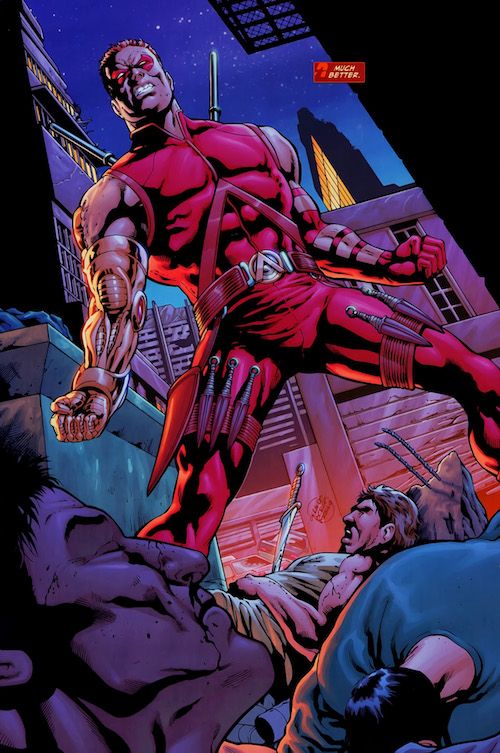
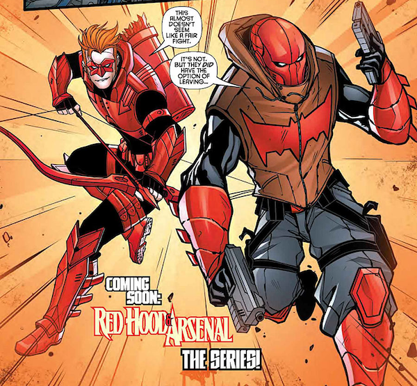
Part of me wants to give Roy a pass here because he’d just had his arm ripped off, his daughter was horribly killed, he fell off the wagon drug-wise, and he was working for a supervillain. Another part of me wants to drag this costume to hell because everything I just said in the last sentence was some of the worst stuff DC’s ever done. The rest of me knows that objectively speaking, this costume is…pretty bad.
The mask is fine. The collar is fine. The golden robot arm is…impractical, given how soft a metal gold is, but so is shooting arrows at criminals with guns, so fine.
But OH MAN YIKES @ the rest of it, huh? The big triangle strap poking into his solar plexus…is that supposed to be an A? Why does he need another one on his belt? Why are they both essentially Aquaman’s logo? I know he’s back to being Arsenal here but there are other ways to stylize an A! What’s supposed to go in that big hunting horn flap on his right thigh? That knife in that guy’s chest back there? Why does he have five thigh-knives and then one awkwardly larger one? What’s with the ski poles on his back? Do men understand that if you put an elastic band around your thigh and then weigh it down with 2–4 knives, it will not stay around your thigh? Why is his belt buckled over his knife holsters?
This is also a great example of something that a lot of Green Arrow art falls victim to, which is that those weird arm straps Ollie started sporting in the ’70s aren’t just to give him awkward tan lines. They’re meant to protect his inner arms from the release of the bowstring, which means that the solid part should be on the inside of Roy’s arms, not the outside. You just lost one arm, Roy, don’t slice the meat of your forearm off the other one.
Finally, in answer to that narration box: no, Roy. It’s not much better.
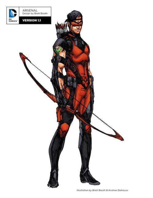
Brace yourselves, because I’m about to say something good about one of Roy’s New 52 costumes, but…this is actually a bit better than the last one. It clearly draws its inspiration from the previous look, but the use of two distinct shades of red plus the touches of gold break the whole thing up a bit and make it look less arbitrary. The hip quiver is a thing real competitive archers use, and though I don’t think it works for someone who does a lot of backflips while he archeries, it’s clear that some thought was put into this design. Like all New 52 costumes, it has way too many little lines all over it, and he’s still wearing his bracers backwards, and are those spats? But honestly, it could be worse.
But the hat. Why? Who looked at this costume and thought, “You know what it needs? A TRUCKER HAT”? Why did they hate us?
This is the dumbest thing I’ve ever seen.
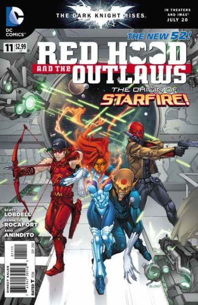
Sure, weird preppy armor and a throwing star on his face, why not? I will say that I appreciate that this is the most Robin Hood (or Will Scarlet, I guess) Roy has looked since he last dipped one of Ollie’s costumes in cherry Kool-Aid, but it’s also so egregiously unnecessary that I’m furious. Although…at least he’s not Jason.
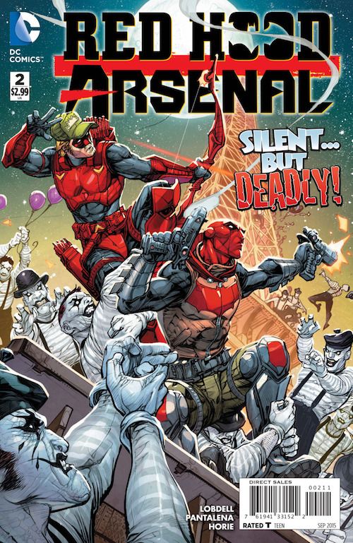
Why would you set yourselves up for a fart joke like that? Why is Roy wearing an armored tankini over his Under Armour? So many questions.
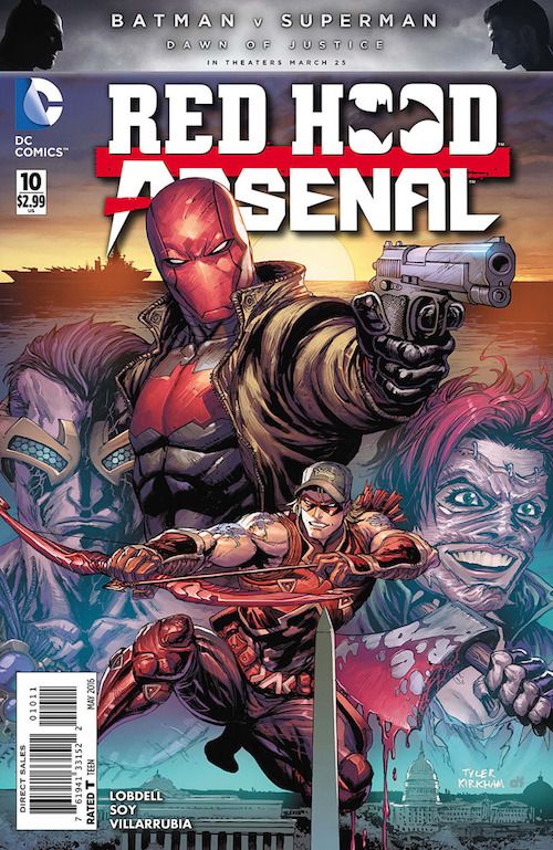
This outfit is back but more “tribal-y,” I guess? I’m so tired.
I’d like to note that Roy went through at least six costumes in five years but never got rid of the damn hat.
Oh no, see, he turned the hat around now. And he’s got wraparound shades, too, so we’re doubly douchey! Boy, that’s just gilding the lily, isn’t it?
I don’t know what to tell you guys. I feel like a broken record at this point. There are too many lines. There are pointless pouches. His bracers are still on backwards.
(In case you’re wondering if Roy has ever had an unquestionably good, truly personal costume: yes. It was on the Teen Titans cartoon, and it was amazing.)
Roy. At the risk of sounding like your mother, you are a handsome young man in the prime of your life! You have such a pretty face! Please, for the love of Locksley, get yourself into a better costume and let your light shine. You deserve it!
And while you’re at it, burn that hat.