
By the Cover: Dave Caplan, Creative Director at Little, Brown
Welcome to By the Cover, where we spotlight some of the artists that make your books look so gorgeous.
In today’s By the Cover, we’re chatting with Dave Caplan, a Creative Director over at Little, Brown.
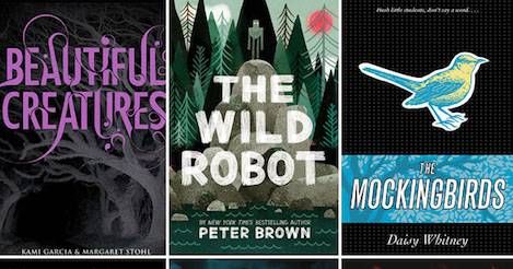
Caplan’s worked on a ton of fantastic, bestselling YA and MG novels, including some of my personal favorites, like Unbreakable by Kami Garcia and the recent, absolutely delightful The Wild Robot by Peter Brown.
Read on to learn about how he got his start in publishing, and to see some alternate covers to Kami Garcia’s Unbreakable!
How did you get your start, working in publishing and designing books?
I first entered the Publishing industry quite accidentally. To tell the truth, I hadn’t even considered a career in Publishing until I had a serendipitous encounter with an college friend after I had just moved to New York City.
She was working at Scholastic Inc. at the time, and I had mentioned to her that I was looking for a full-time job in any field, while hoping to pursue a graphic design degree at night. She told me about an Editorial Assistant position that was available in her department, and suggested that I apply for the job. My resume at the time very much reflected my interest in graphic design, so it was not surprising that I didn’t get called in to interview for that position.
However, I did receive an unexpected call from David Saylor who was the Creative Director of Scholastic Press. He was looking to hire a Design Assistant, and I was lucky enough for my resume to have been forwarded to him. David knew that I didn’t have any previous design experience (I had graduated with a degree in Anthropology), but he decided to take a chance on me.
Thanks to David, I received received an excellent hands on design education that far exceeded anything I would have experienced in a classroom setting.
Do you have a favorite project in particular? What about it made it so special?
One of my favorite projects is a book I’m working on right now titled, The Secret Keepers, by Trenton Lee Stewart.
It’s a story about a twelve-year-old boy who discovers a watch that grants him the power of invisibility, and it’s his job to uncover the mysteries associated with it. Trenton’s writing has both a current and classic feel, and I wanted to somehow capture the world he created with all its rich imagery.
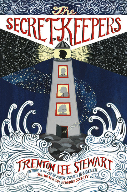
When exploring the initial packaging, I was inspired by what I often refer to as “modern vintage” book design. This type of design draws on the aesthetics of earlier turn-of-the-last-century dust jacket and case cover design, and reinterprets them with today’s design sensibilities.
In terms of imagery for the front cover, I immediately gravitated towards a lighthouse — which with its iconic shape, creates tons of great graphic opportunities. The lighthouse also plays a central role in the story. In my image research I was inspired by several vintage case cover designs, and even a retro jazz album by The Cannonball Adderley Quartet.
Finally, I was fortunate enough to work with Diana Sudyka, the illustrator, who took the baton from my initial point of inspiration, and created this fabulous piece of artwork and lettering.
Does it matter if you don’t fall in love with the book?
As a designer, I love the thrill of working through a great cover idea — no matter the subject or storyline. The process of design and discovery is always far more rewarding than the end result, and this is what always keeps me creatively fueled and engaged.
There are at least 5 different design solutions for any cover, so there is always an opportunity to challenge yourself and come up with something you’ll find special.
How many mock-ups and comps do you generally whip up, before leading up to your final?
I like to say that each cover has its own journey towards a final approval. Sometimes you get lucky and nail it in the first try, and sometimes you have to keep plugging away and you can easily create 40, 50, or even 60+ cover comps.
When a cover approval process drags out, it takes a lot of focus to keep reinventing yourself and your cover concepts. As I mentioned before, you have to really love the process of design more than the end result.
And drink lots of wine.
Any advice for aspiring book designers?
It can certainly be challenging to break into publishing, and having the right portfolio can definitely help get your foot in the door. If your portfolio doesn’t already include some examples of book design, I always suggest coming up with your own projects which might include reinterpreting a classic book cover, or inventing your own titles — anything to help show how your eye works in this format. Thanks to stock photography, it’s incredibly easy to source great images for portfolio pieces.
For those who are at the beginning of their careers in publishing, it’s important to work hard, be flexible, and be a sponge. Design is like any other skill in that it’s built up through practice, dedication, and a non-stop desire to learn more. Always be hungry and align yourself with projects that will broaden your design sensibilities, and challenge yourself to get out of your comfort zone — you will never regret it.
Lastly, creative inspiration comes from everywhere, and it pays to always be observant of your visual surroundings. That disgusting, peeling painted wall in the subway might just be the perfect texture to add to your next cover design.
Do you have any favorite unused covers you can share with us?
For sure! The approval process is fairly layered as a cover oftentimes has to satisfy a lot of different criteria and parties. That ranges anywhere from making sure your author is happy, to making sure your cover is strongly placed within the visual landscape of that book’s market. That said, there are a few covers that clearly just satisfied just me!
![]()
Icons by Margaret Stohl: I loved this first version of the cover. I thought its strong, graphic composition and color helped it to stand apart from the other dystopian fiction covers out there at the time, which often featured photo illustrated scenes of cities in the distance.

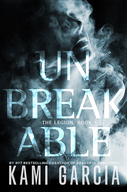
Unbreakable: This is a great book which has tons of spine-chilling imagery. While I love the final cover, which focused less on the spookiness of the story, I also had fun playing with these early cover ideas that verged on horror.
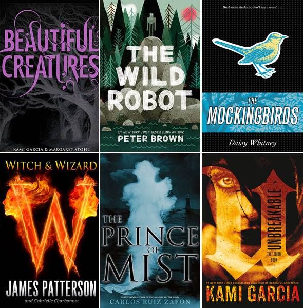
And finally, can you show us some of your favorite projects? We’ll share them below.
Here a just a few of the many projects I loved working on:
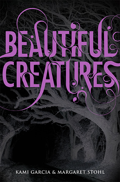
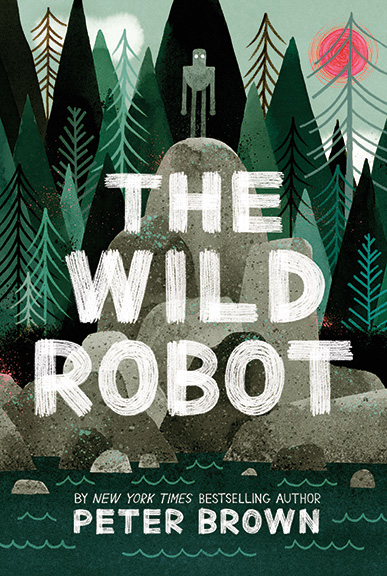
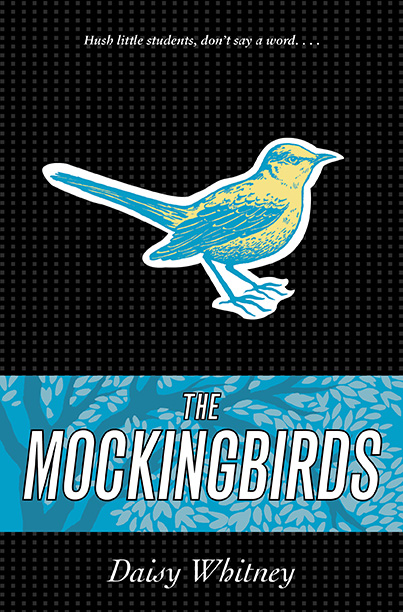

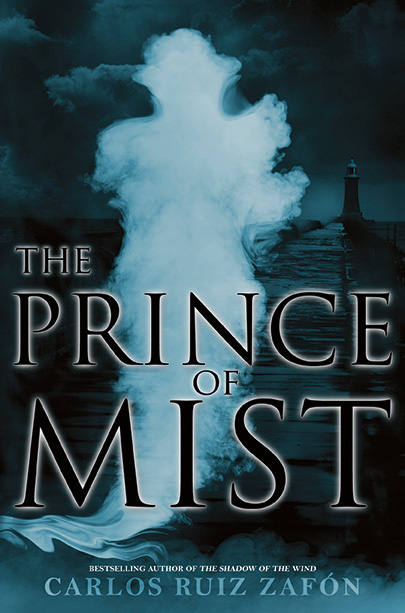

Beautiful Creatures by Kami Garcia and Margaret Stohl; The Wild Robot by Peter Brown; The Mockingbirds by Daisy Whitney; Witch and Wizard by James Patterson; Unbreakable by Kami Garcia; The Prince of Mist by Carlos Ruiz Zafón.