


Alternatives To the New (Not Great) Charlie and the Chocolate Factory Cover
Penguin UK recently teased a new release as part of their Modern Classics line.
Publishing as a Penguin Modern Classic for the first time. Can you guess which tasty tale this cover belongs to? pic.twitter.com/FxLXT8Jw8W
— Penguin Books UK (@PenguinUKBooks) August 6, 2014
The guesses on Twitter were what you would expect with that image. The Stepford Wives. Valley of the Dolls. Instead, it was something else.
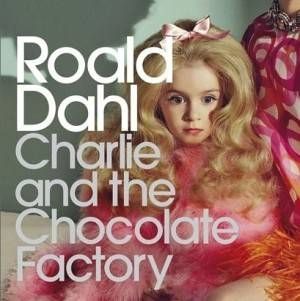
Celebrating 50 years of @roald_dahl's #CharlieAndTheChocolateFactory, it's the first Penguin Modern Classics edition! pic.twitter.com/SIiimeraR1
— Penguin Books UK (@PenguinUKBooks) August 6, 2014
That was… unexpected.
According to a blog post,
This new image for Charlie and the Chocolate Factory looks at the children at the centre of the story, and highlights the way Roald Dahl’s writing manages to embrace both the light and the dark aspects of life, ready for Charlie’s debut amongst the adult titles in the Penguin Modern Classics series.
I understand that the feel for this cover was meant to be slightly unsettling, but this cover feels more Toddlers & Tiaras than Charlie and the Chocolate Factory. To be honest, I am still not completely sure if that is an image of an actual person or a doll.
I am guessing that the image on the cover is meant to be Veruca Salt, but, as another Rioter put it, that is kind of like putting an image of Draco Malfoy on an anniversary cover of a Harry Potter book.
There are so many potential covers that could have been used. The most obvious choice would have been candy. There are lots of beautiful candy and food photography out there that would have looked gorgeous with the Penguin Modern Classic font. Or even stacks of Wonka bars, or a large golden ticket, or maybe even a conveyor belt carrying candy out to be sold.
A second choice, to focus on children, could have had kids in a candy shop, looking in through a window or standing at the counter waiting for their candy. Or maybe kids waiting at a set of gates, trying to get a glimpse into the factory. The photo could have shown the frenzy behind the contest to get inside of Wonka’s factory or the high demand for Wonka treats.
If they wanted to go a more ominous or dark route, there is always the possibility of using the classic factory smokestacks. It could have highlighted the mystery behind the Wonka factory, how no one really understands what happens behind those gates, but only sees the finished results.
 Penguin could have even utilized imagery from the 1971 film adaptation, Willy Wonka and the Chocolate Factory, which is equal parts dark and light. For the release of Truman Capote’s Breakfast at Tiffany’s, it utilized a still from the classic film starring Audrey Hepburn, so it would not be completely out of the ordinary to utilize a film that is beloved and so engrained into our society.
I love the Penguin Modern Classic line, and I love Charlie and the Chocolate Factory. But I do not love this new cover release and I wish they would have gone another way entirely with this modern classic.
What do you think of the new cover design? Do you like it? Would you have liked to see something else?
____________________
Expand your literary horizons with New Books!, a weekly newsletter spotlighting 3-5 exciting new releases, hand-picked by our very own Liberty Hardy. Sign up now!