


1984 In Covers
Whenever a book is having a cultural moment, I find myself looking at how the book’s covers have been rendered. For books that are older, it’s fascinating to see how covers have been reimagined over the course of time. Covers are a book’s biggest, easiest selling feature; much as we say we don’t judge a book by its cover, we do. Here’s how 1984 covers, the classic by George Orwell, has looked over the years.

George Orwell’s classic 1984 — a staple of high school classrooms everywhere — has been holding strong to the top of the bestsellers list for the last few months. I spent a little time looking at covers from previous eras, as well as foreign editions, and I found some interesting commonalities, rounded up and talked about below.
It’s worth noting that 1984 has a curious placement in regards to its availability in the public domain. As I began pulling covers together, I kept seeing tons of English editions, and it didn’t seem right — the book isn’t old enough to be in the US public domain. And while that’s true, it’s also true that the book is out of the public domain in Canada, Australia, and South Africa.
The book is also not yet available in the public domain in the UK. That will happen in 2021, and I can only imagine what some of the remixes of that book might look like after the political era upon both the US and the UK.
Pulling together the precise provenance of covers is challenging. There’s a lot of incomplete information about publishers, language of publication, and date of publication. So rather than trying to sort out the covers by those means, this round-up instead is taking a different approach: cover tropes.
Many of the covers could easily fall within many of the tropes. And some covers are baffling enough not to fit into any of the tropes below.
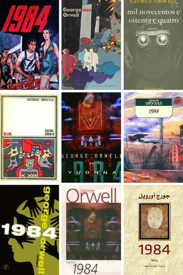
All Eyes Upon You

Both English and foreign-language editions of 1984 have featured eyeballs on their covers. Some of the foreign ones include the top left (Turkish), center row right (Spanish), center row center (Persian), bottom row left and bottom row right (both Spanish).
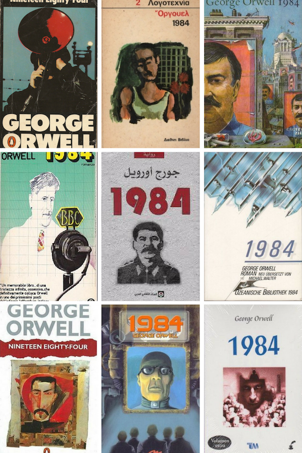
But wait! We’ve got more eyes on more covers, too.
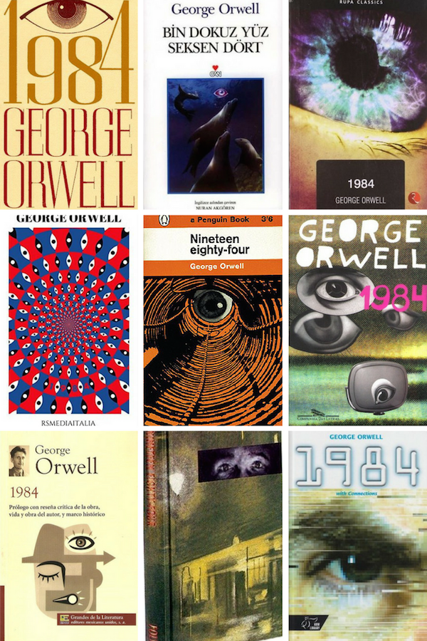
Among these covers, we have foreign-language editions which include top center (Turkish), top right (from an Indian publisher, language unclear), center row left (Italian), center right (Portuguese), and bottom left (Spanish).
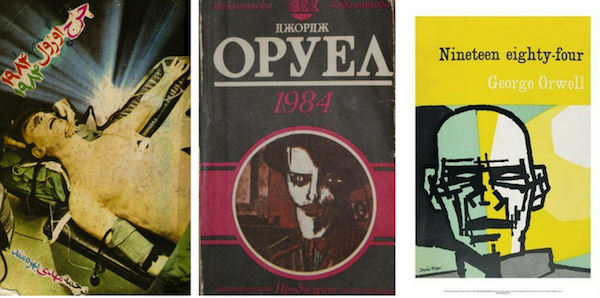
How about some more eyeballs?
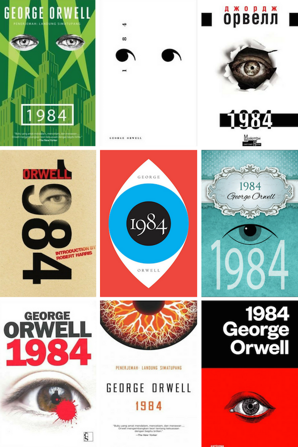
Some of these feature some of the most excellent and creative designs, I think. Among the foreign-language editions here are top left (Indonesian), top center (Spanish), top right (Ukranian), bottom left (Czech), bottom center (Indonesian), and bottom right (Portuguese).
Surveillance Cameras
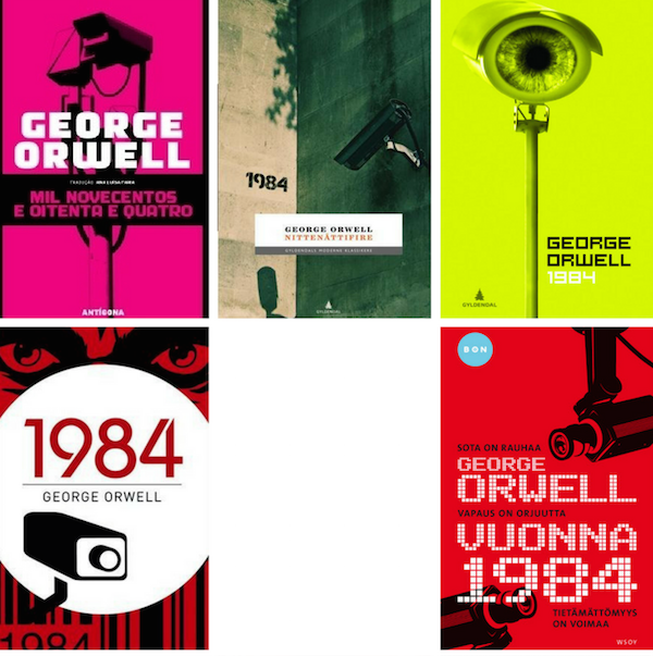
So many of these are the thing of nightmares. Among the foreign-language editions are top left (Portuguese), top center and top right (Norwegian), and bottom right (Finnish). Thanks for this, Scandinavia.
Citizens (Dis)United
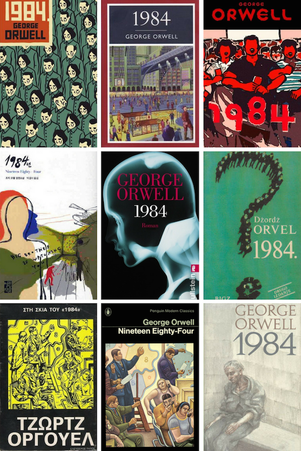
Creatively named, but the commonality here is that we’re looking at the common people in some capacity. It’s interesting to see the contrast between, say, the top right image and the bottom right image and what they say about the common person. Foreign-language editions include top left (Croatian), top right (Slovakian), center left (Korean), center middle (German), center right (Serbian), bottom left (Greek), and bottom right (Dutch).
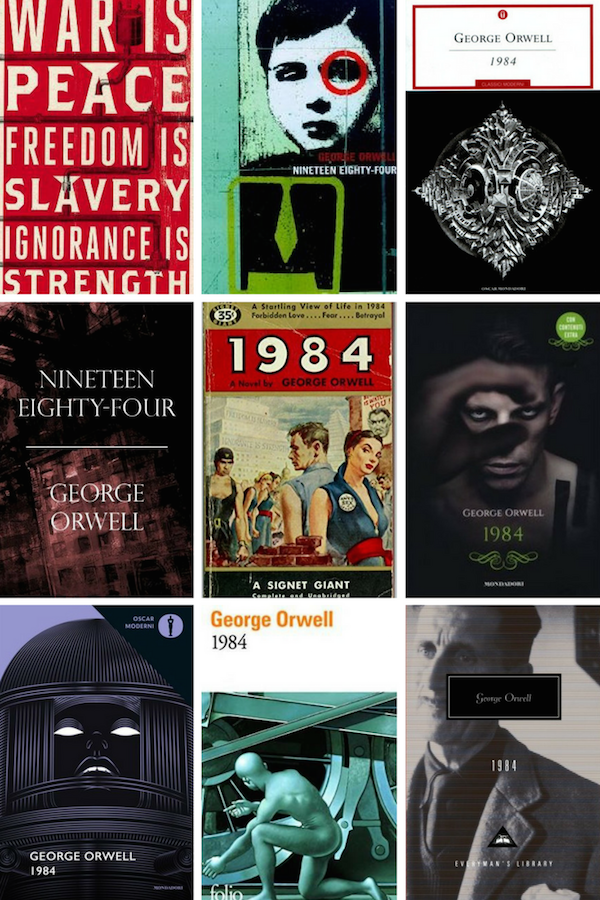
Font-Driven Design

This one’s pretty self-explanatory. It’s the font, particularly the title, which drives the cover’s design. Foreign editions include top left (German), top right (Greek), center middle (German), and bottom right (Danish).
Font-driven covers, which are still in vogue today — if not even more so today — are in abundance for Orwell’s classic.

Foreign-language editions in the round-up of font-driven covers above include: top left (Dutch), top middle (Italian — isn’t that pretty perky for such an unperky book?), center middle (Swedish), and center right (Thai).
The Big Scary Man
AKA: Big Brother.
It’s interesting to see how some of the renderings of power here look like they might be inspired by some real-life dictators.
Foreign-language covers above include: top center (Greek), top right (Dutch), center left (Italian), center middle (Arabic), center right (German), bottom middle (Spanish), and bottom right (Danish).

Some more imposing leaders for your cover consideration. Foreign-language editions include: top left (Arabic), top center (Hungarian), middle left (French), middle center (German), middle right (Chinese), and bottom left (Spanish).
Frankenstein . . . Or His Monster
Less reminiscent of citizens or Big Brother. More reminiscent of Frankenstein and/or his monster. The left image is Persian (and you could so easily substitute that in for Shelley’s classic!) and the center image is Bulgarian.
Straight-up Horror Vibe

These particular covers certainly convey horror, don’t they? Foreign-language editions include top center (Lithuanian — so creative!), bottom right (Chinese), and bottom center (Polish).
Cities & Identifiable Objects
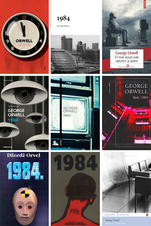
“Recognizable objects” felt like too broad of a category for these covers. Instead, I pulled together the identifiable objects that conveyed a feeling of governmental control and/or showcased cities themselves. Televisions and surveillance cameras that look like hanging lights could have gone in a few other categories, but they’ve been popped in here since they fit the feel of these. Foreign-language editions include top right (Ukranian), center left (Danish), center middle (Spanish), center right (Polish), bottom left (Serbian), and bottom middle (Indonesian.
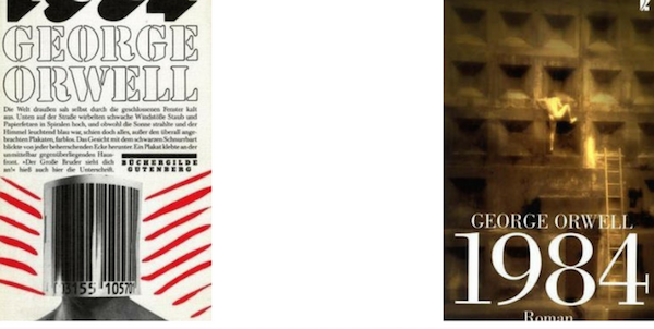
And a couple more for the “objects/cities” broad category. The cover on the left is German (so good!), and the cover on the right is also German (and it’s unsettling).
Miscellanea
Surely, some of the covers in this general “miscellanea” category could have fit into other tropes, but for the most part, these didn’t fit neatly into one or another.
Not to mention, some of them are just weird. But perhaps that weirdness is the point.
Foreign-language editions include top left (Malay) top center (Danish), top right (Portuguese), center left (Polish), center middle (Finnish), center right (Russian), bottom left (Dutch), bottom center (Dutch), and bottom right (Arabic).
Just a few more, including foreign-language editions top right (Italian), middle right (Italian), bottom left (Italian), and bottom center (French). Also a big hello to Mr. Orwell himself in that bottom right cover.
Have a favorite? Find any to be more strange than another? I’ve personally found the center cover image in the collage immediately above to be the most jarring and strange. Admittedly, it’s been many years since I’ve read the book, but I don’t remember that scene or image.