


Comics Lettering: By Hand or on the Computer?
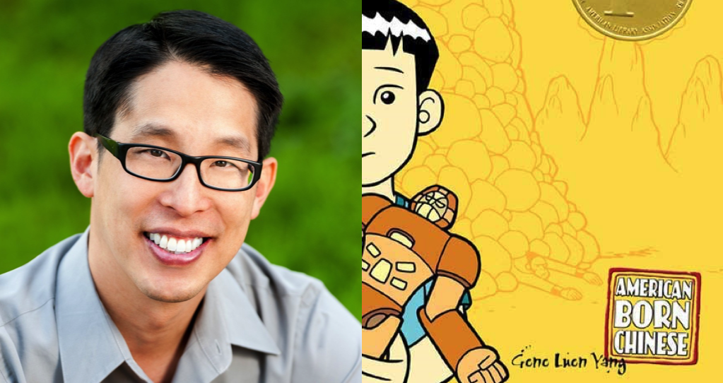
Once a month, Gene Luen Yang, the National Ambassador for Young People’s Literature, stops by Book Riot Comics for Creativity in Progress, a minicolumn on art, process, and how he creates comics.
There’s a controversy about lettering in the comics industry. Some folks believe that because most comics are hand-drawn, the lettering must also be done by hand. Otherwise, the words and pictures won’t mesh together and their dissonance will kick the reader out of the story.
Others believe that we ought to just use the modern tools that are available to us. Lettering by computer is much, much easier, especially when it comes to editing. Before computers came around, changing the dialogue on a page of comics was a daunting task.
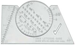
I began making comics in 1984, when I was in the fifth grade. Back then, there were no personal computers capable of comic book lettering. I had to letter by hand, and I quickly realized how much I hated it. It was common practice to use an ancient tool called an Ames Guide to keep your lettering straight. I simply could not get the hang of that stupid Ames guide.
Also, writing so neatly for such a prolonged period caused my hand to cramp. I looked around for a classmate with good penmanship willing to take over this part of the comics-making process for me. I was never able to find one.
Memories of those hand cramps are probably why I was so excited when computer lettering became a possibility. I do, however, sympathize with the other side of the controversy. The polish of computer lettering can sometimes be jarring, especially in a comic that’s meant to be personal, one that’s meant to feel like a diary.
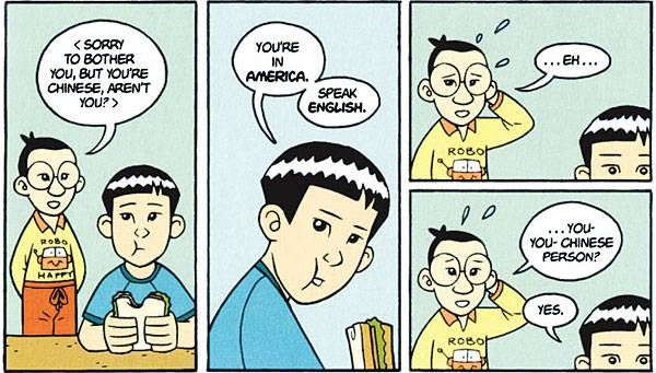
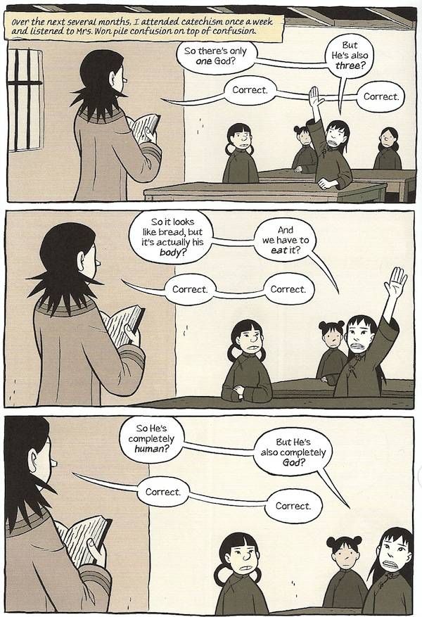
I lettered American Born Chinese with a modified version of WhizBang, a popular comics font. (By “modified” I mean that I used Photoshop to scrunch the font’s width down by about 20%.)
Since then, I’ve switched over to a font based on my own handwriting. I created it using a piece of software call TypeTool. It took several days, but I’m happy with the result.
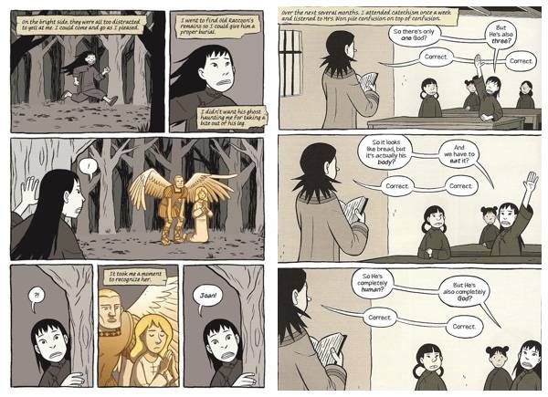
Boxers and Saints is my most ambitious project font-wise. I made three different fonts to express three different aspects of that story. I used my usual based-on-my-own-handwriting font for spoken words, as well as captions that I wanted to read like real-time thoughts. I used a serif font for passages that I pulled from the Bible. (A serif is little ledge at end of a stroke of a letter.) And I used the cursive font based on my wife’s handwriting for captions that I wanted to read like journal entries.
Master letterers like Janice Chiang can letter both by hand and with a computer. One of my cartoonist friends actually letters with a computer first, and then traces over the computer letters in order to give them a more organic look. I must admit, the results are beautiful.
That technique, that compromise between hand- and computer-lettering, might be worth a try.


